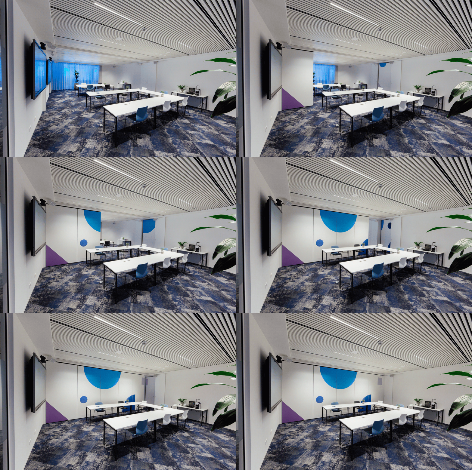
Bioville
REBRANDING
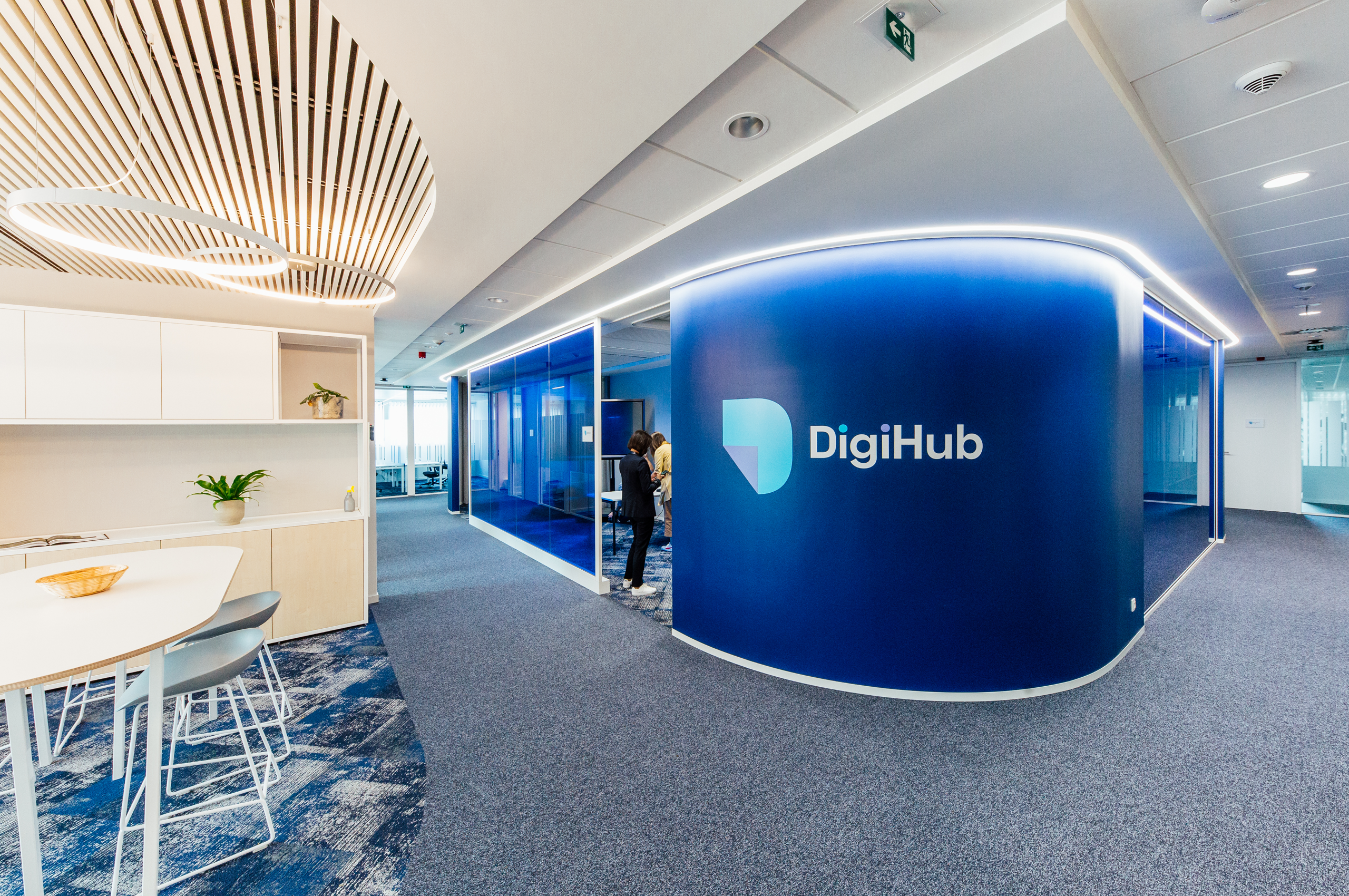
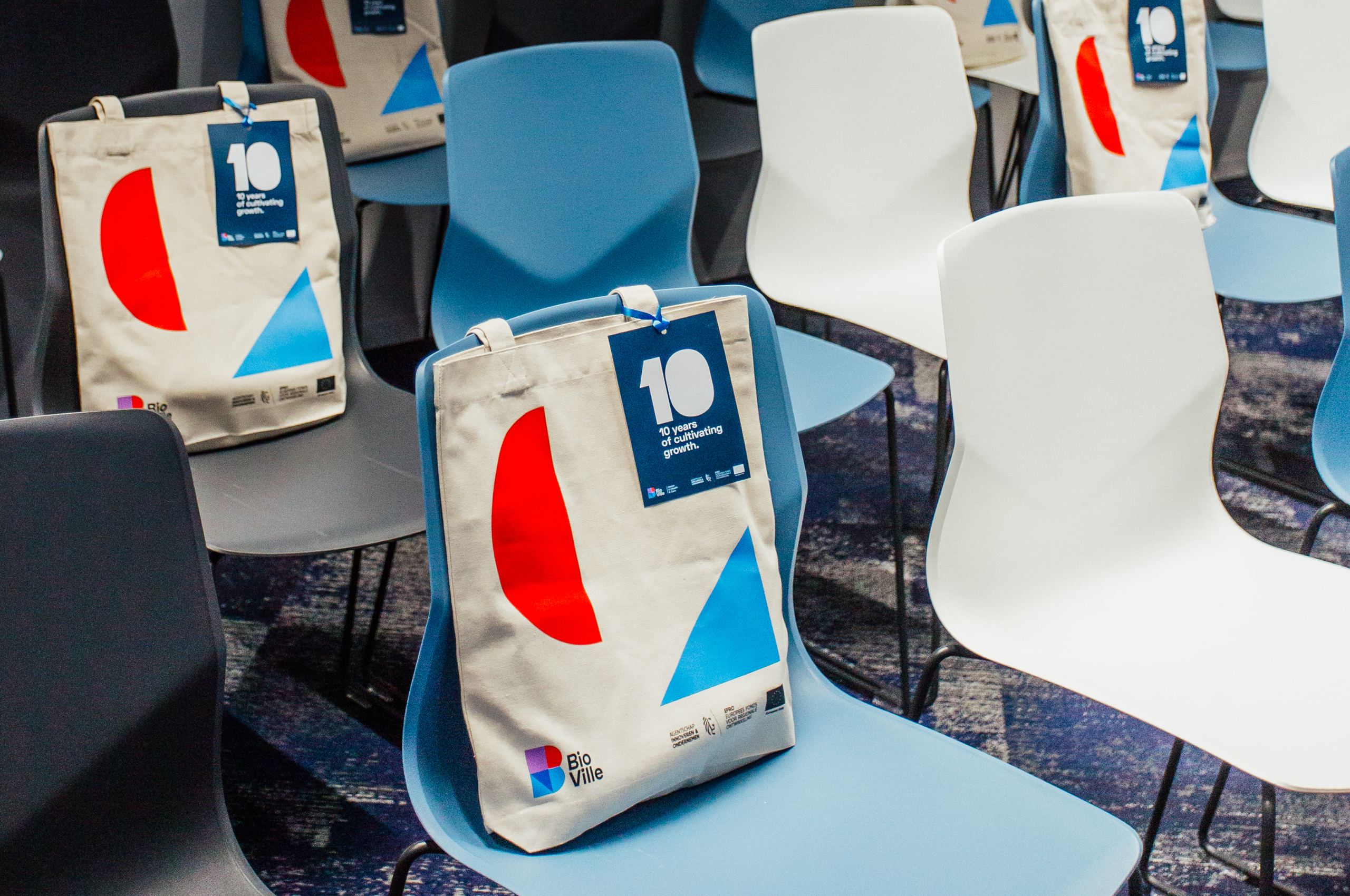
A 10-year anniversary. Brand new 'digiHub'. Plus: plans for an additional wing. Not one - but three reasons for BioVille to get their strategy, brand identity and marketing right. To the rescue: team L&T.
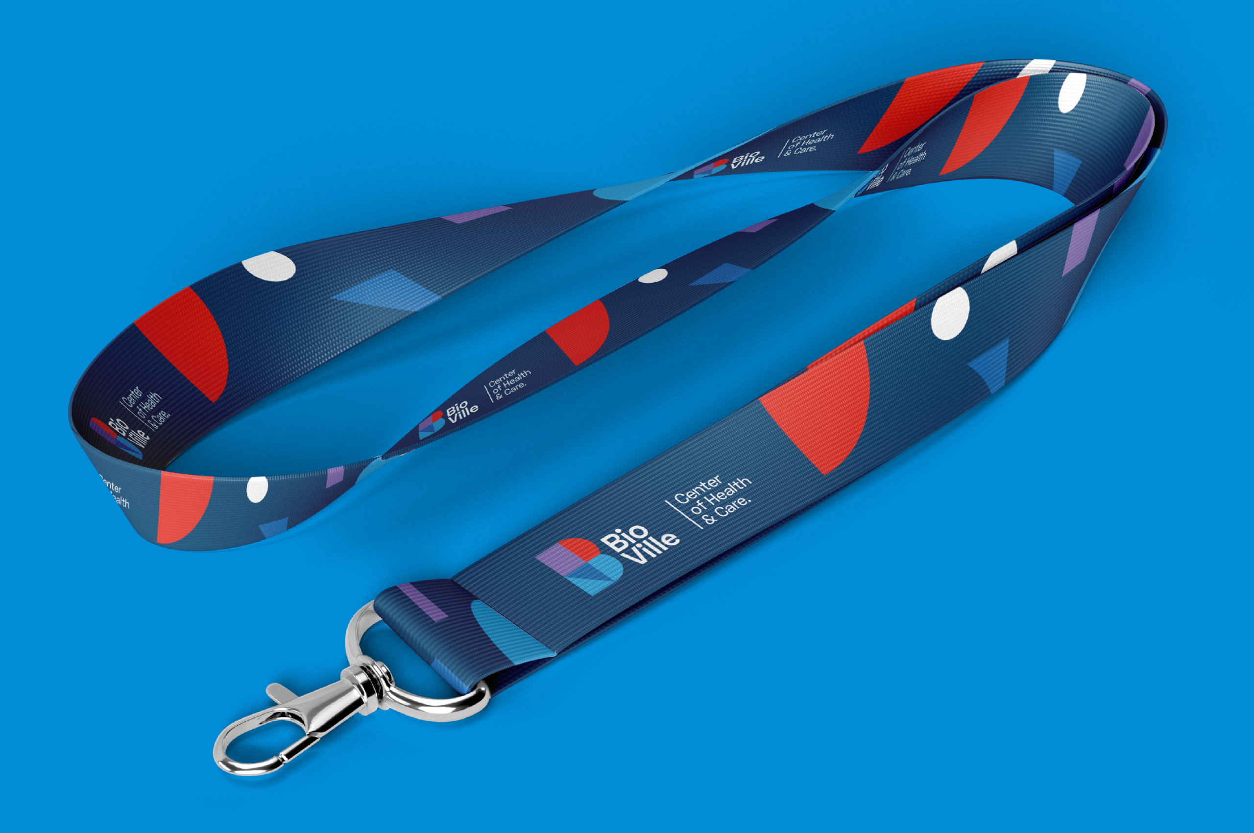
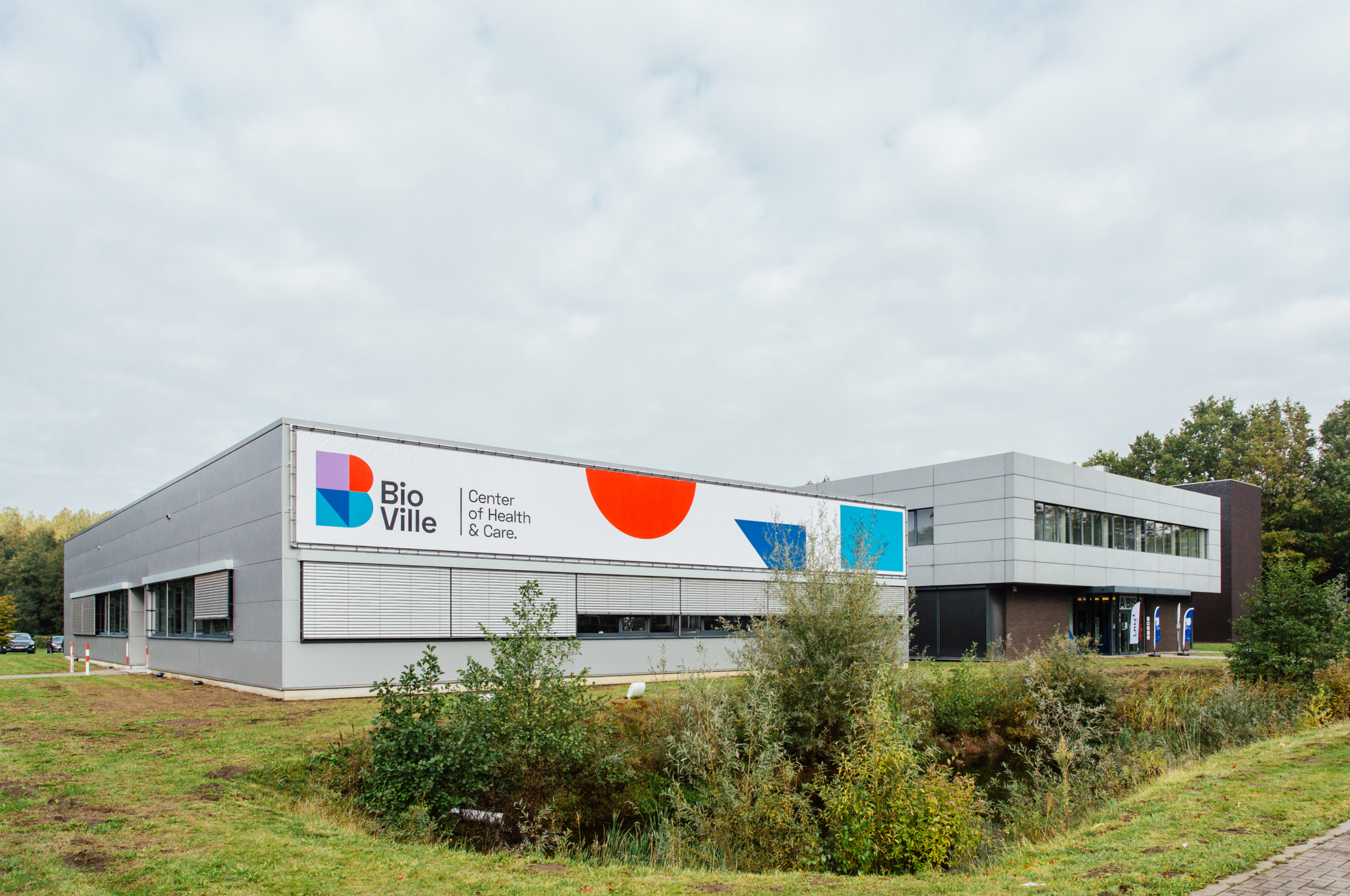
Honestly? There was dust on BioVille's look. With the design of a tictac-fresh brand identity, clear strategy and smart marketing approach, we're getting the incubator ready for the next 10 years.
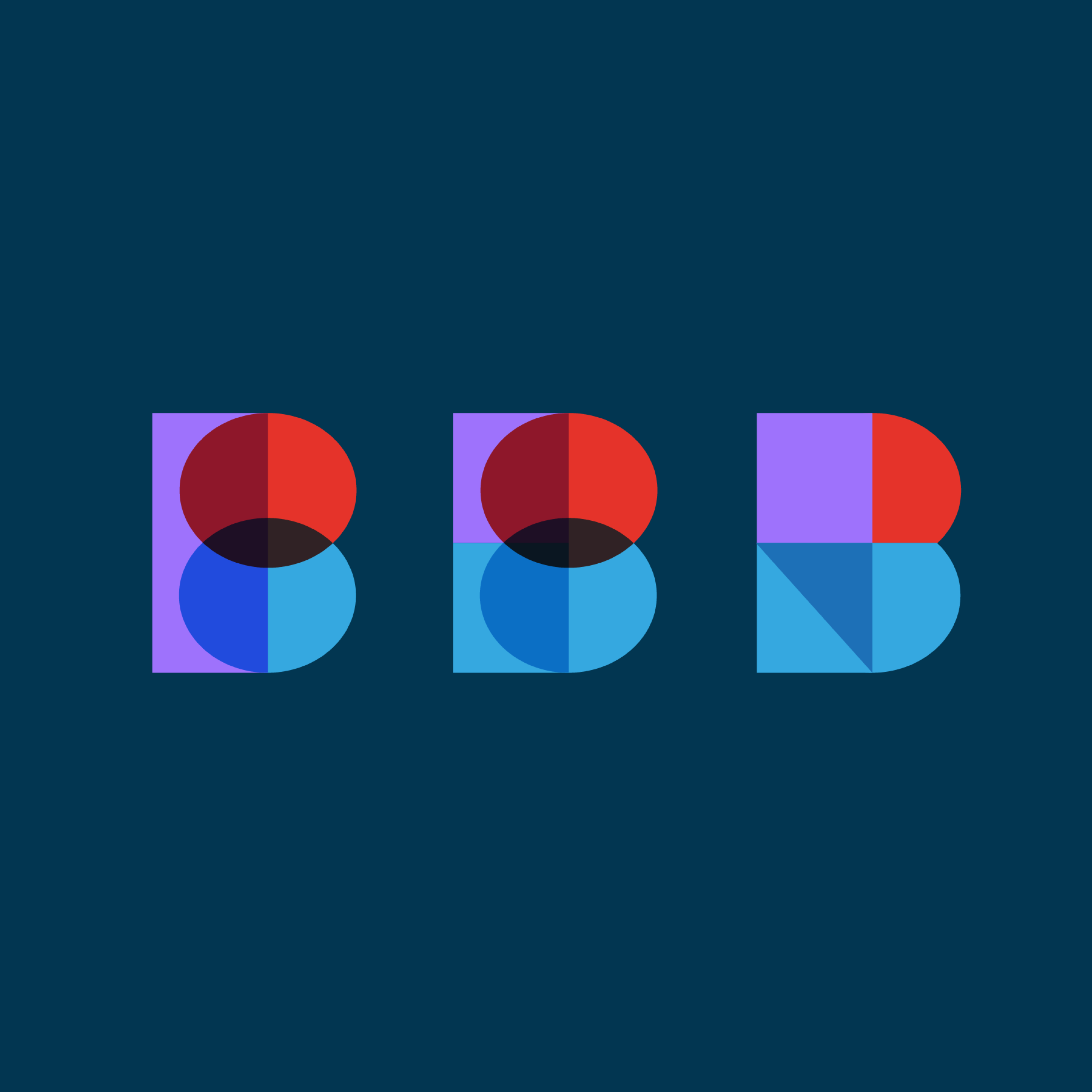

Grow a logo
We never design a logo to 'just be pretty'. We look for ways to reinforce the gut feeling customers have about a brand. And the we make it pretty.
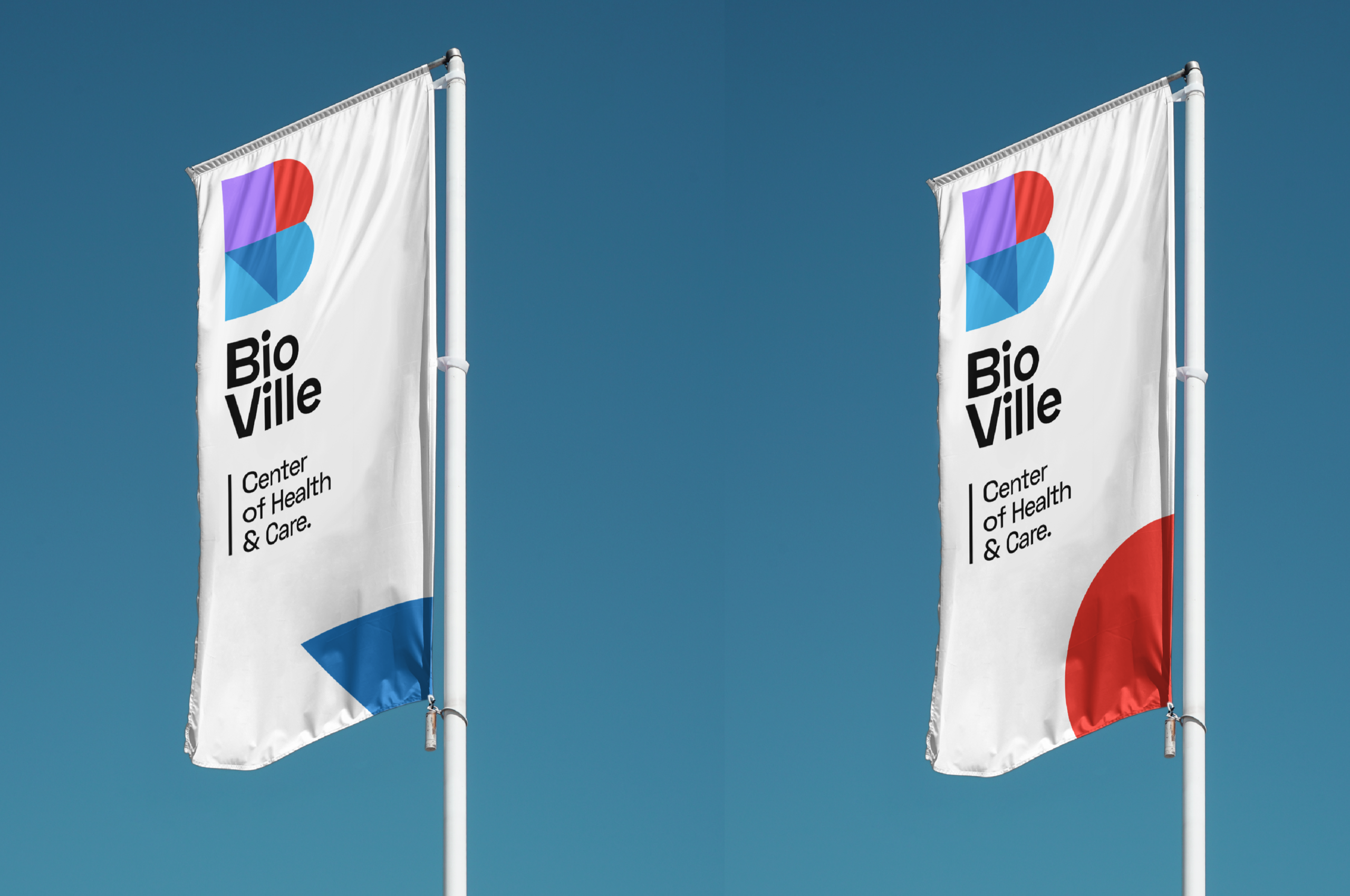
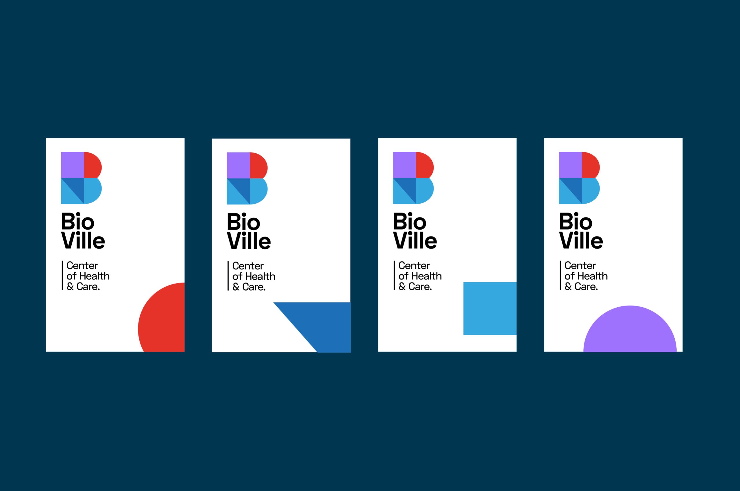
The logo is based on cell division. The design starts with a simple cell, which eventually grows into the 'B' of BioVille. It doesn't have to be rocket science.
Color Clash
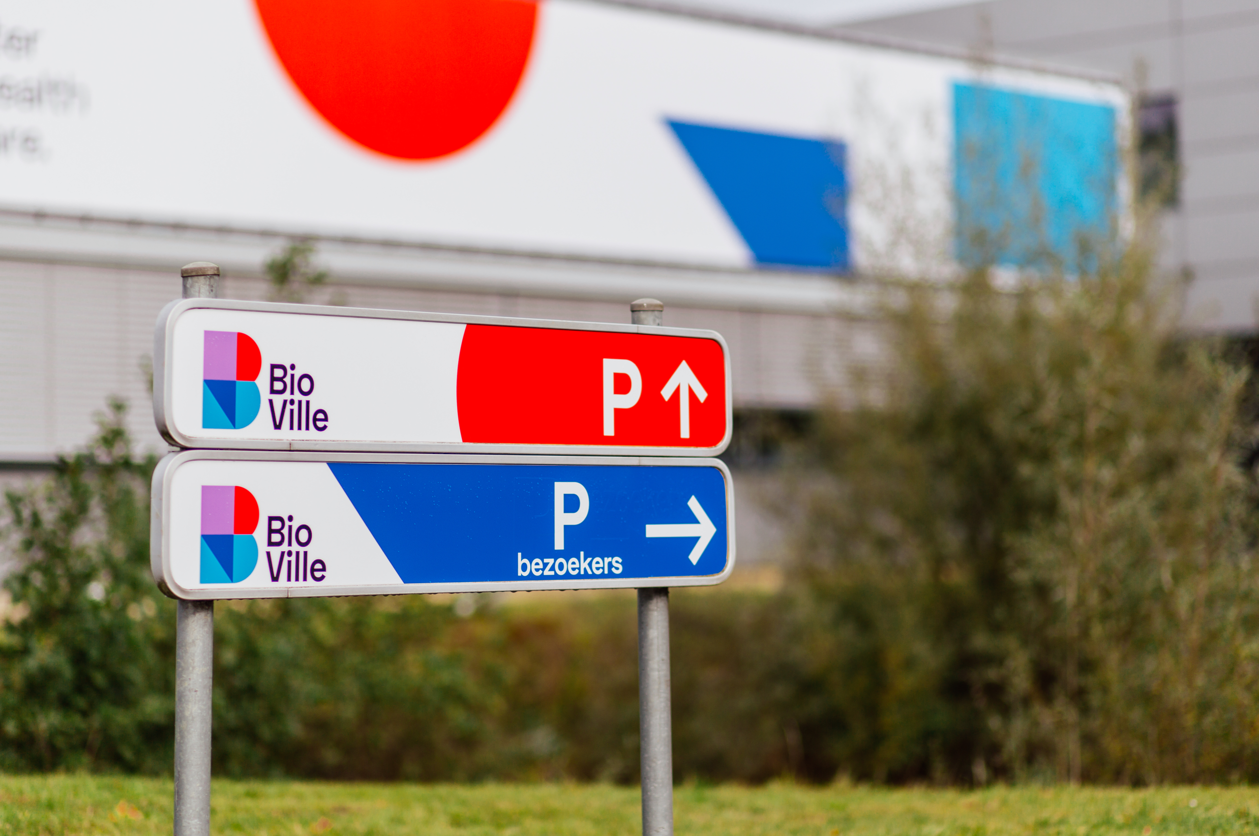
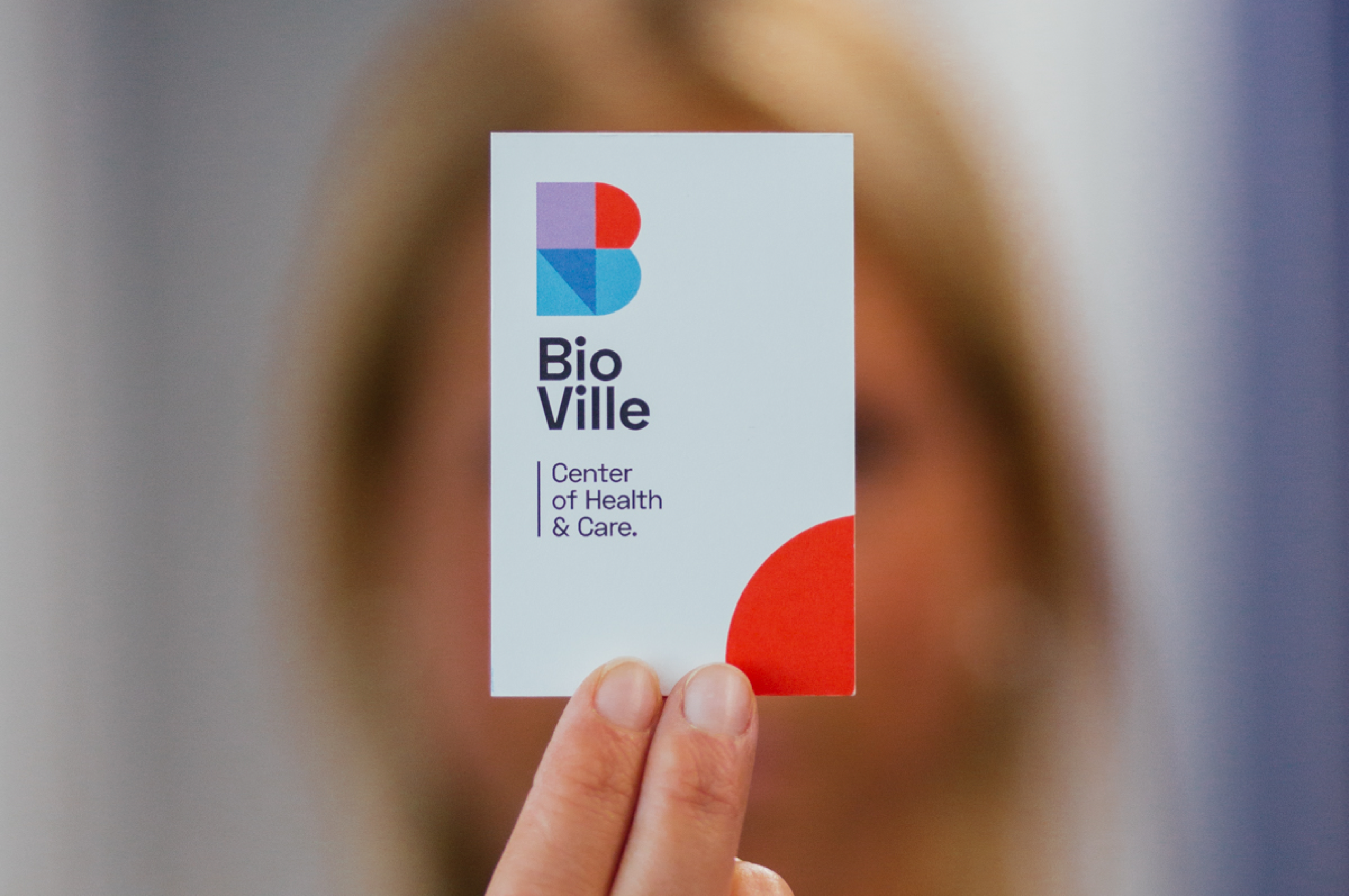
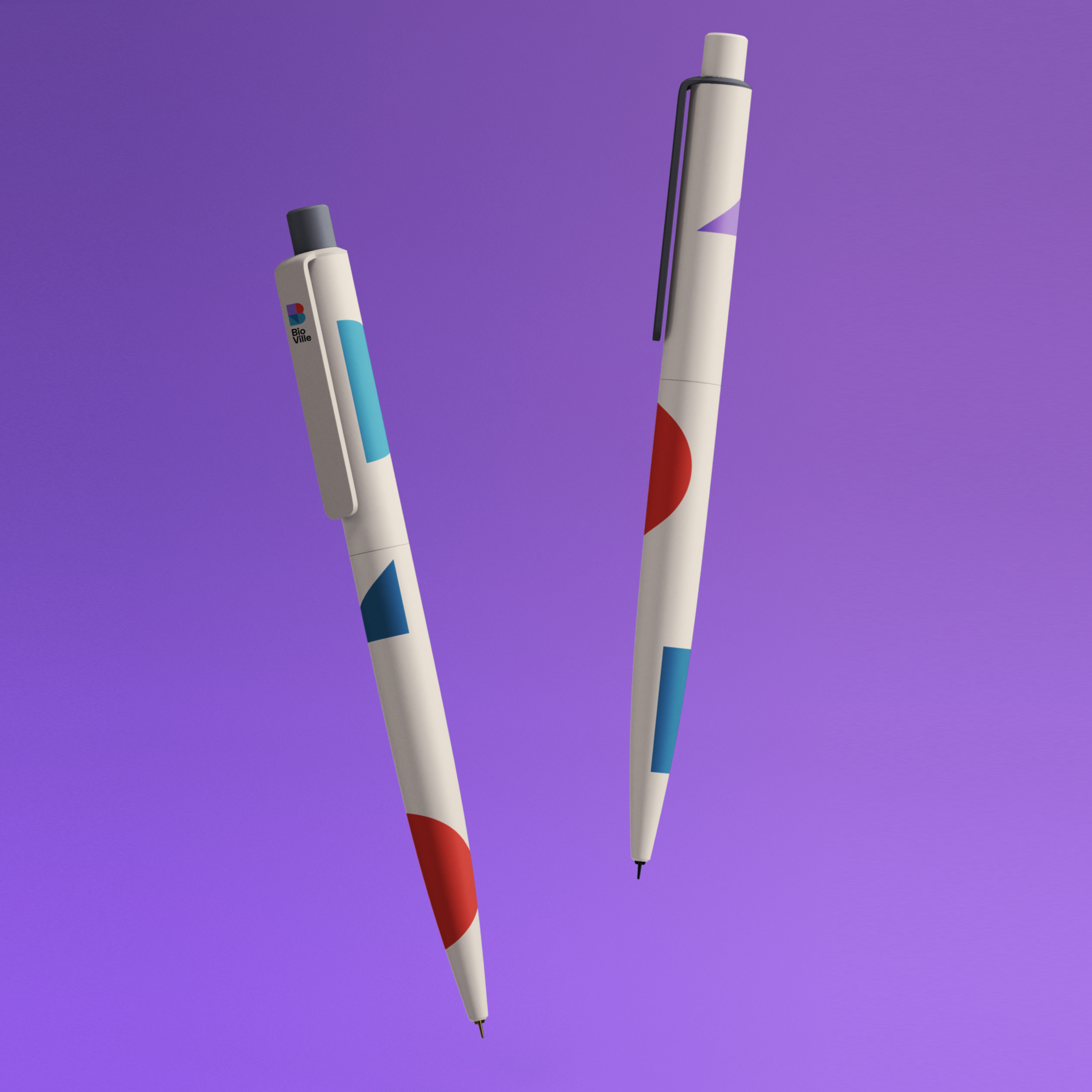
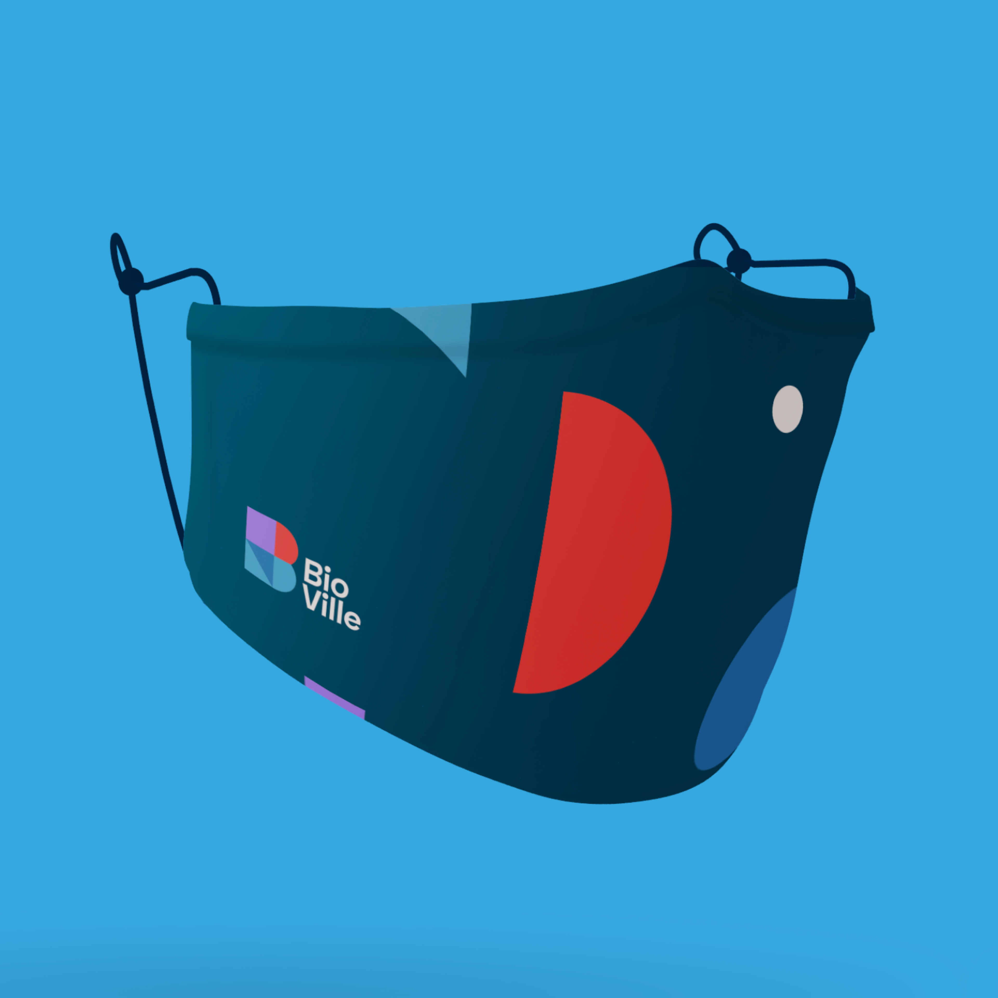
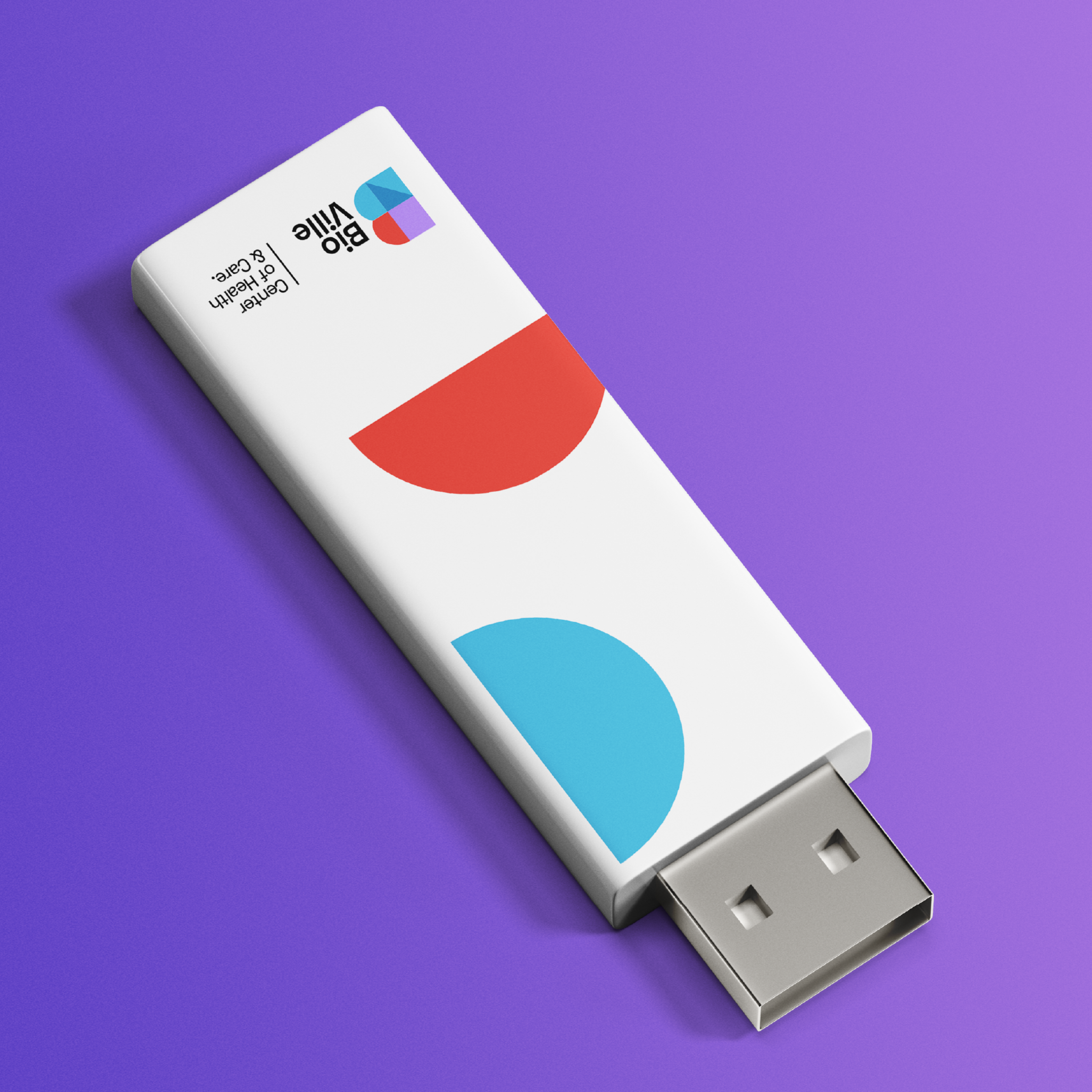
The clash of colors (Red! Blue! Yet another blue!), with purple as a creative accent, makes for a striking, recognizable whole - especially in a Health & Care environment.
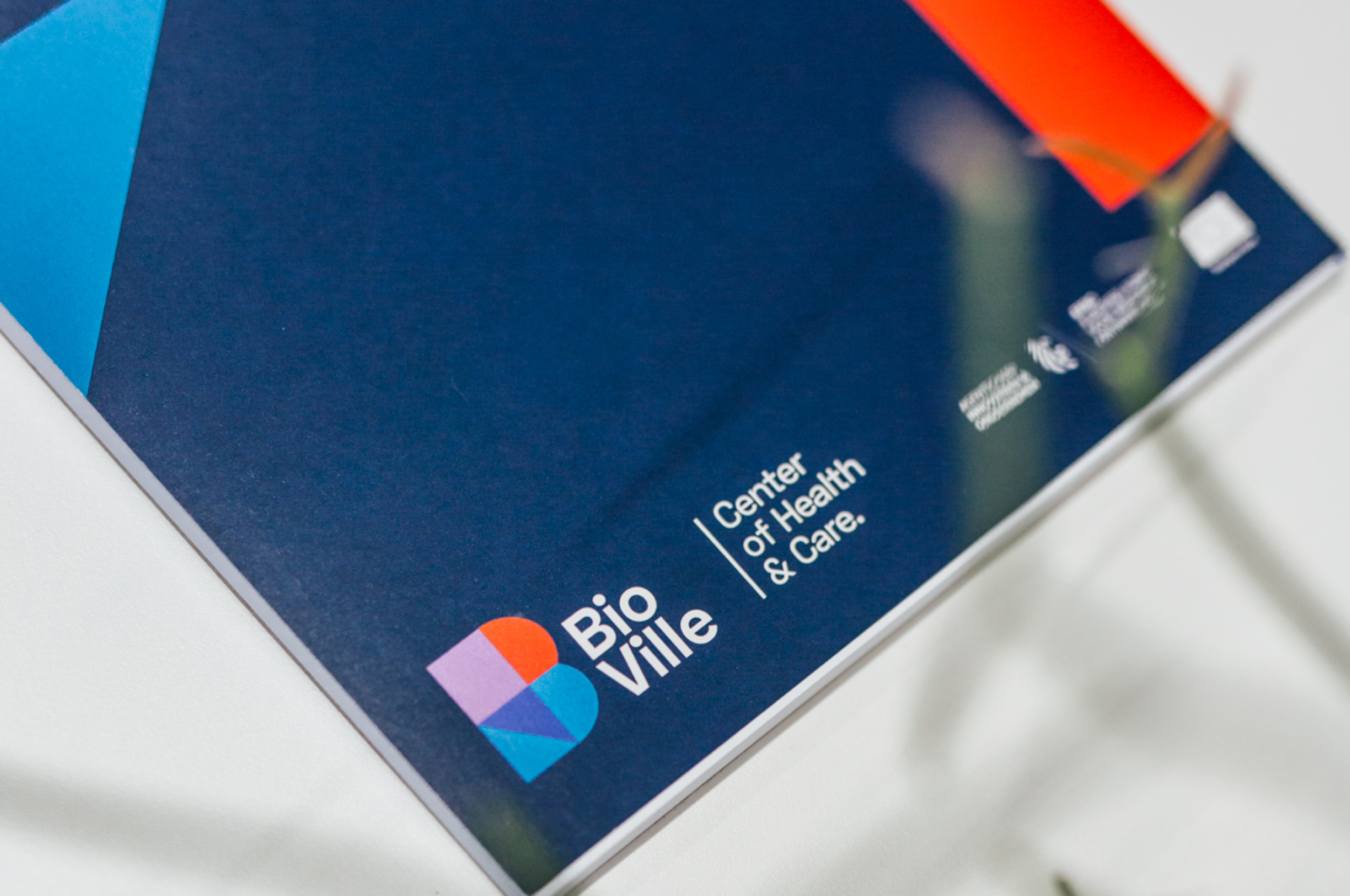
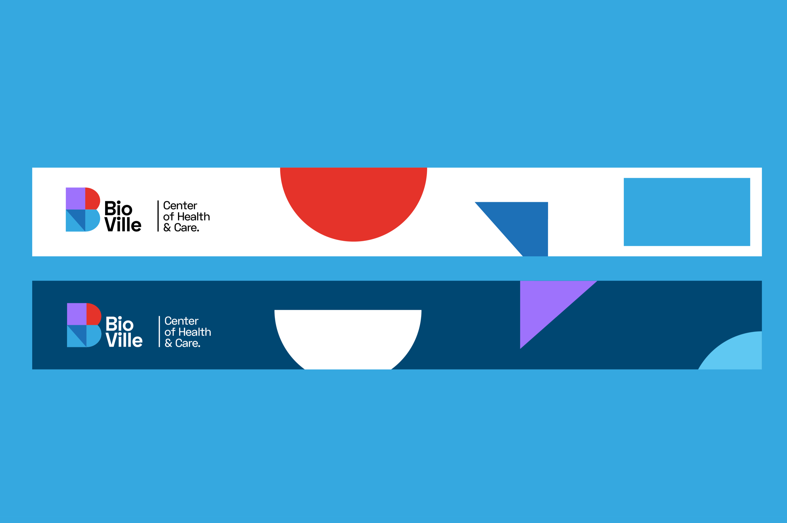
The branding can be very playful, but is still sufficiently mature to stand its ground in a professional environment.
We also did: building dressing, social media, swot analysis, animations, determining buyer personas and social media.
