Bitemark
BRANDING WITH IMPACT
Bitemark is young, wild and wants to stand out. And rightly so - after all, as “digital partners for growth”, they are entering a market that is quite busy. It's up to us to make them shine - in the right way. How? With a name to take a bite out. And a striking visual identity. Roooaaaauuw! 
Website
bitemark.be
Instagram
@bitemark.be
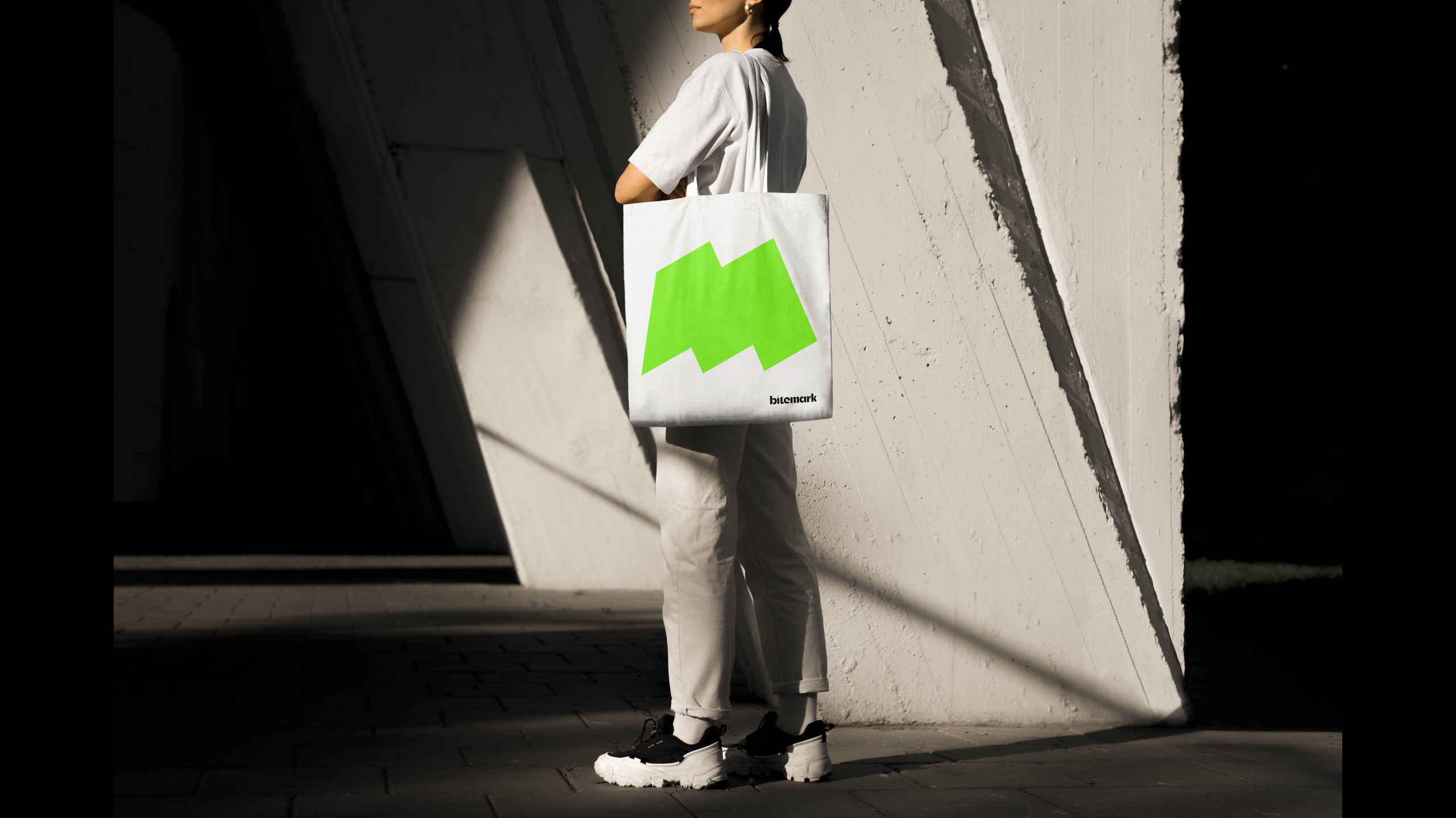
What's in a name?
Everything. It is the starting point. The name 'Bitemark' is short, unique and distinctive, making the company immediately stand out. Moreover, it has a strong sound, making the name stick in the memory of potential customers. Not unimportant in a competitive market.

Strategy first
The visual and verbal identity is the result of a strategic exercise we did with the client. Among other things, we took into account brand positioning, target group and competition to communicate their services and values in the right way.

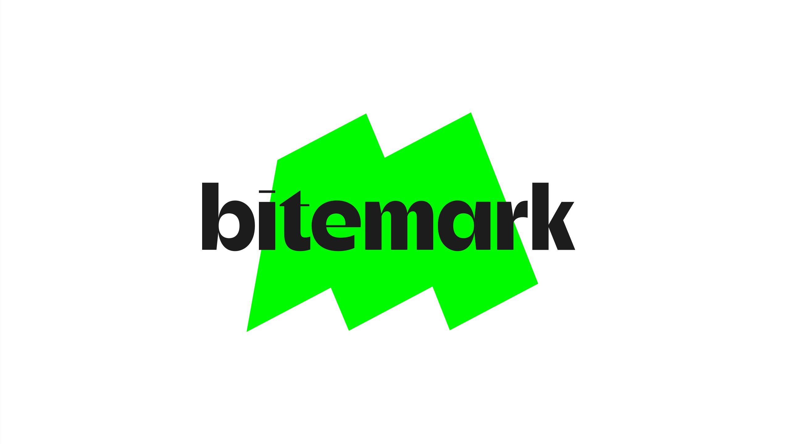
Recognisable icon
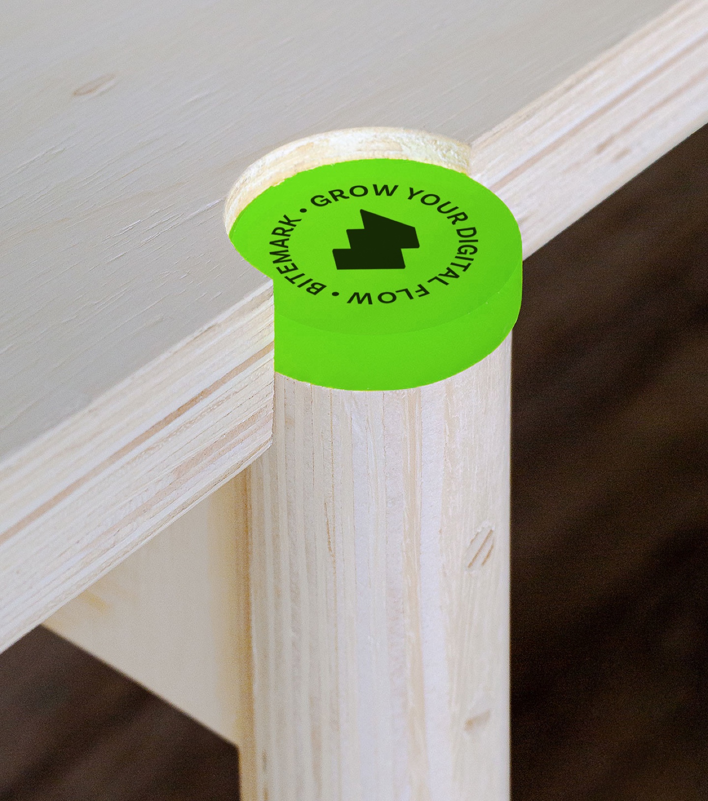
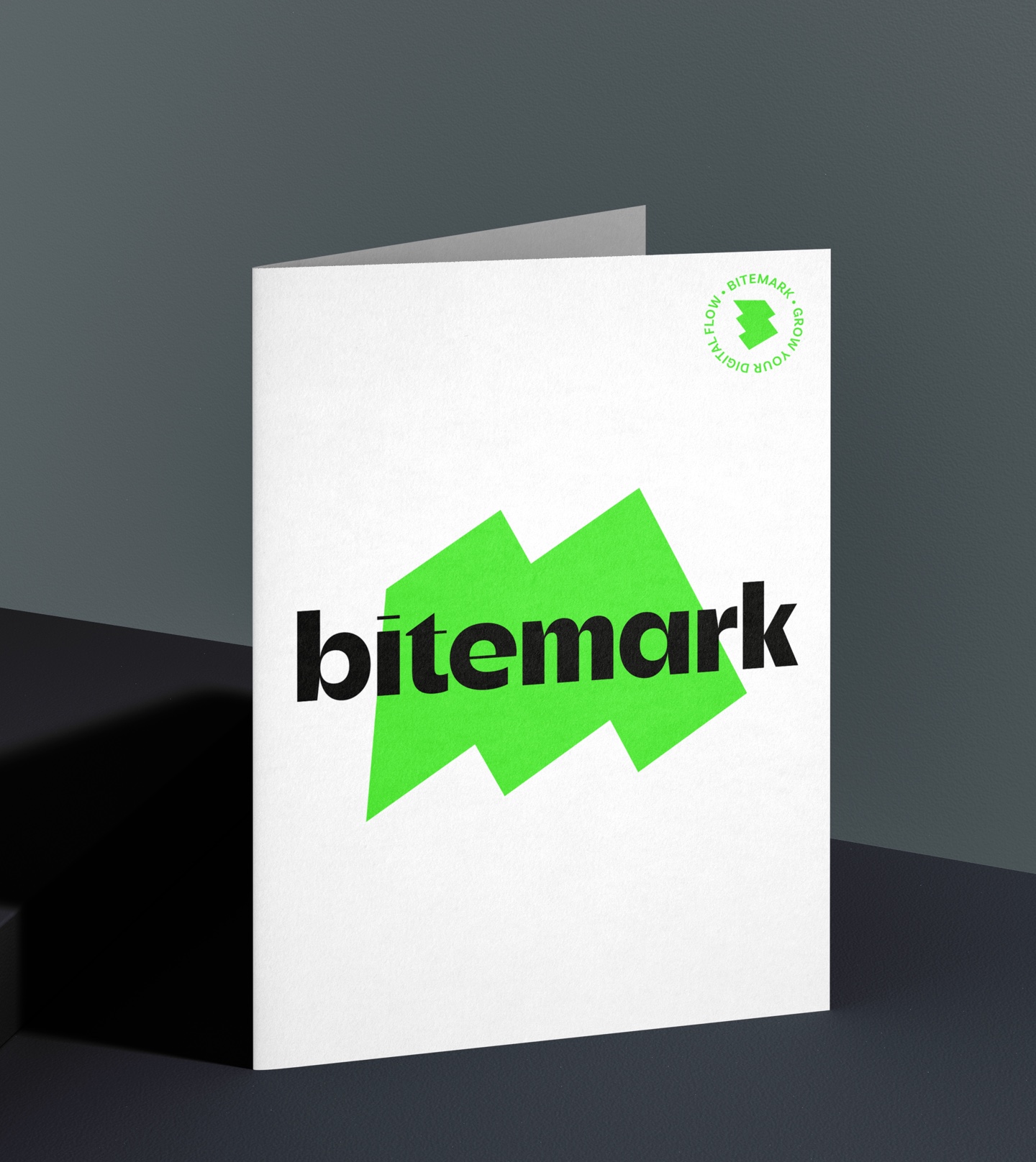
BiteMark's logo cleverly plays on the letters 'B' and 'M'. By combining the letters, they create a unique shape that is flexible and recognisable. This can be used as an icon, for example for social media.
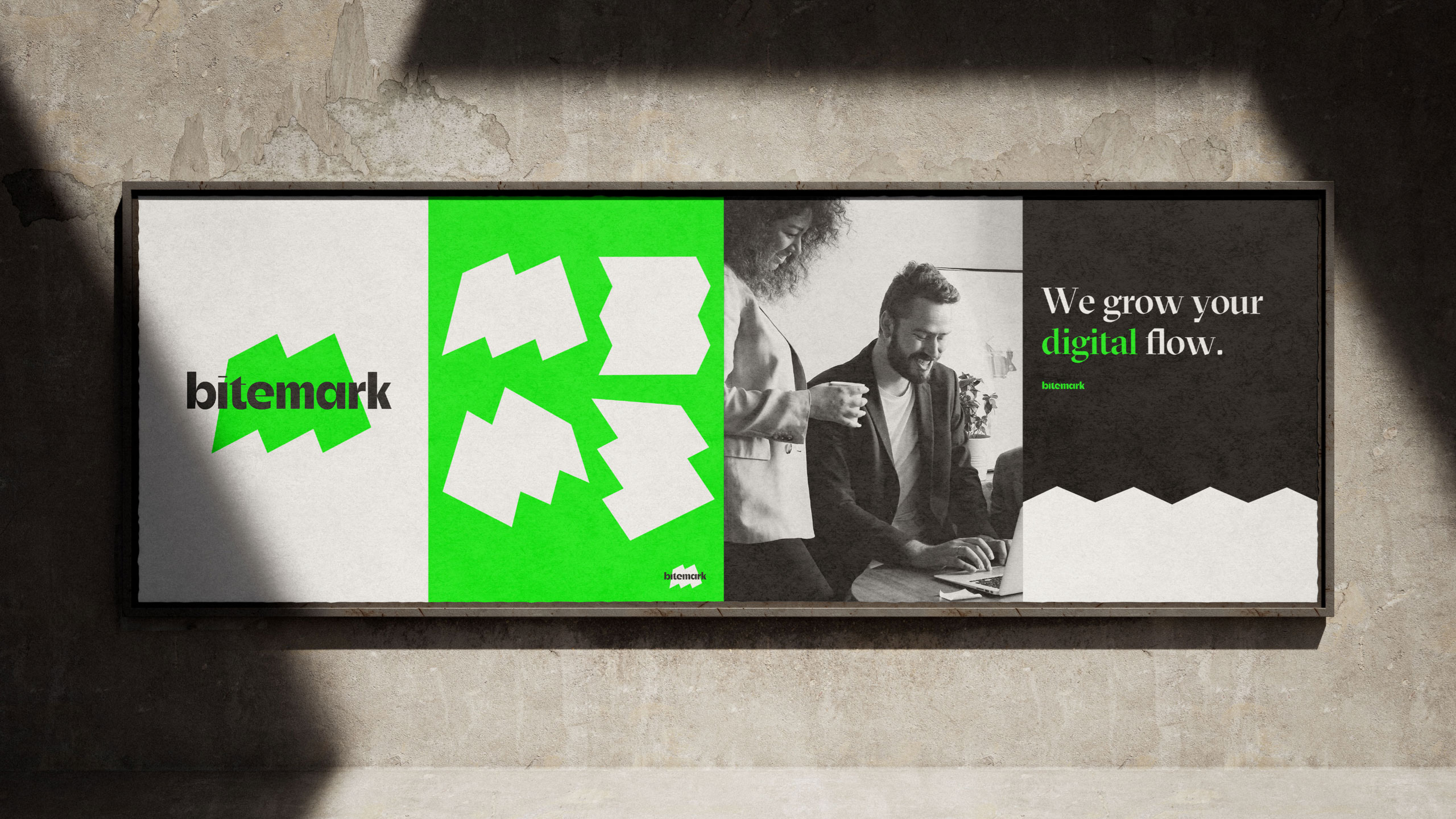
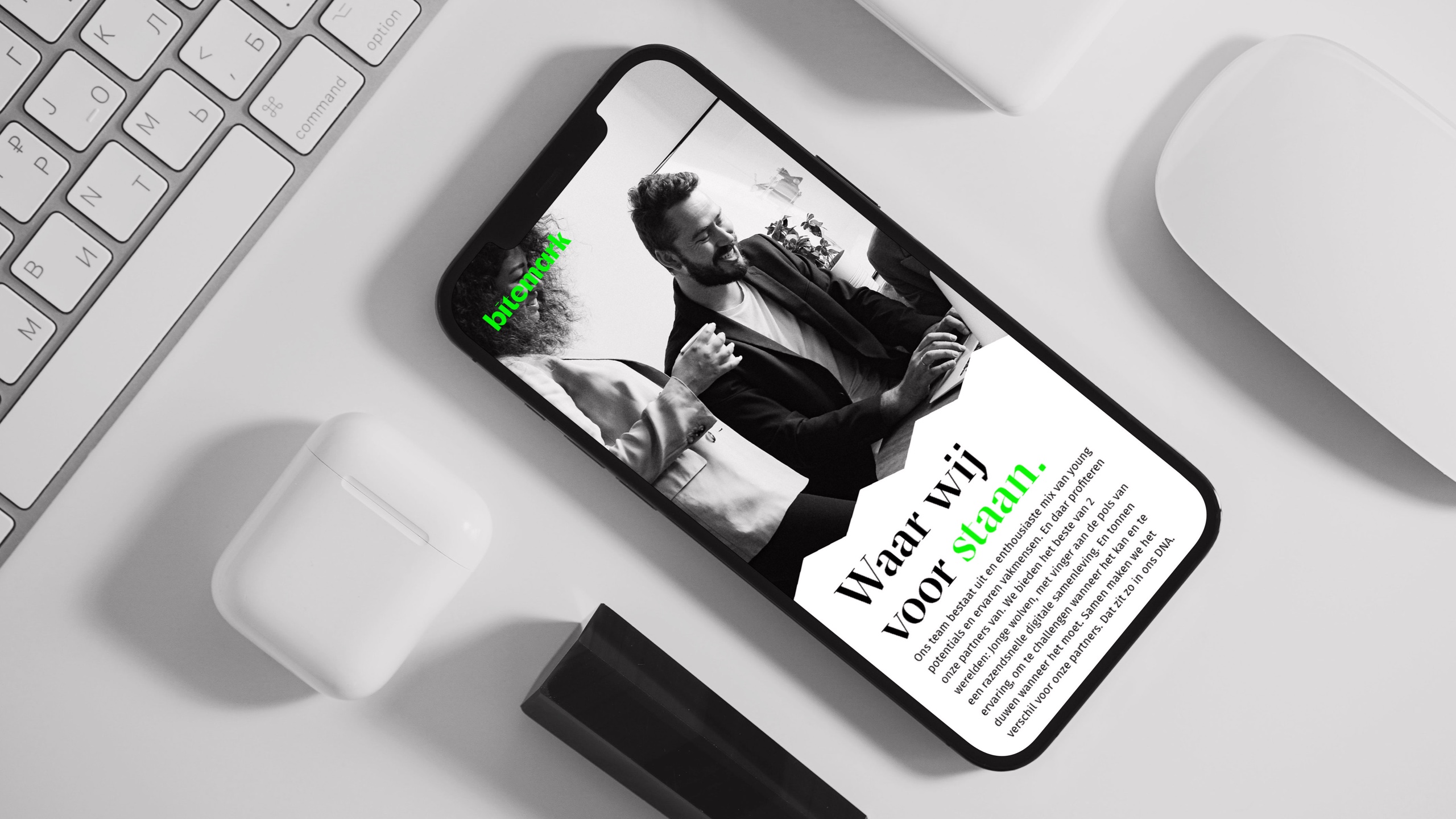
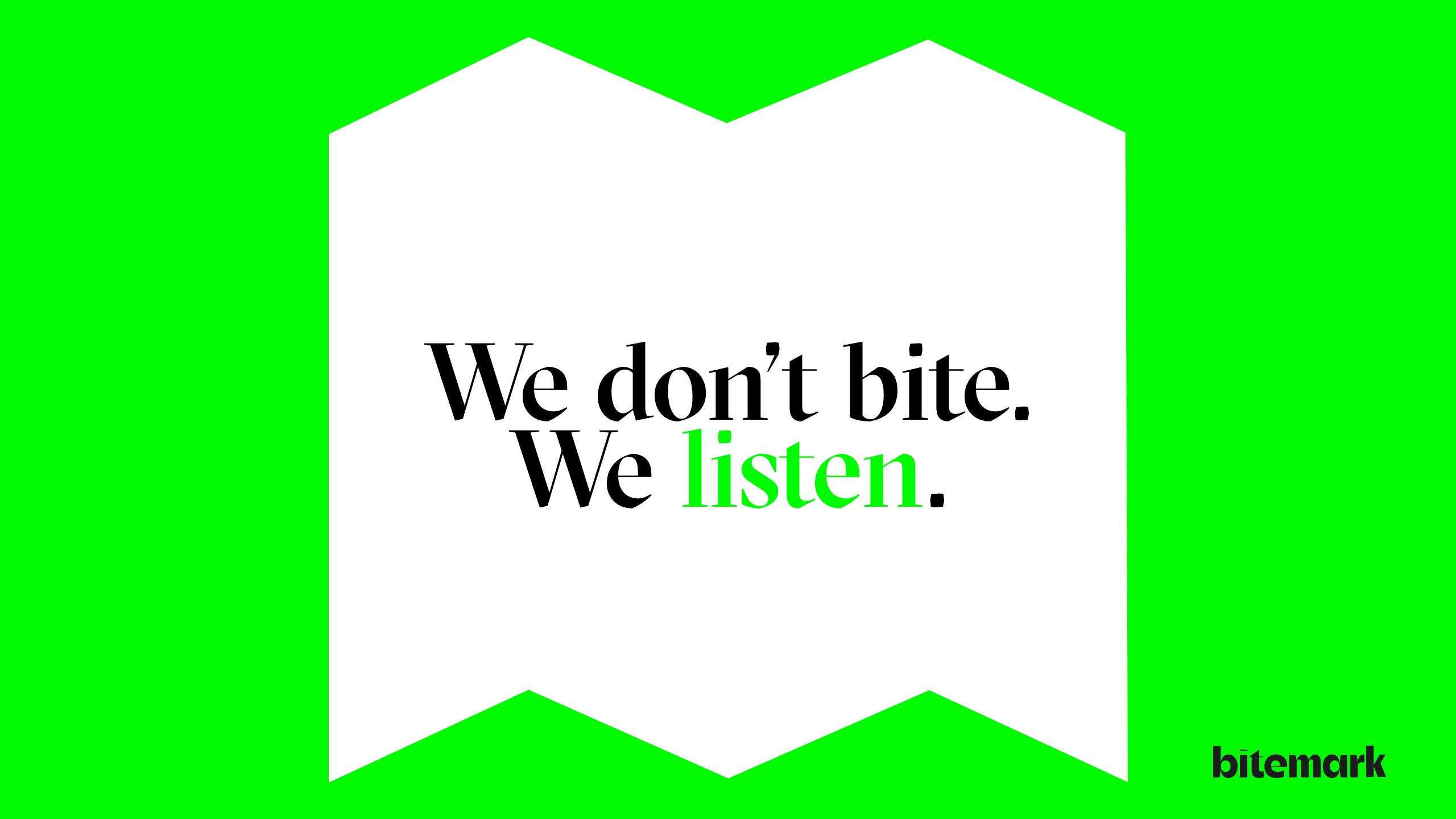
Moreover, this amorphous shape acts as a container in which photos can be placed, such as cases or portraits of the team.
Striking colours
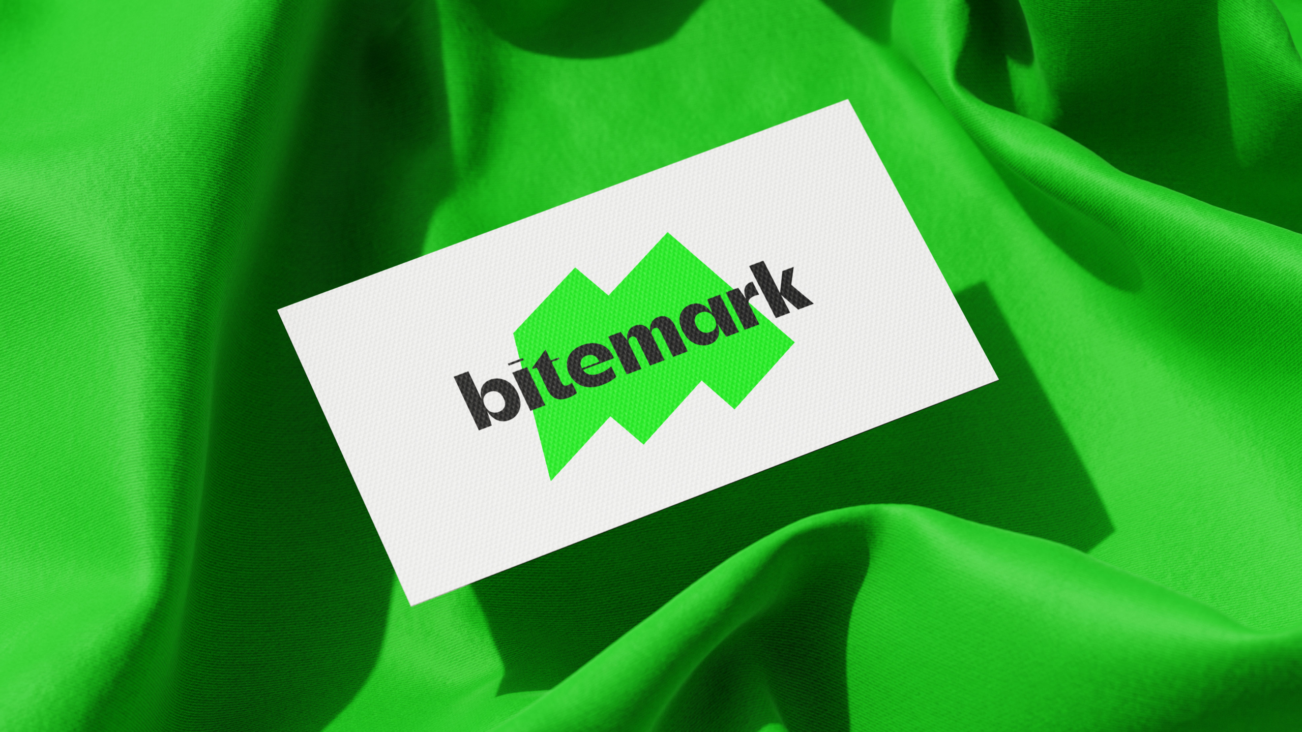
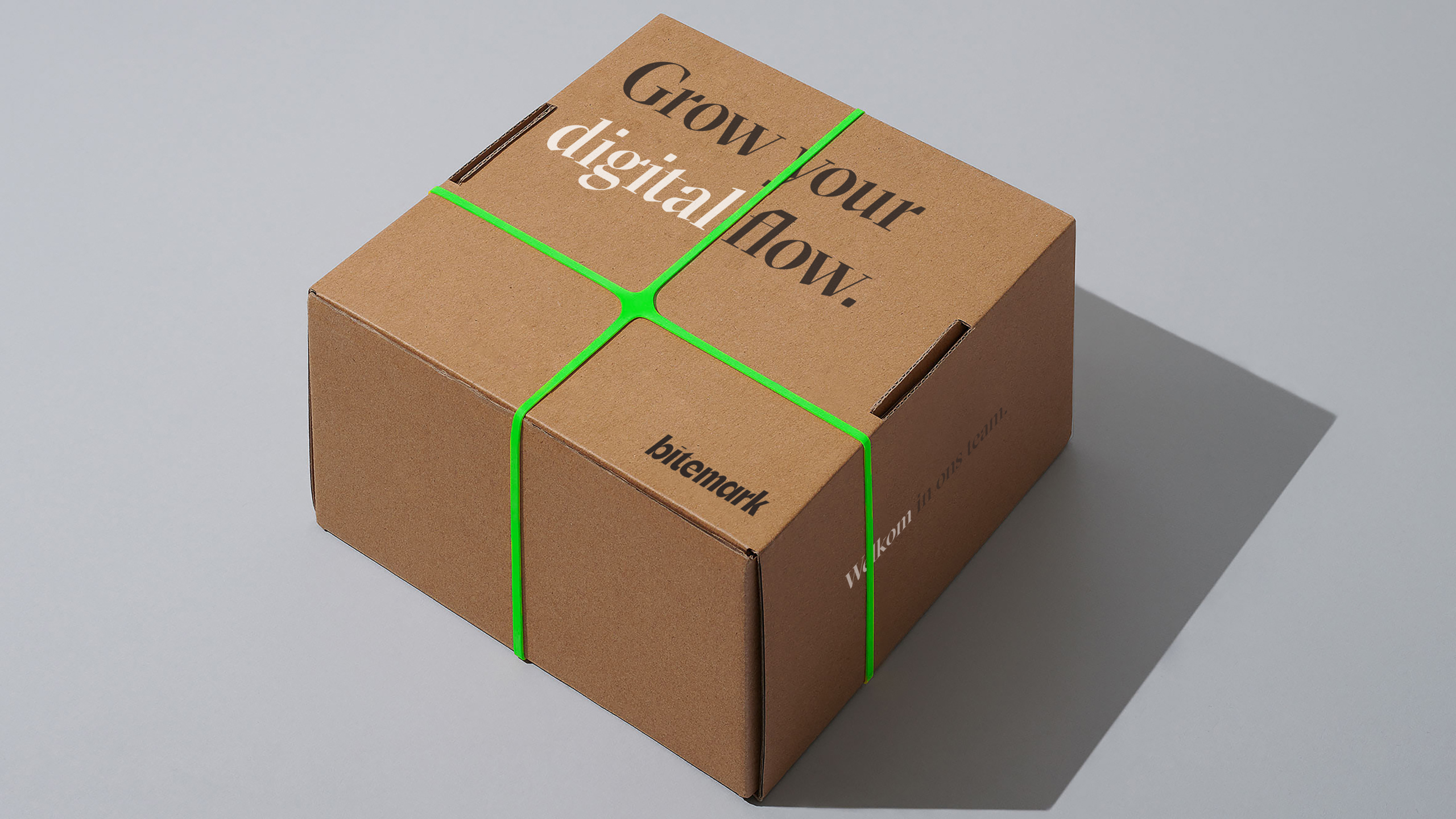
For their colour palette, we chose a striking fluorescent green combined with black, white and grey. This colour combination exudes energy, modernity and professionalism, further differentiating the brand.
Baseline
With the baseline 'We grow your digital flow', BiteMark highlights their expertise and promise to drive digital growth for their clients. This catchy baseline summarises what the company stands for and what they can offer to their customers.
Future
In addition to their strong visual identity, BiteMark also has an attractive and user-friendly website. Just the beginning, as they have many other future elaborations in store to help their clients grow.
With their expertise and focus on digital growth, they are well positioned to be a complete partner for companies looking to improve and grow their digital presence.
