Boundless Bocageland
A HARMONIOUS LANDSCAPE IN FOCUS
Landscape park Grenzeloos Bocageland is a beautiful stretch of nature, located right on the border between Belgium and the Netherlands. The organization is dedicated to protecting and enhancing this unique landscape. To strengthen their mission, RCA developed a fresh brand identity.
Website
www.bocageland-paysdubocage.org
A STRONG STRATEGIC FOUNDATION
The process began with an in-depth strategic phase. Through various workshops, we collaborated with stakeholders to redefine the park’s core values, objectives, and verbal identity.
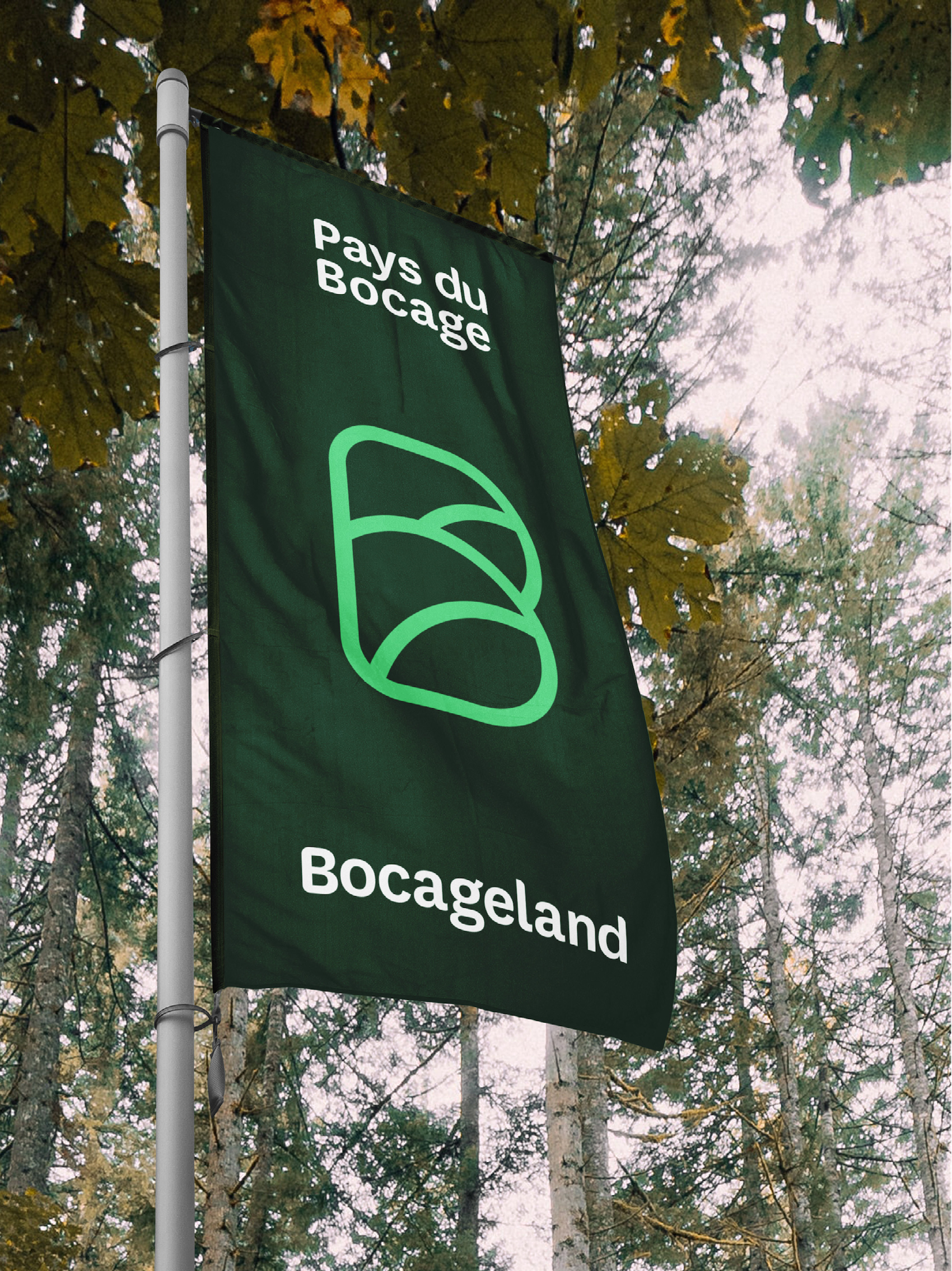
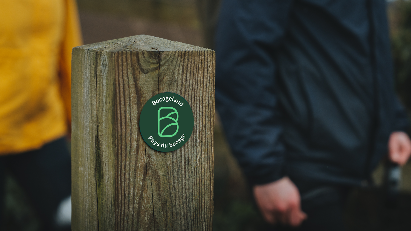
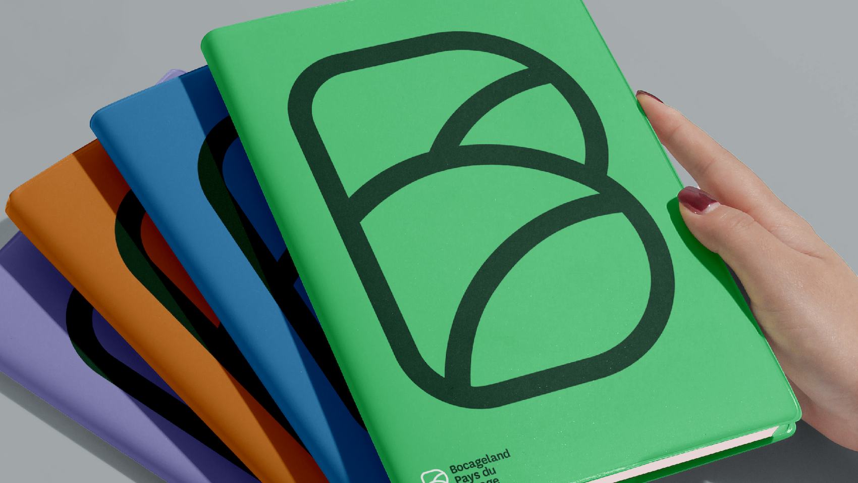
THE 'B' IN THE LOGO
The logo of Grenzeloos Bocageland is inspired by the letter ‘B’ from Bocage. The organic lines within the logo reflect the landscape and connect the different elements of the brand identity.
This powerful symbol captures the essence of the park and can be used flexibly, both as a full logo and in a simplified form.
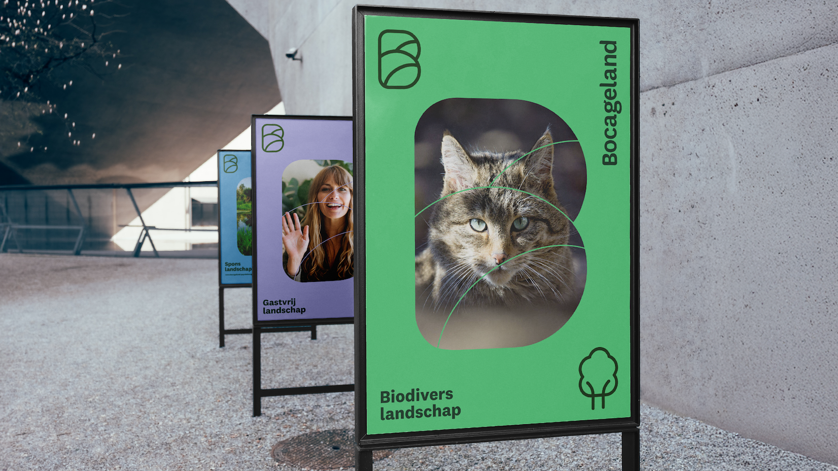
A HARMONIOUS COLOR PALETTE
The colors were carefully selected to reflect the organization’s core values. Dark green represents networking and collaboration, light green symbolizes biodiversity and growth, and blue refers to water management and balance.
Together, these colors create a strong and recognizable visual identity that supports the mission and vision of Grenzeloos Bocageland.
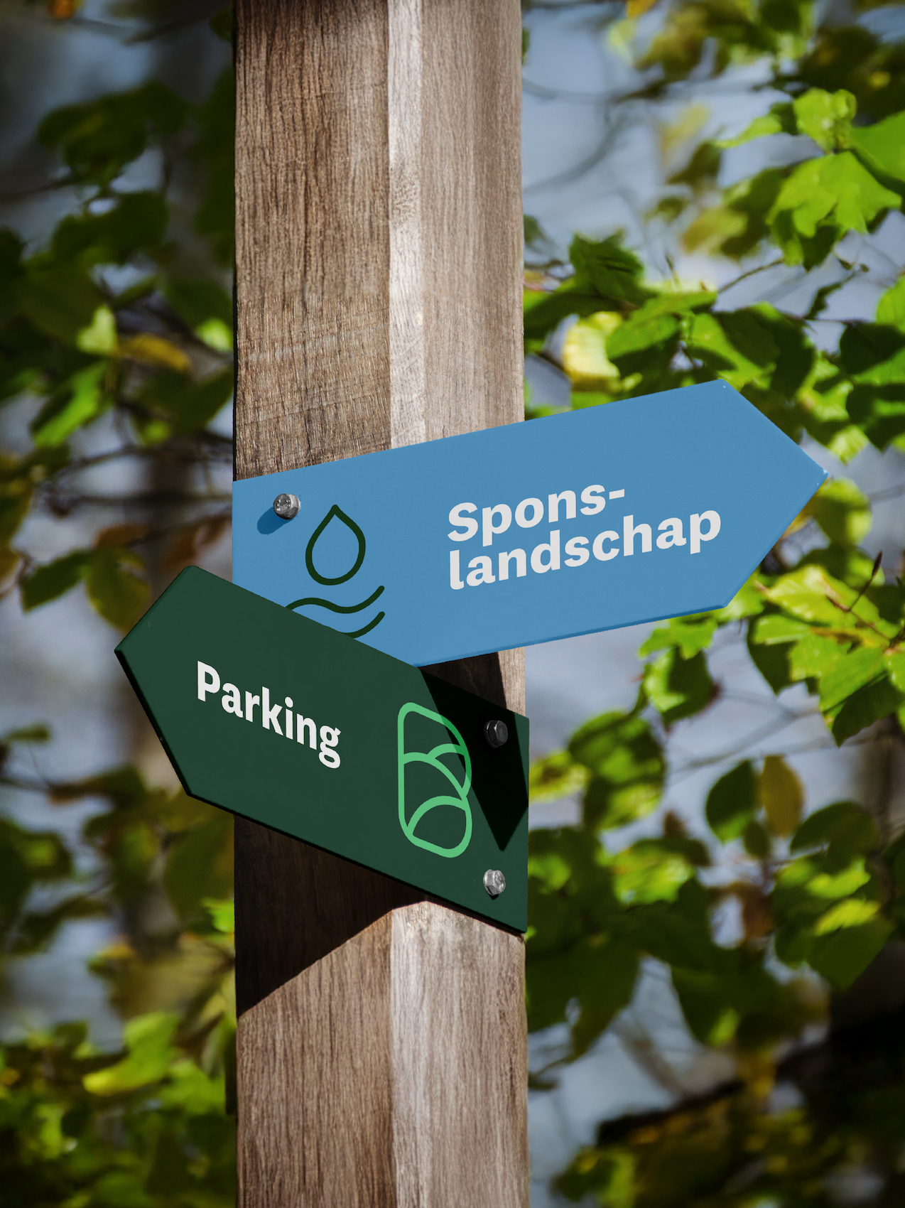
GRAPHIC ELEMENTS
Line drawings bring the park’s five core themes to life. Each theme is represented by a unique line fragment that aligns with the overall visual style and the brand’s baseline.
Additionally, icons have been developed for various applications, such as the Bocage Café, the Bocage Academy, and regional workshops.
In total, 20-25 icons have been designed to reinforce the brand identity and contribute to a consistent brand experience.
A CONSISTENT LOOK & FEEL
To implement the new branding across all touchpoints, we developed various applications that ensure a professional appearance. This includes an email signature, PowerPoint template, letterhead, and templates for event invitations.
Finally, we developed clear brand guidelines detailing typography, color usage, logo applications, shapes, and imagery.