Confibelle
STRATEGY, BRAND IDENTITY AND WEBSITE
Confibelle is Isabelle, and vice versa. Her mission? To advise and assist homeowners so that they can rent out their property as carefree as possible. Our mission? To make Confibelle stand out in the world of syndication and real estate.
As always, we start with a strategic exercise. No weeks of analysis. But a hands-on, spirited workshop where we go straight to the core. Topics covered include: competitors, mission, vision and positioning. The challenge? How do we give Confibelle the right, professional image?
Logo
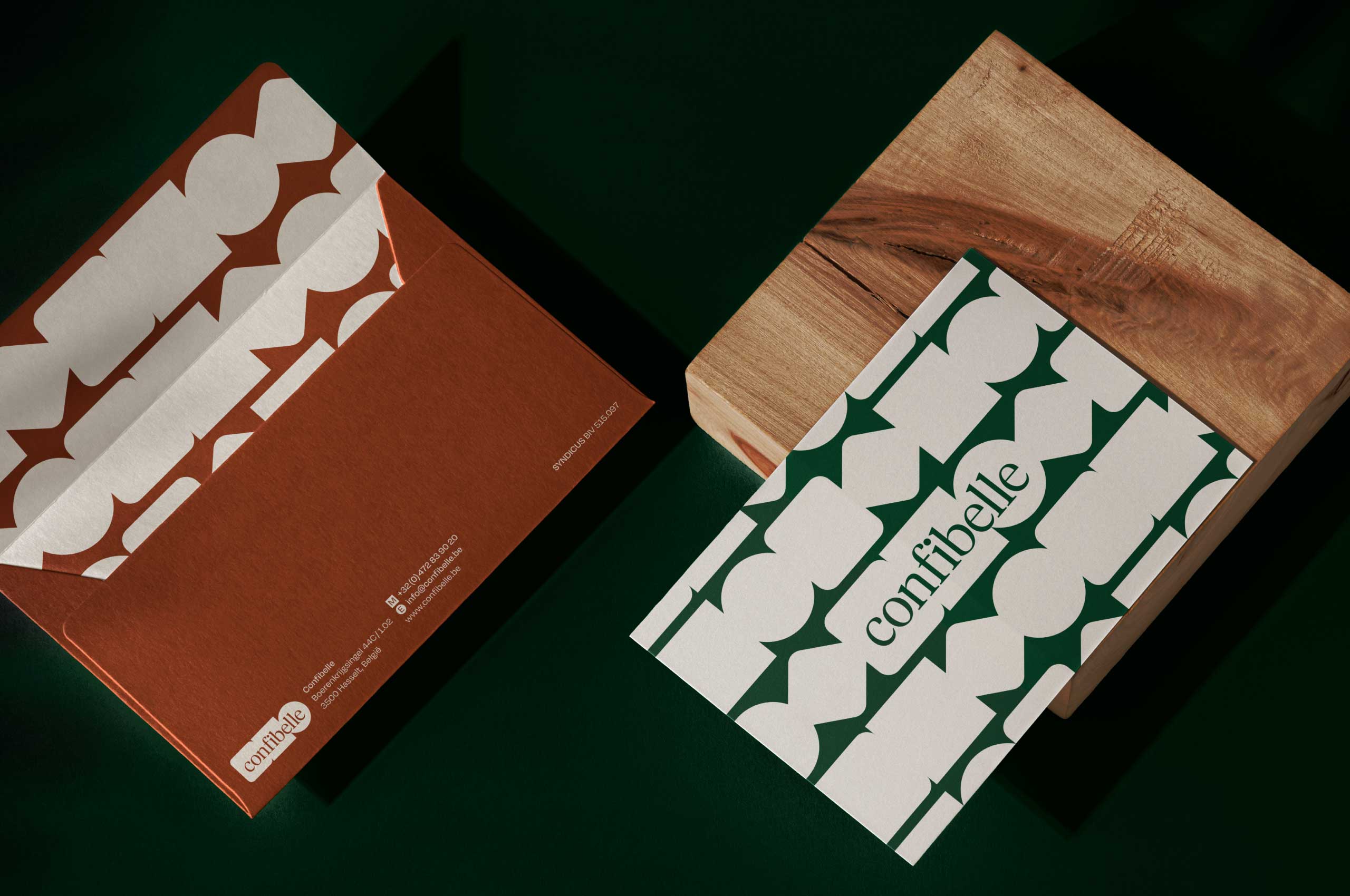
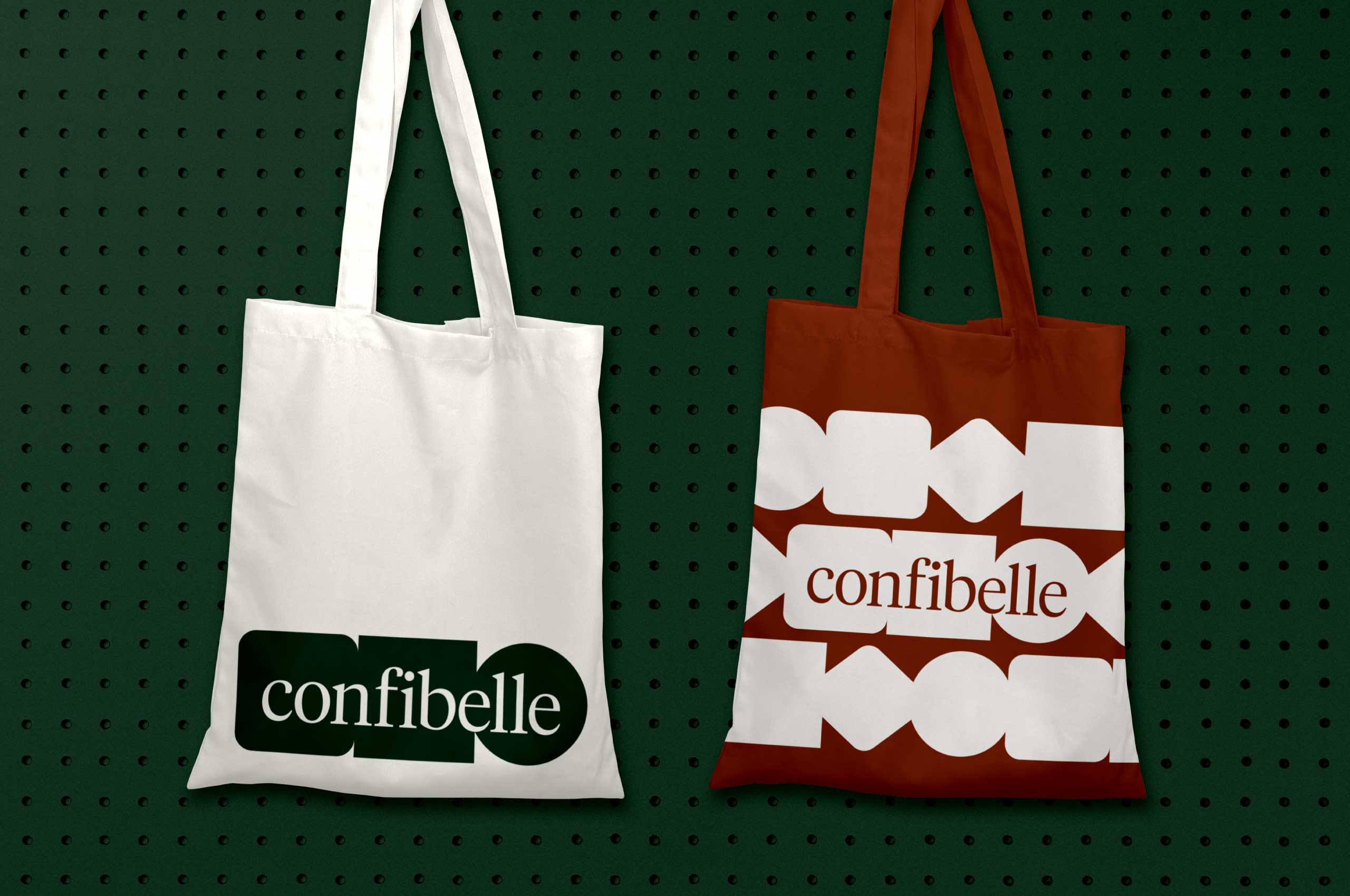
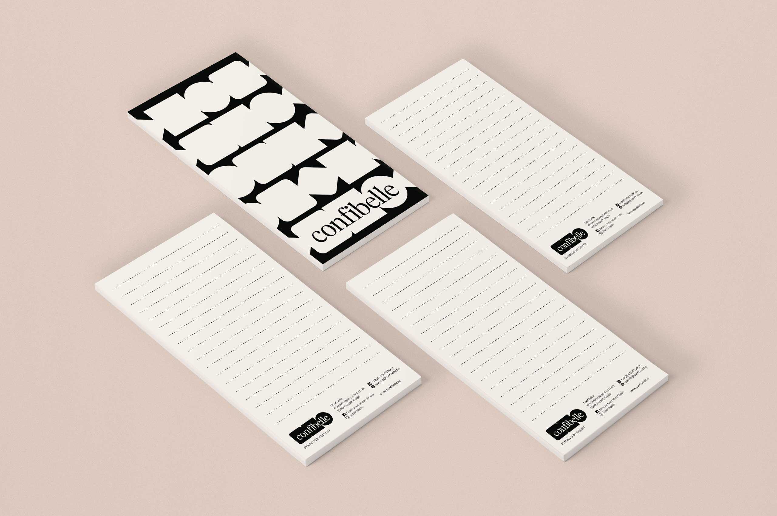
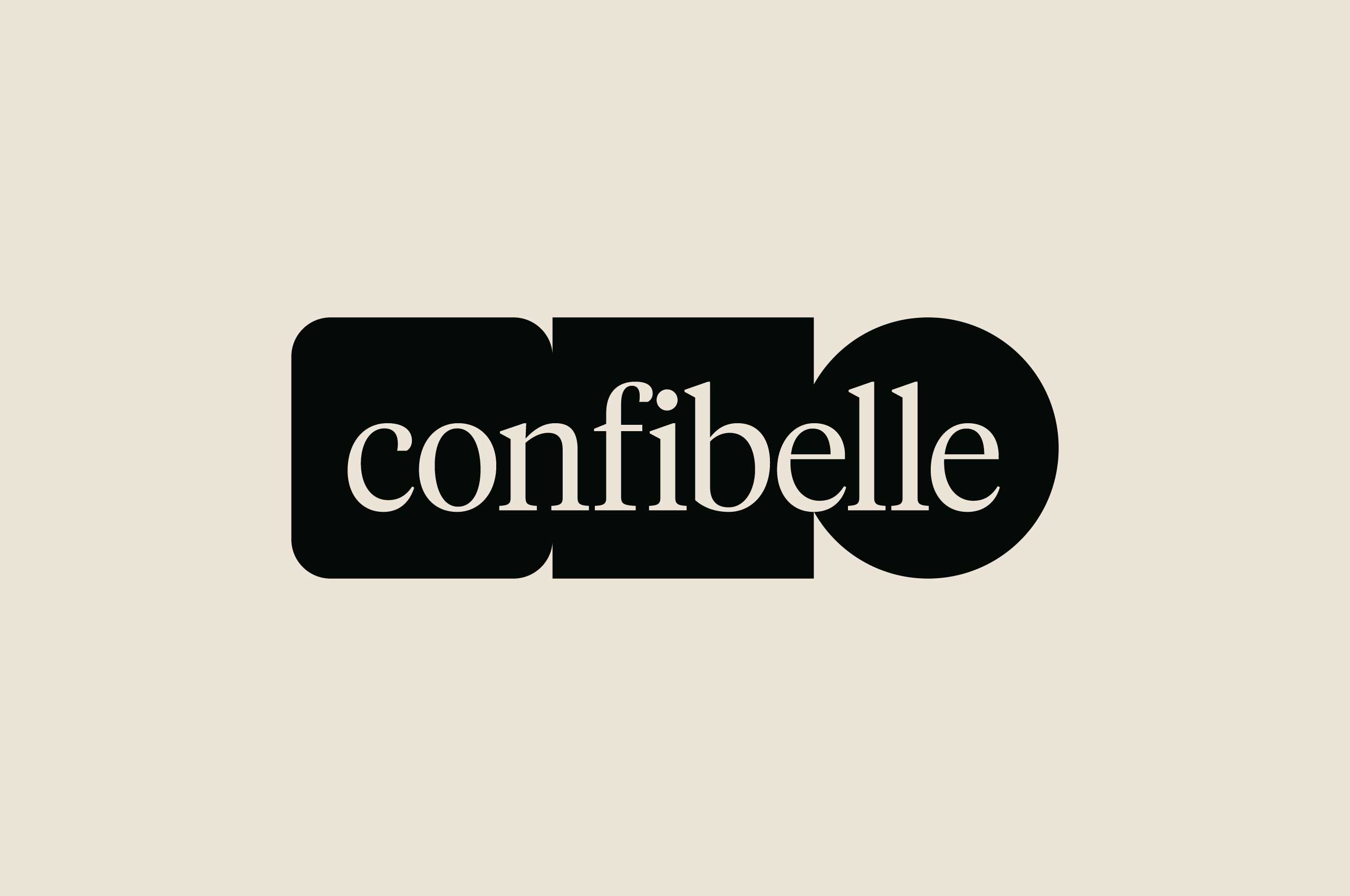
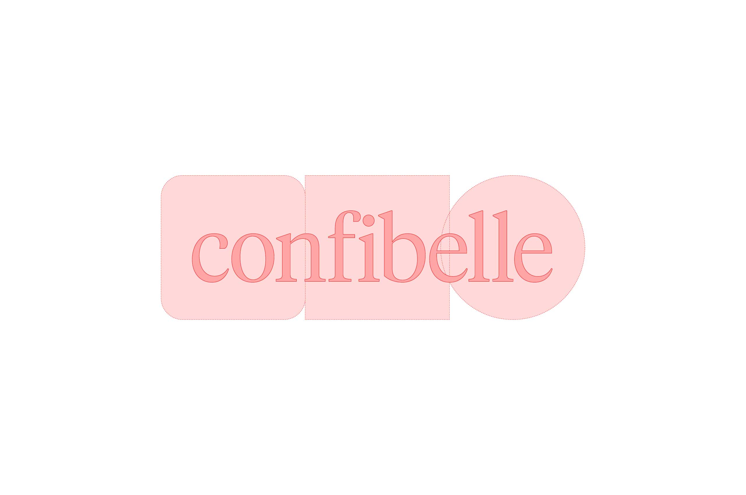
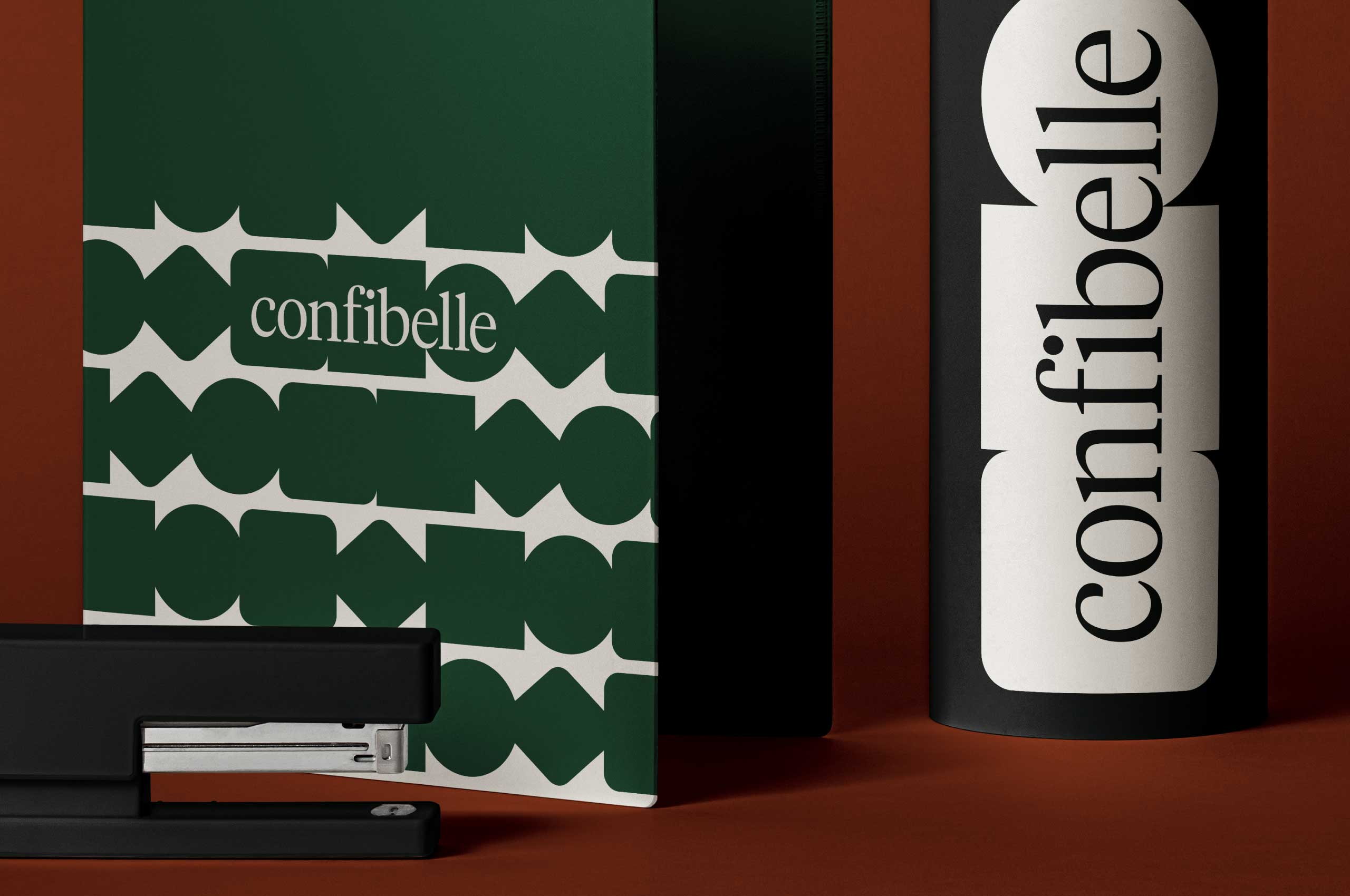
The shapes of the logo symbolize the many different challenges and types of people the trustee faces. Confibelle is the unifying factor between all these separate elements. She ensures that everyone is looking in the same direction.


Colors
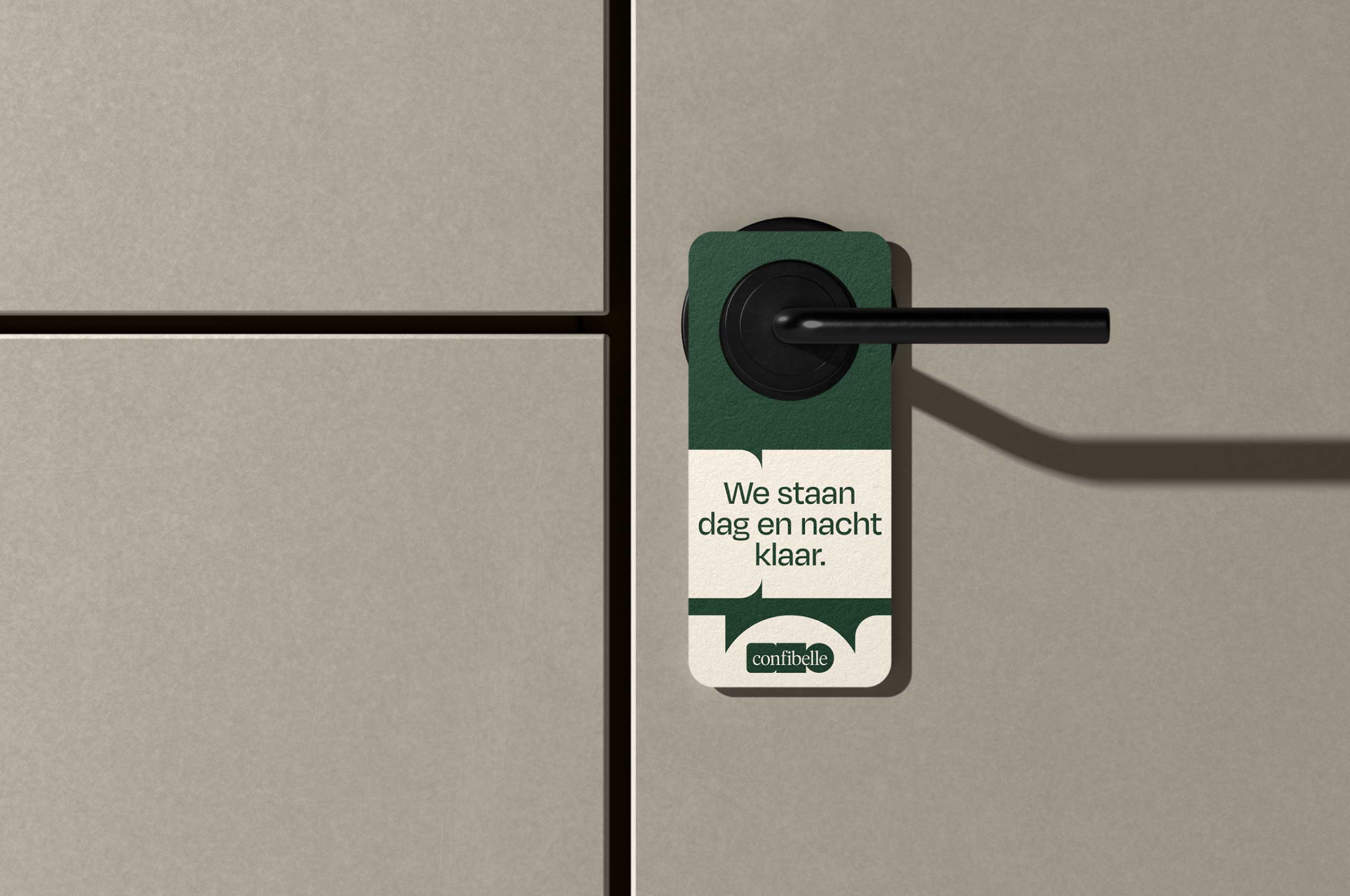
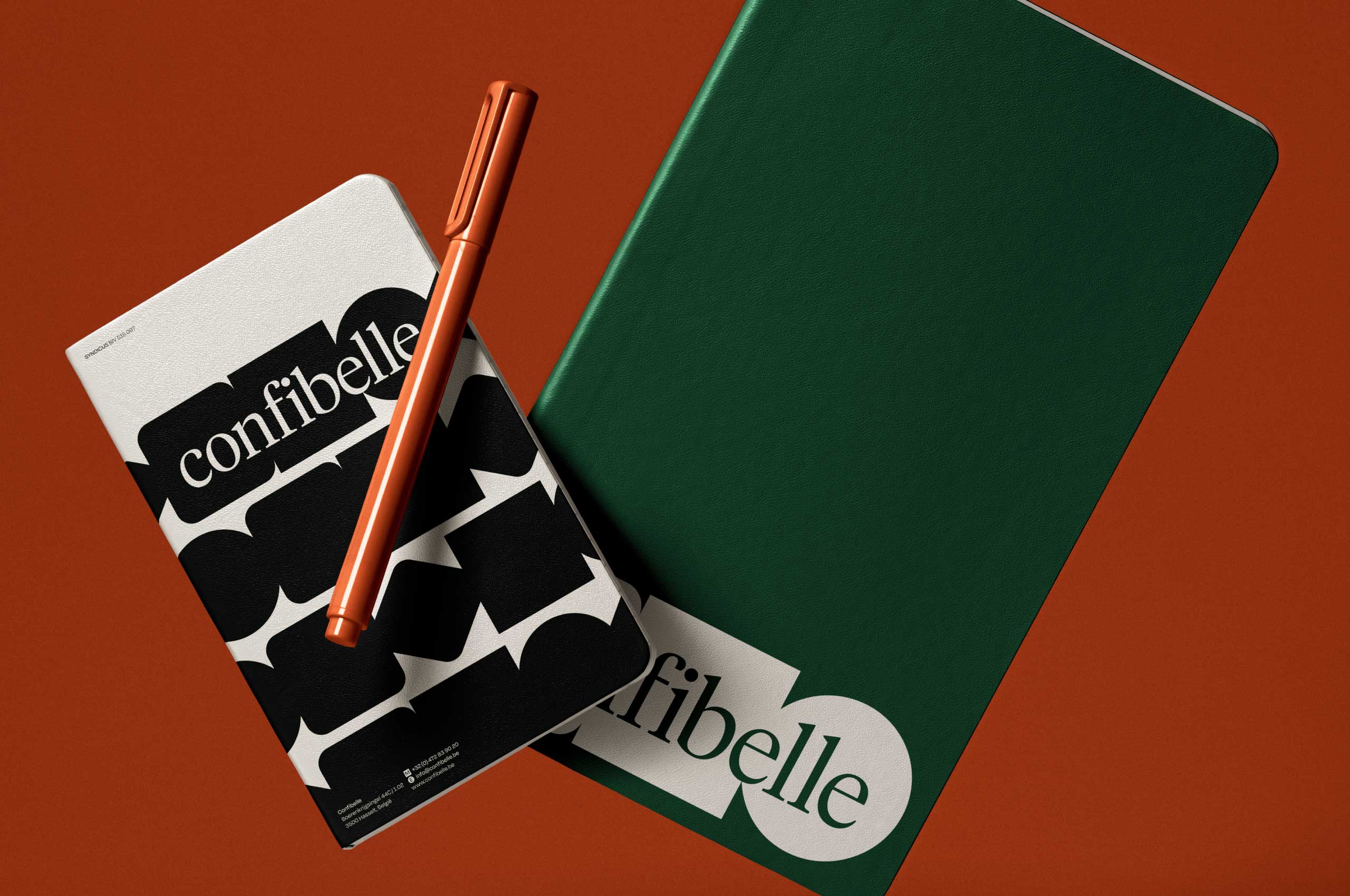
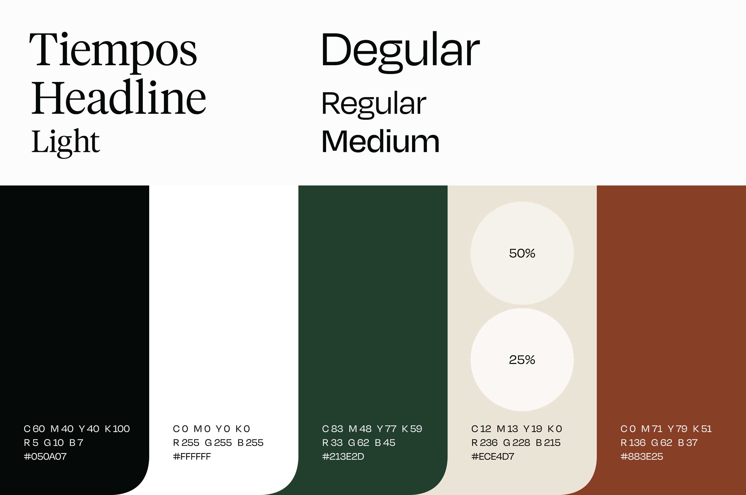
Isabelle is hands-on and incisive in her work. But at the same time: she shows great empathy for her customers. With the color combination green, beige and brown(ish) we emphasize that Confibelle is different from the others, but still competent and professional. The focus is on the warm, empathetic character of the company.
Copy
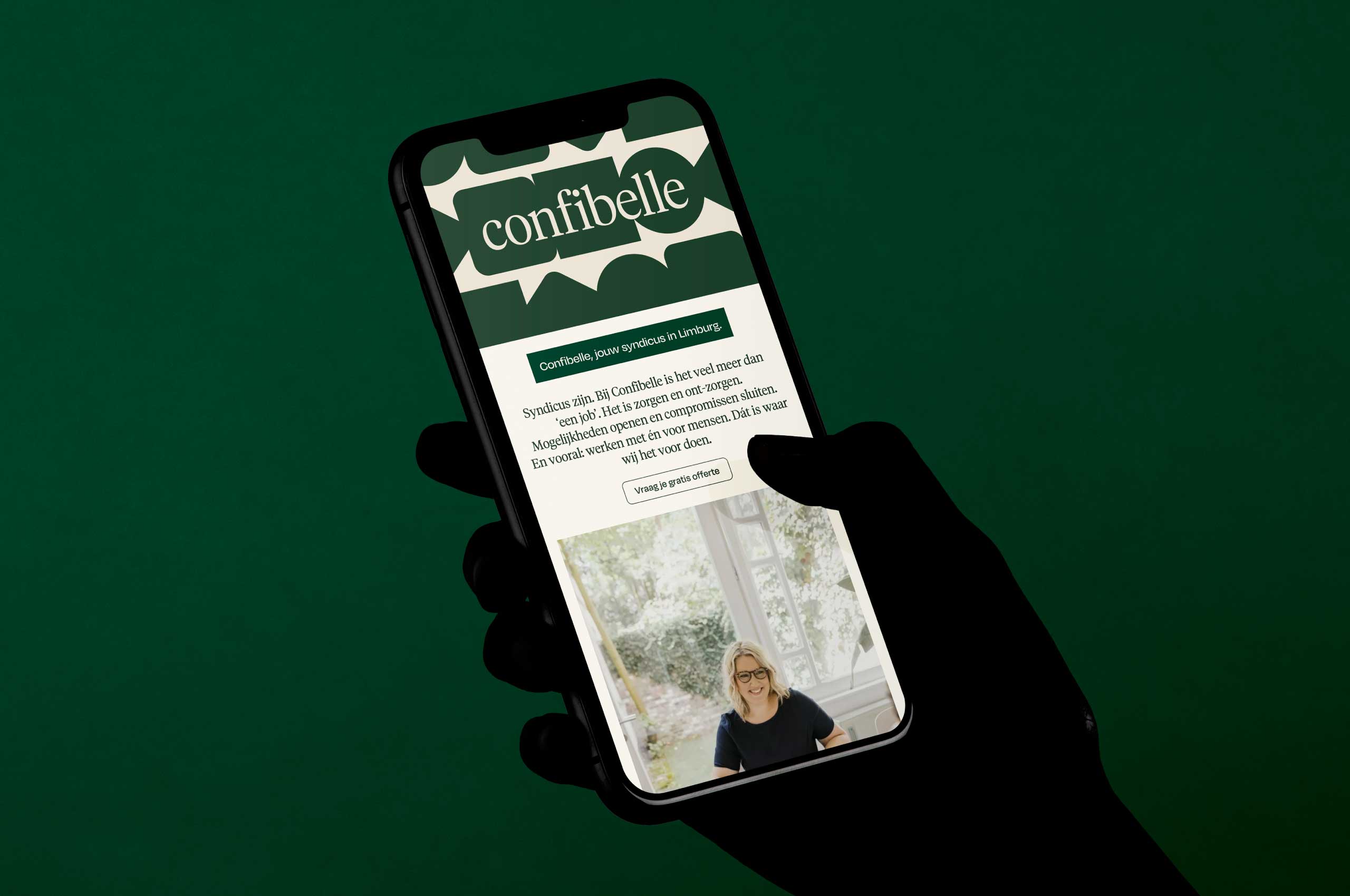
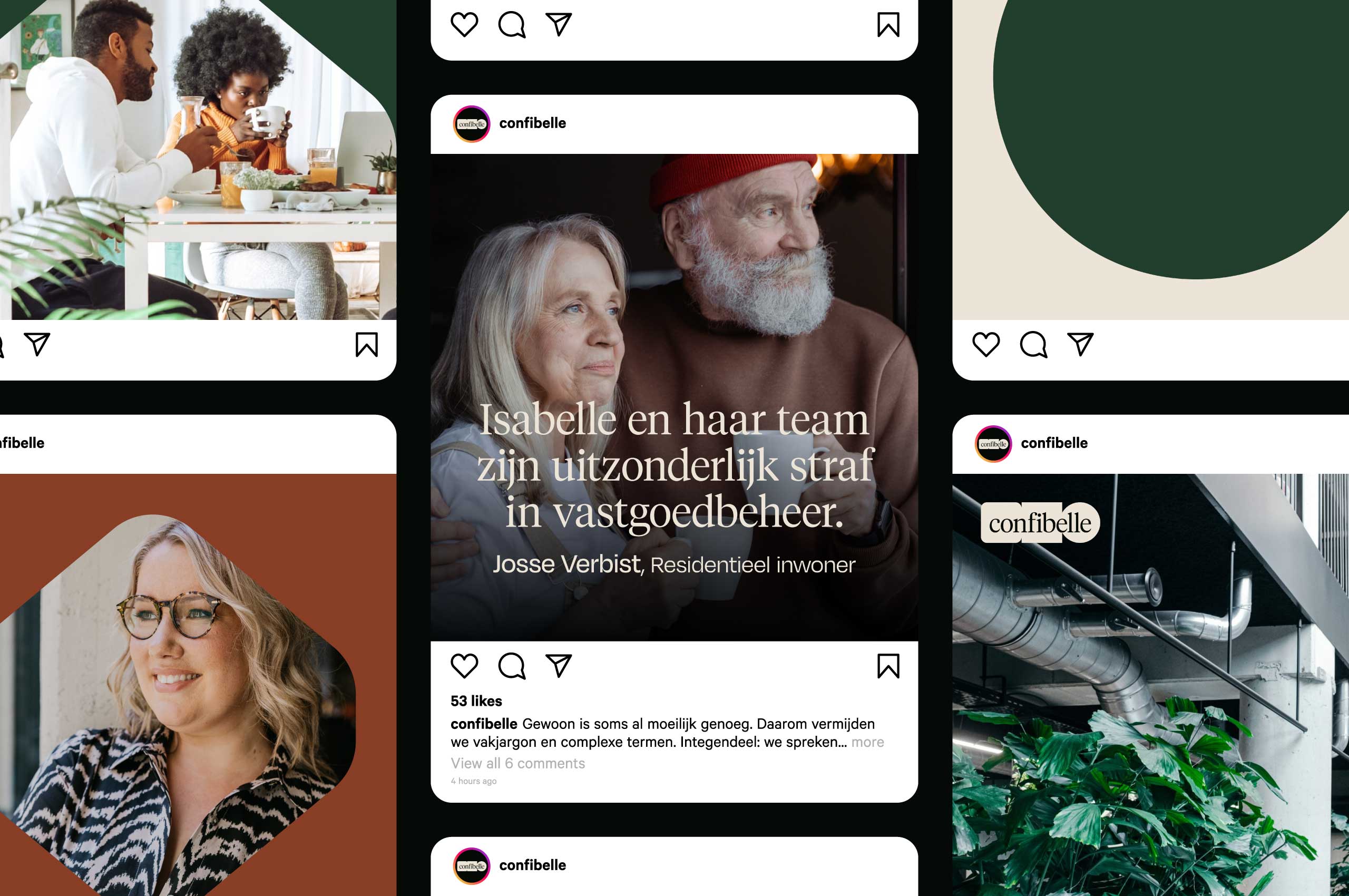
Sometimes plain and simple is hard enough. That's why we avoid complex terms as much as possible. Confibelle maps out everything clearly for you. An accessible tone of voice and clear language are the key elements of our copywriting.
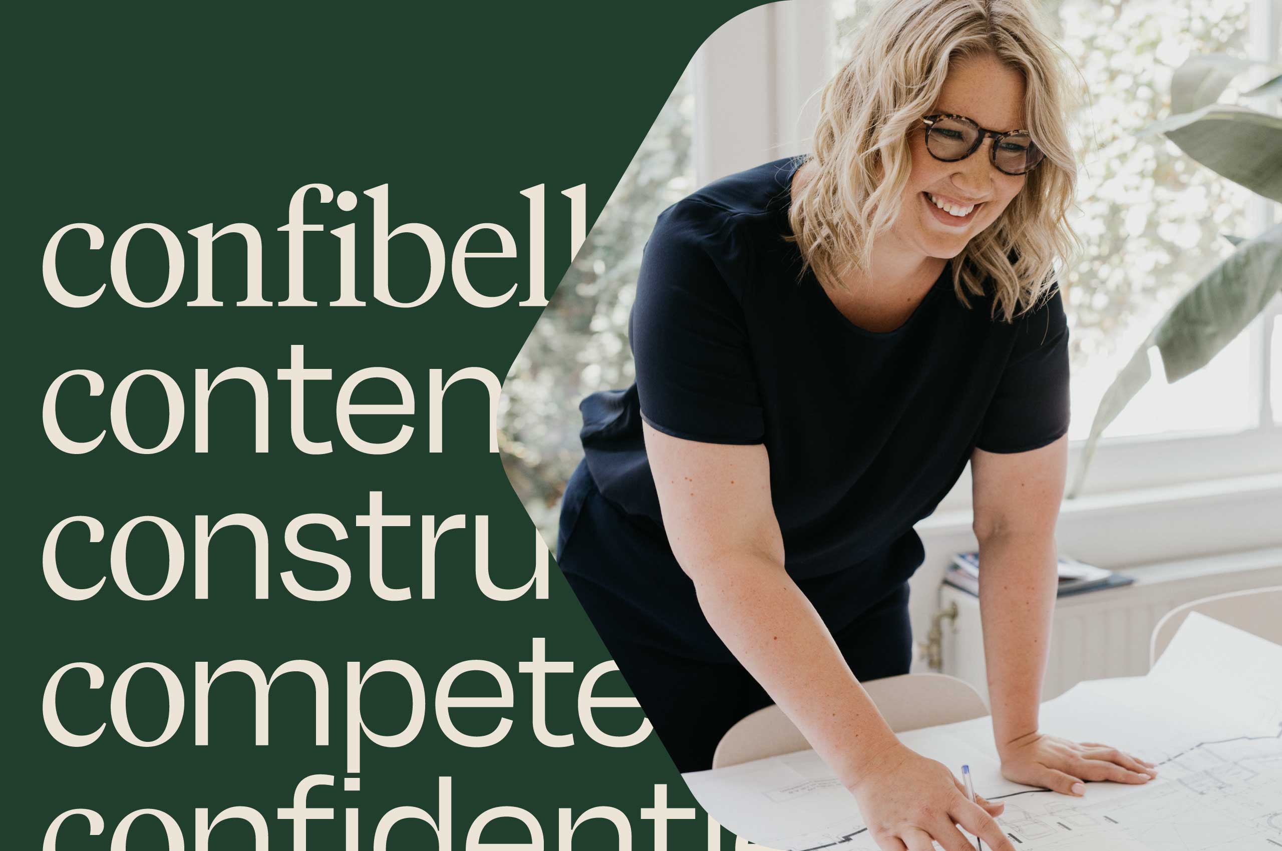
Today, Confibelle is a one-woman show. But Isabelle wants to change that. Fast. The challenge is to create a warm, accessible branding. But one that at the same time exudes the expertise and confidence of a player the industry must take into account.
