Egt.
NAMING & BRANDING A SOURDOUGH BAKERY
Egt. — formerly known as 'De Superette’ — is the real deal on sourdough bread. Egt. is a traditional bakery where bread risen with natural sourdough, quality ingredients and craftsmanship are central. Trust us, once you've tasted their bread, there's no other … Owners Tine and David asked us to knead their branding, including change of name.
Website
egtbrood.be
Photography
Renaat Nijs
Namechanger
A name change is always a balancing act. In this case, owners Tine and David were looking for a specific combination where pure Flemish tradition meets Hipsterville.
With the name ‘Egt’ we were able to realize both. Egt means ‘authentic' in Flemish. Writing the word slightly differently gives it a unique touch.
The baseline 'the slow bakery' - not coincidentally in English - gives it a bit more punch.

Words + visuals
At Lex & Turner, we love it when words and visuals come together. It’s not until the rest is developed (colours, logo, typo, ...) a brand really comes to life.
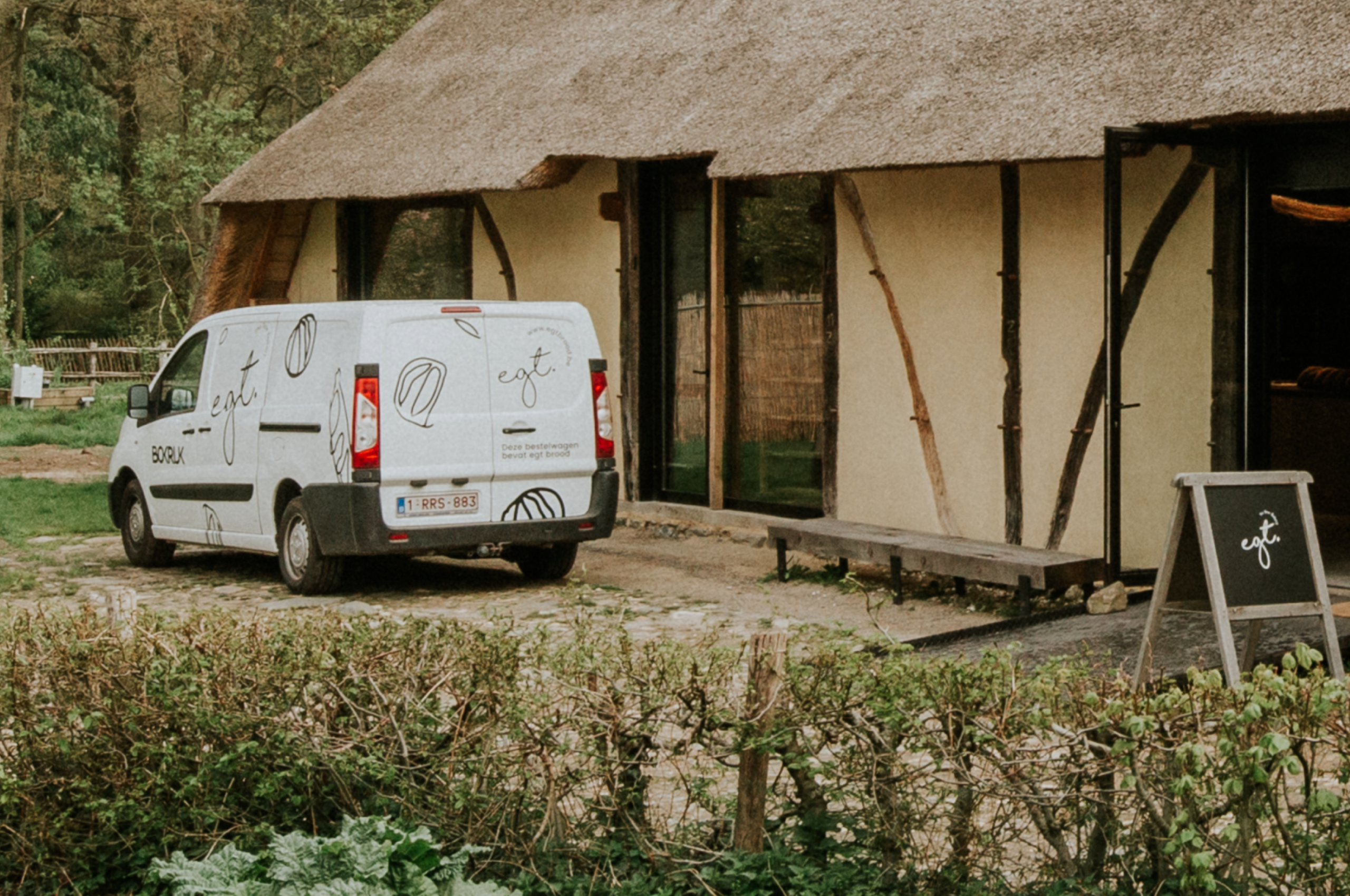
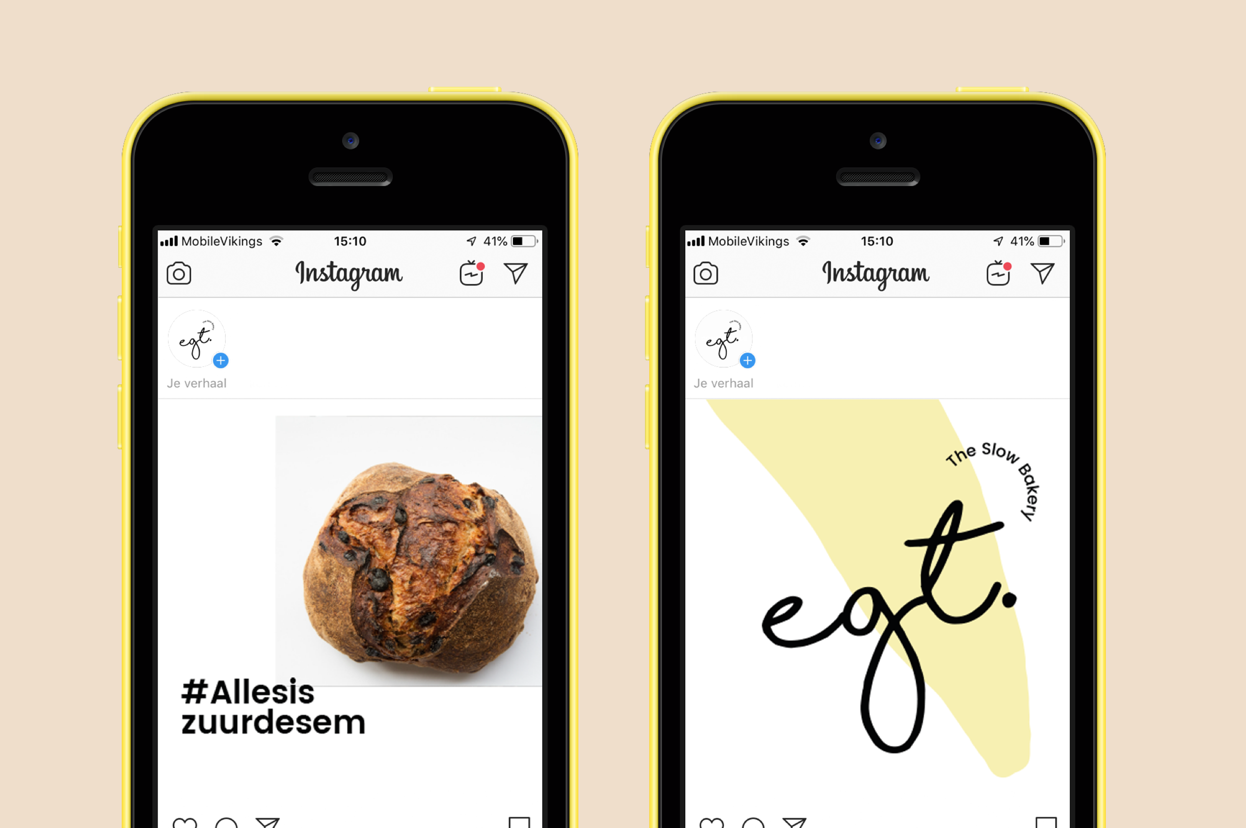
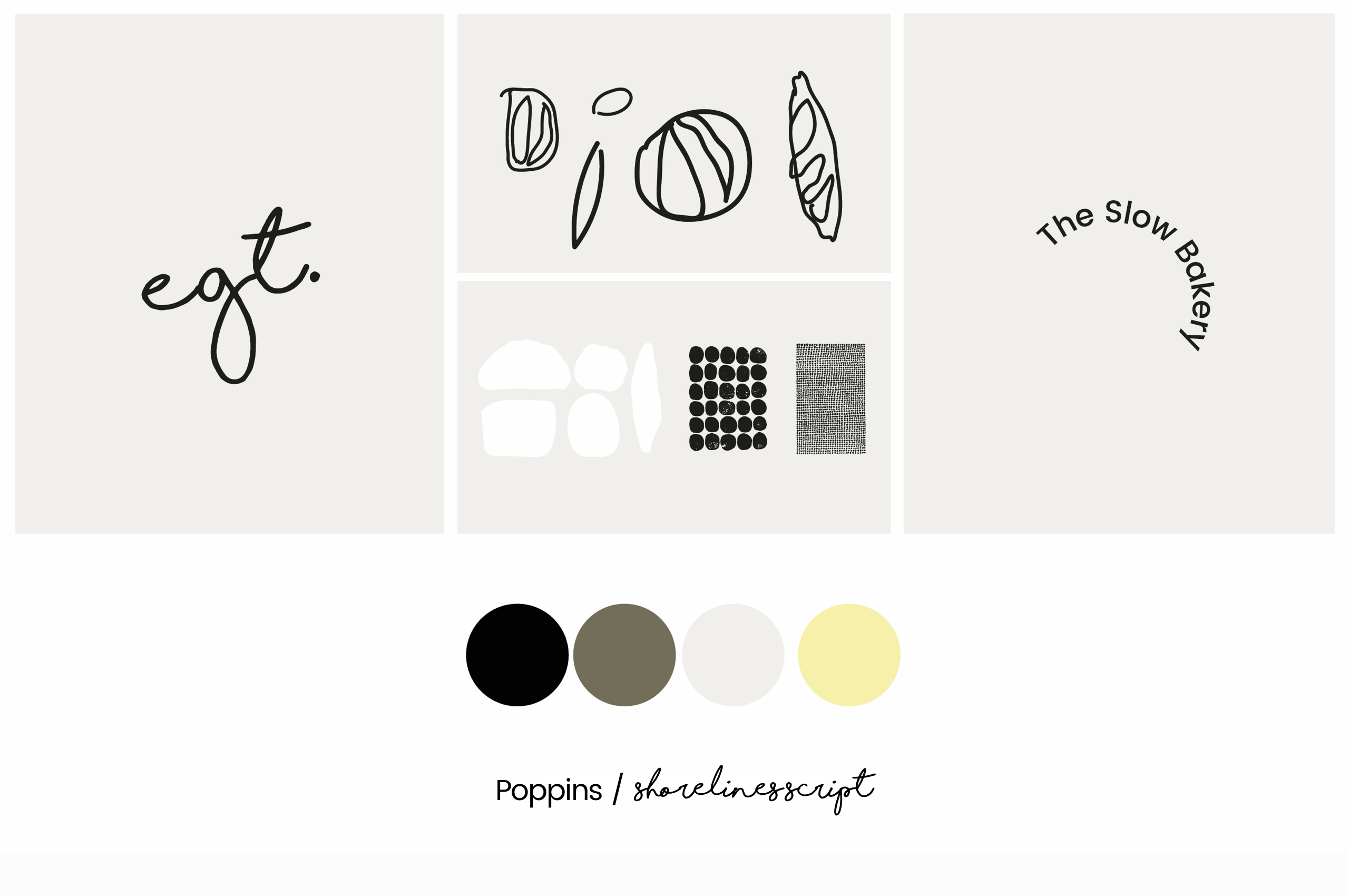
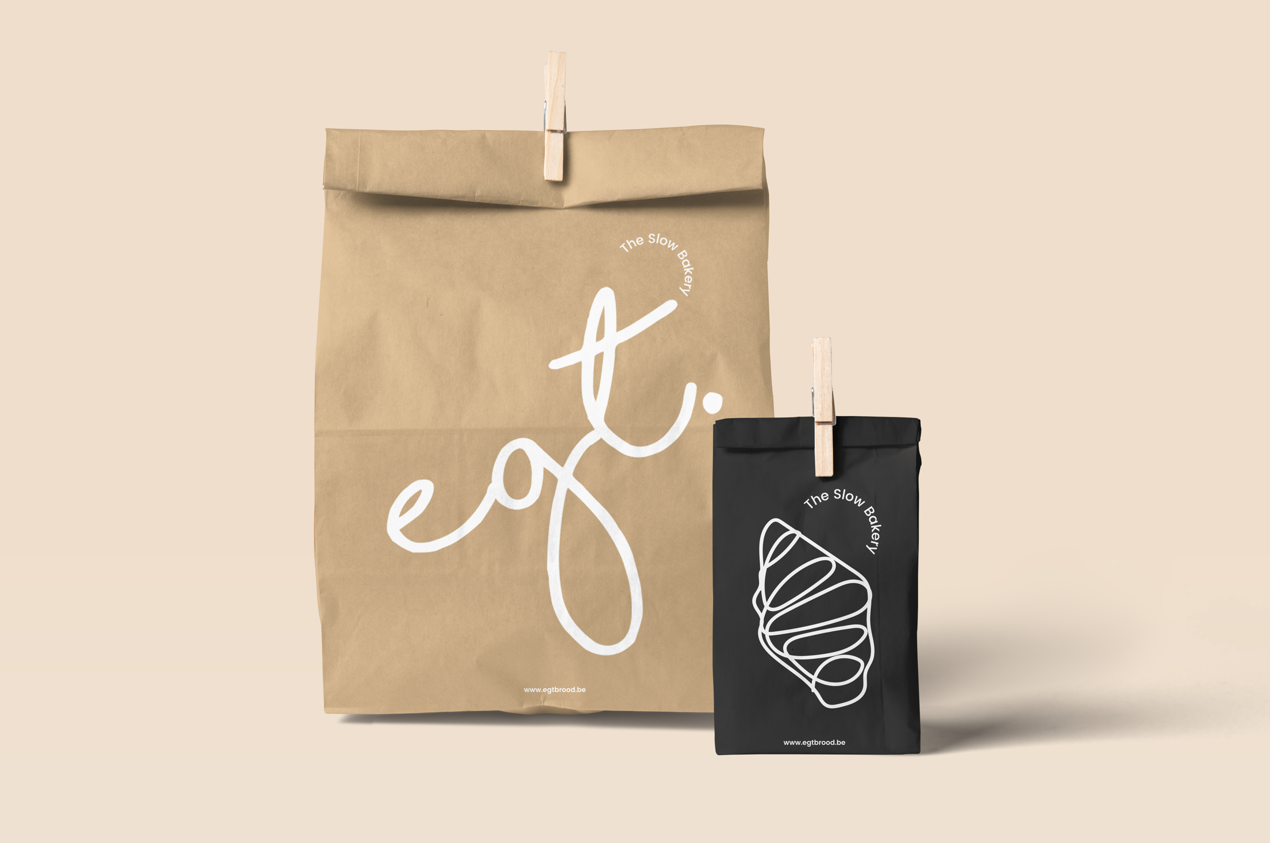
The traditional, manual process of baking bread is reflected in a handwritten, dashing logo. This distinctive logo can be found on various implementatious like the delivery van, napkins, website and postcards.
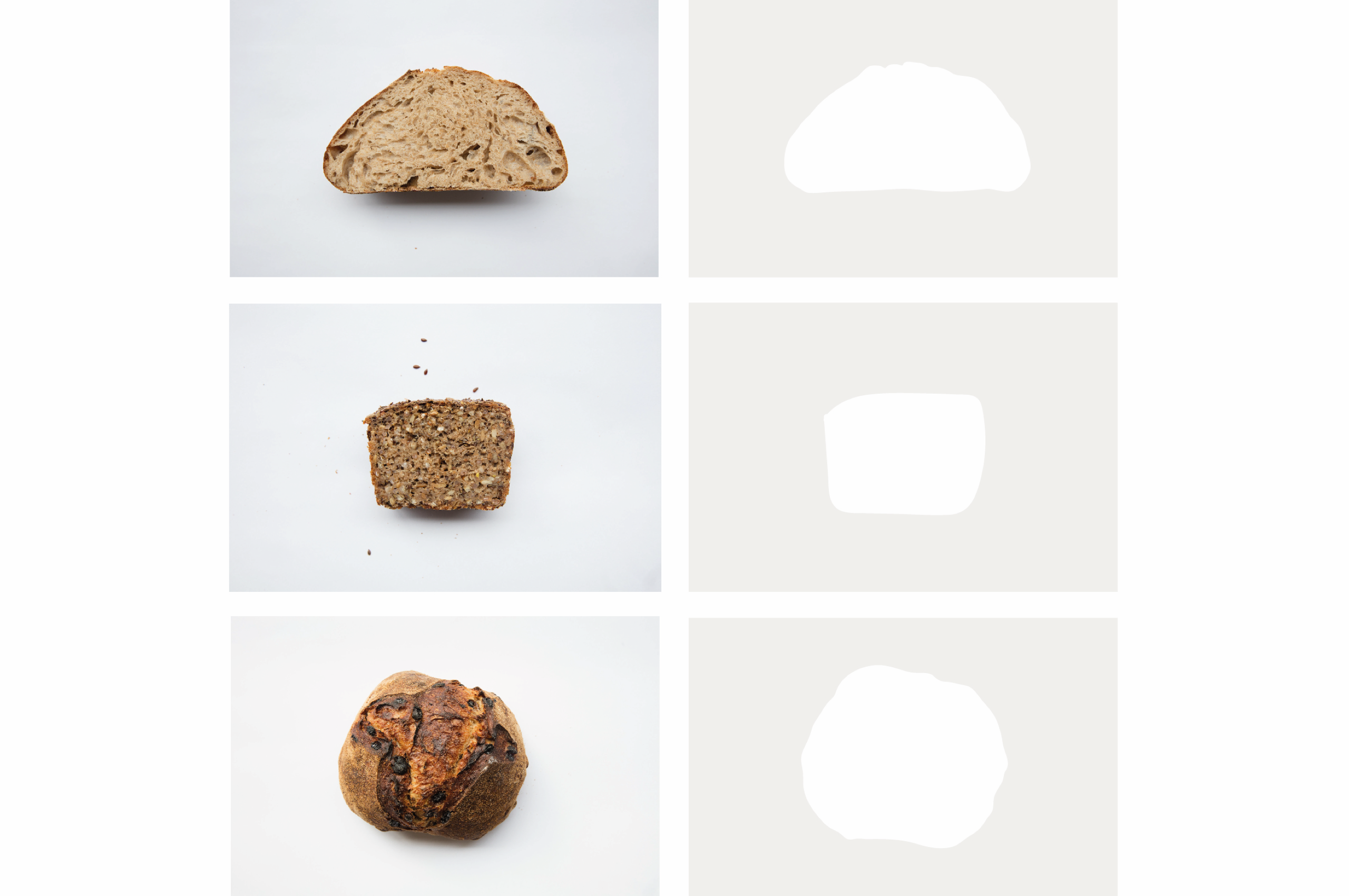
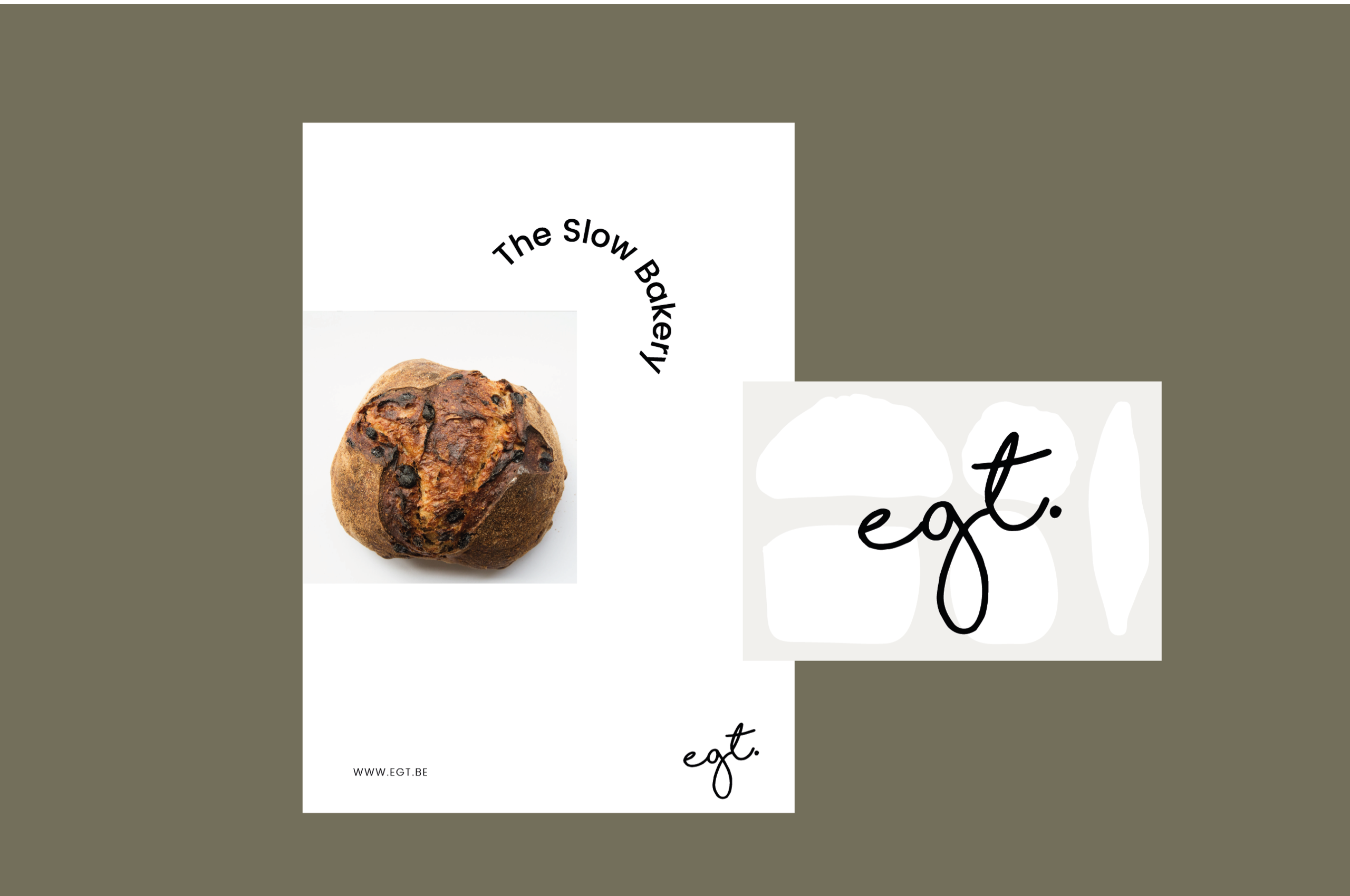
Shapes of loaf
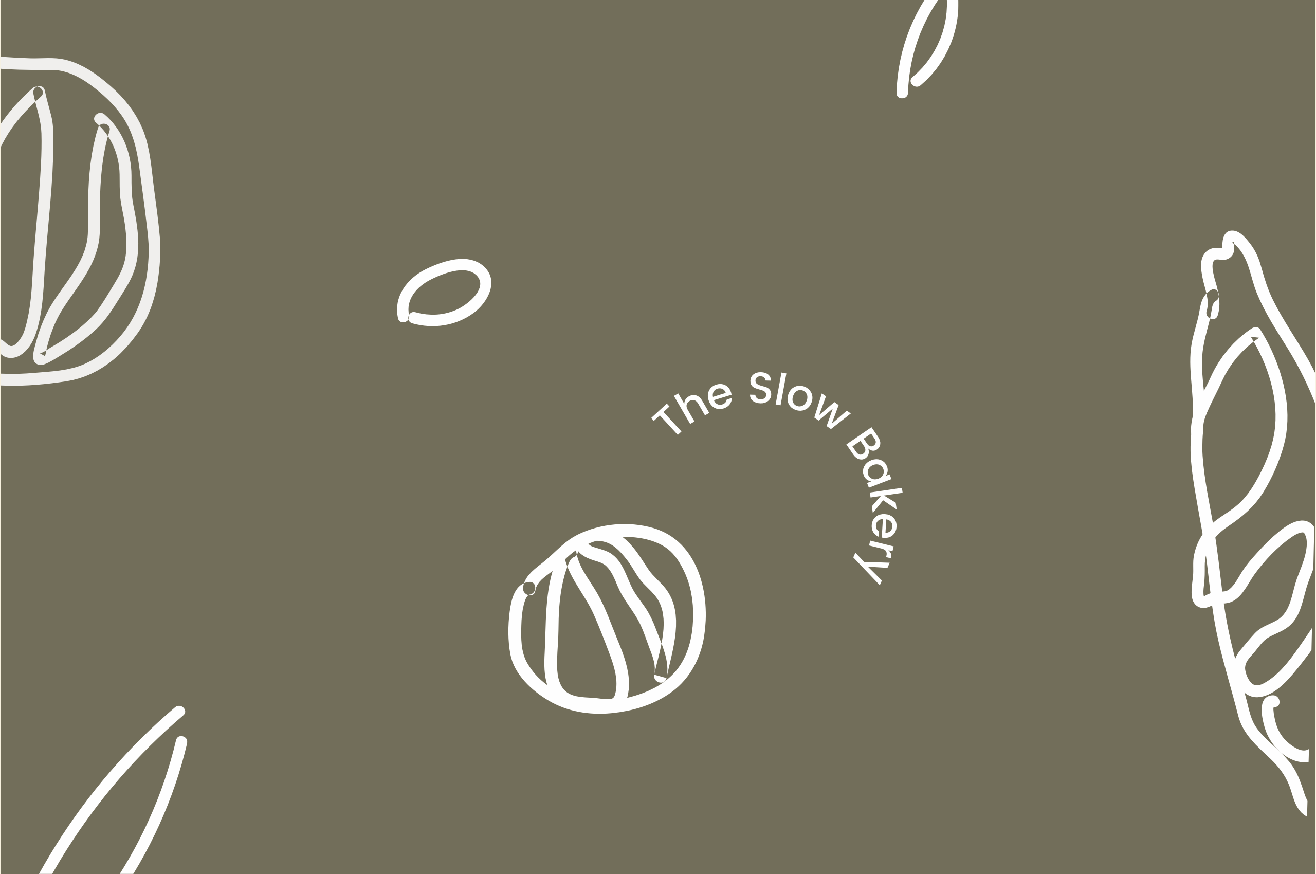
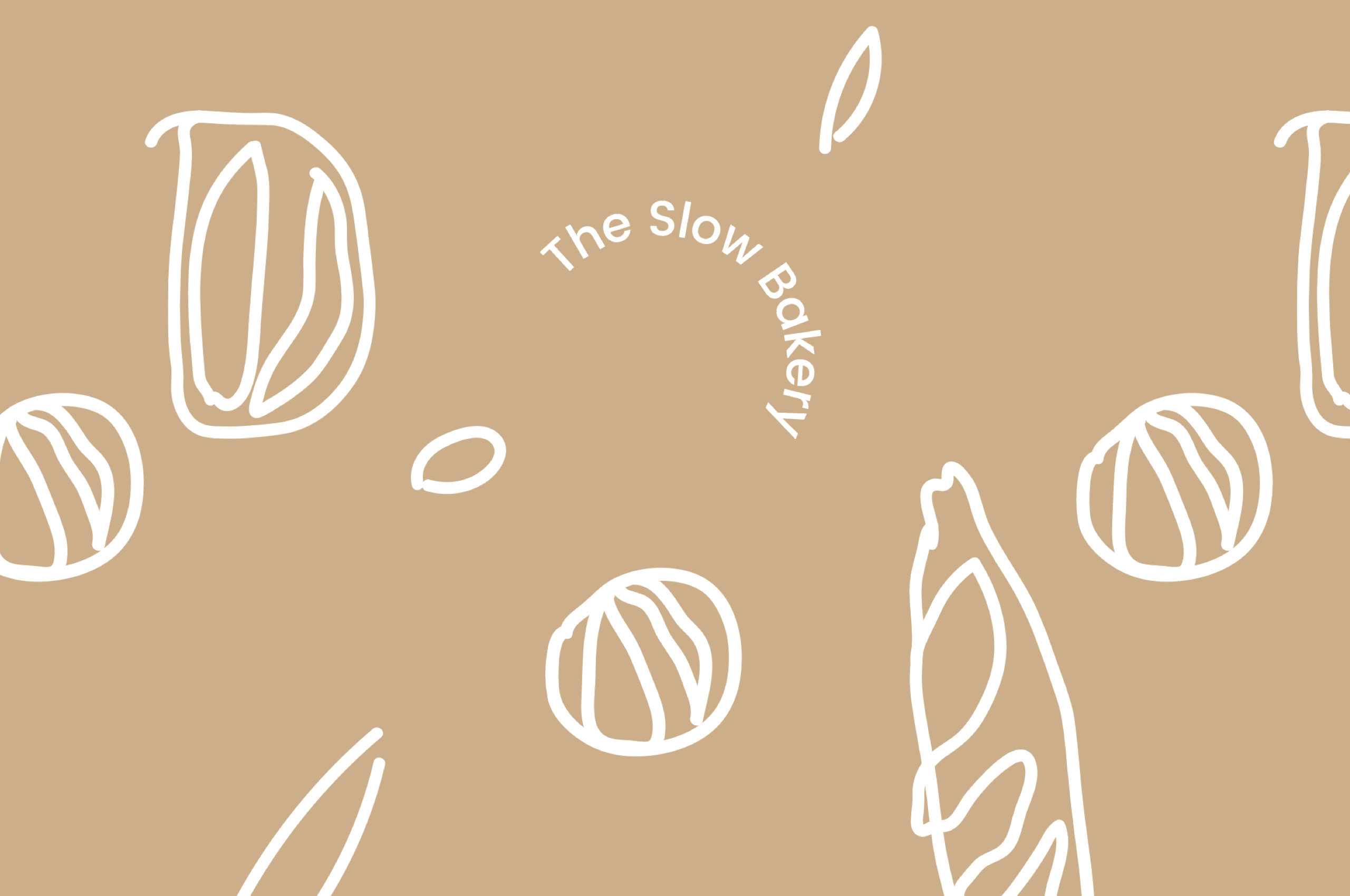
Sourdough bread loaf, with its deep-brown crust, has a rich, deep flavor and always looks very different. These atypical shapes were perfect to play with and create several graphic elements to reinforce the Egt. branding.
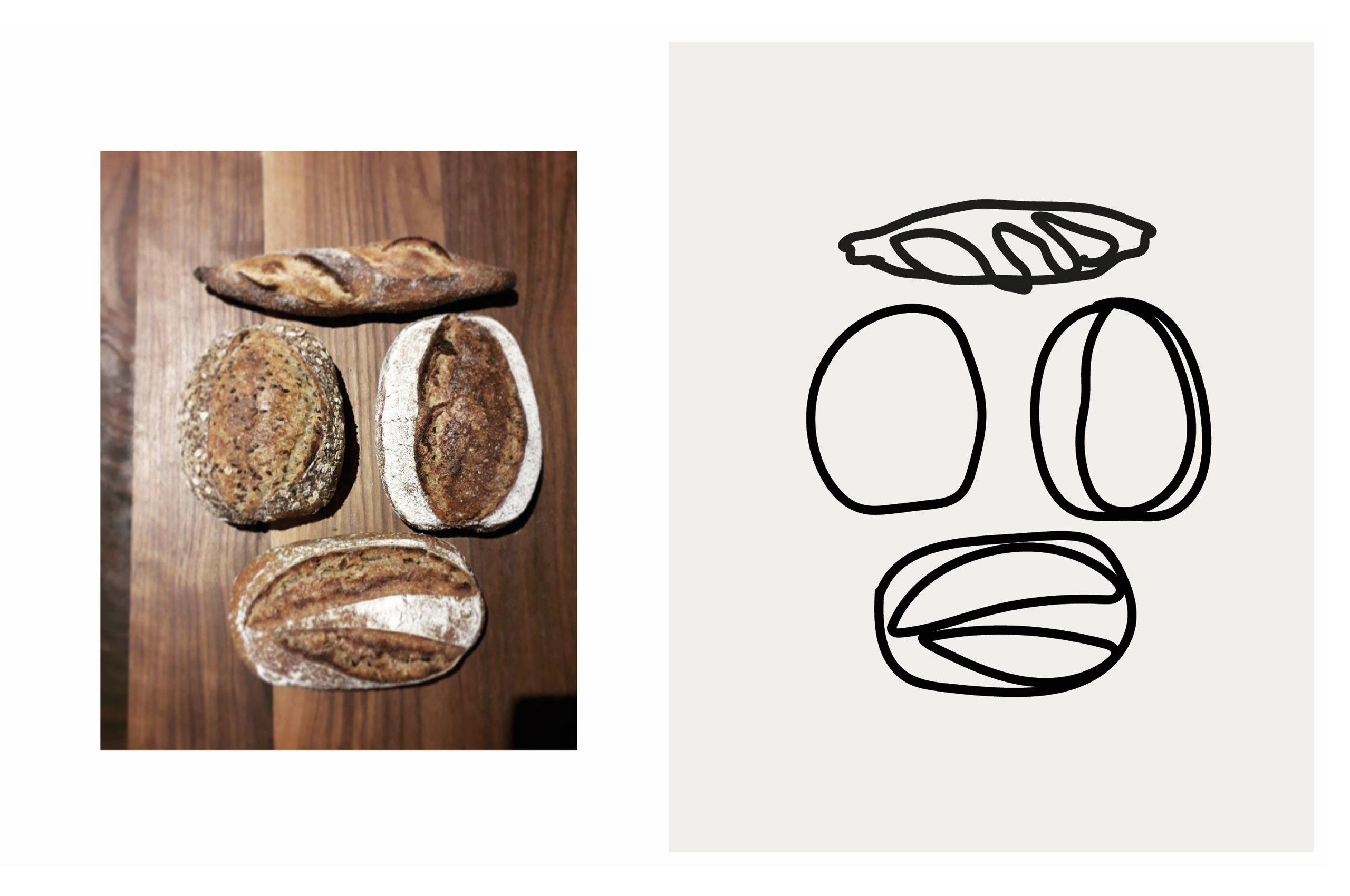
Smell the bread
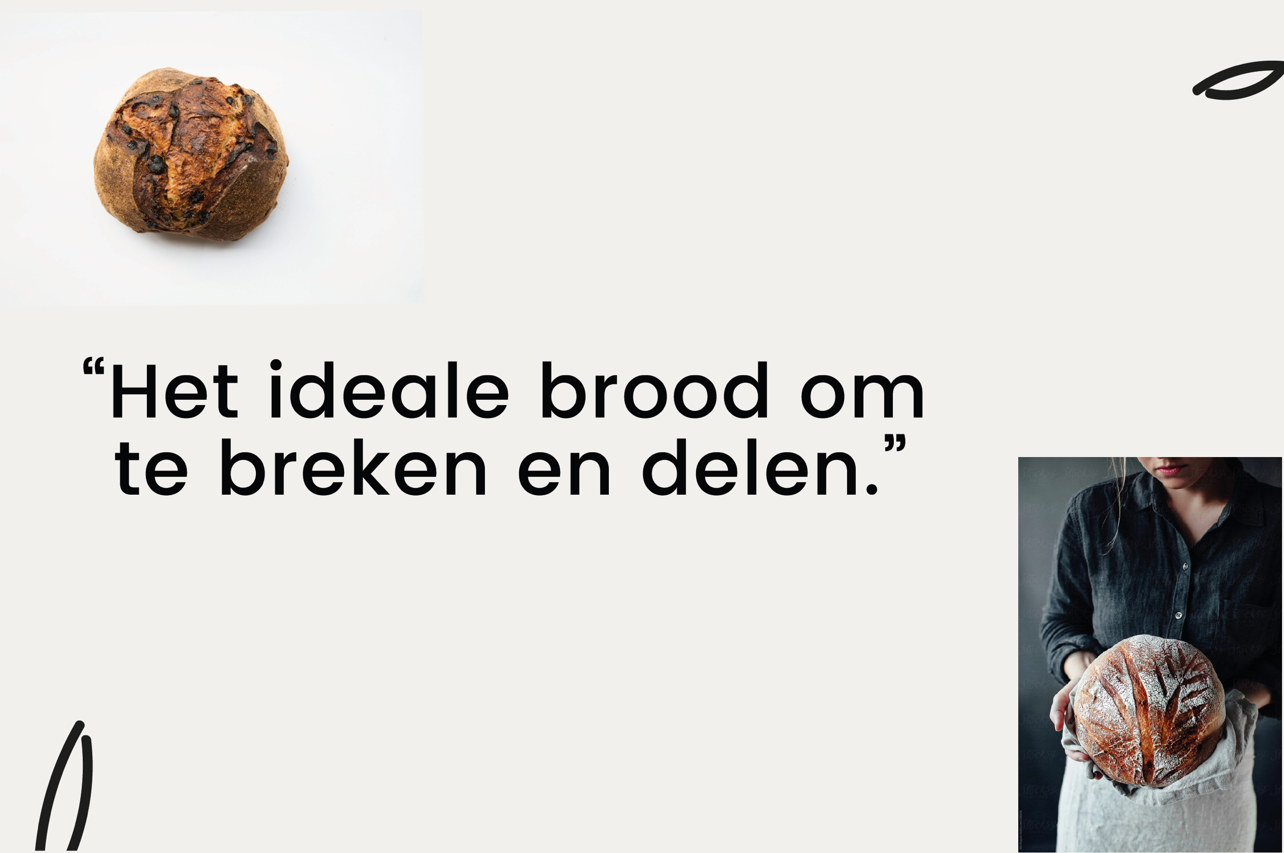
The dusting of flour, kneading dough by hand, the blistering hot ovens, ... This artisanal process of baking bread is a rewarding process to capture. Just have a look: you can almost smell the fresh bread, right?


