Favorite Family
MADE FOR THE SENSITIVE, LOVED BY ALL
Favorite Family is a proud Belgian producer of natural skincare products, specifically designed for highly sensitive individuals. Our mission? To develop a strategic plan and build a clean, compelling branding that reflects the values of this brand-new beauty label.
Favorite Family is clearly not just another skincare brand. Their tagline, "Made for the sensitive, loved by all," captures the essence of the brand: creating products for even the most delicate skin types. This is the ultimate goal of founder Rosy Maes.
Website
www.favoritefamily.eu

“Providing a worry-free experience for parents
who want the very best for their children.”
Rosy Maes
FAMILY FIRST
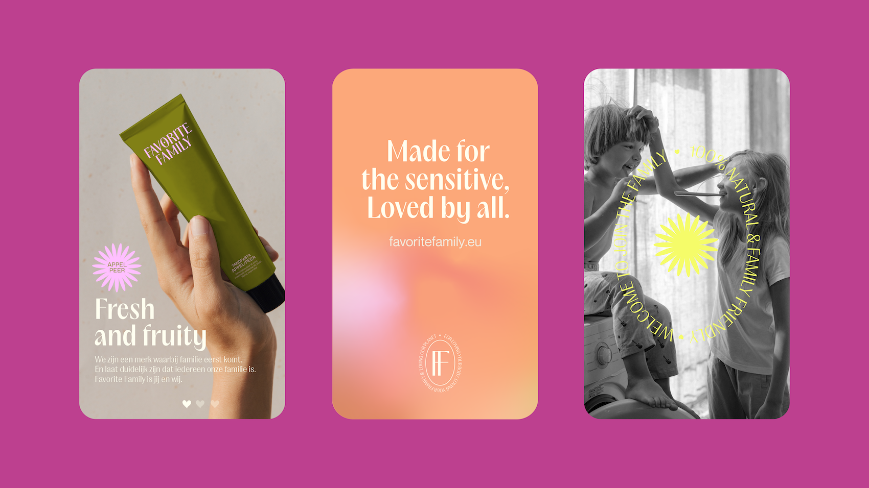
The branding of Favorite Family revolves around warmth, care, and connection. The brand combines practical benefits—soap-free, dermatologically tested, biodegradable, microplastic-free, and more—with a strong focus on family life. The result? A recognizable and accessible brand identity that appeals to both children and parents.

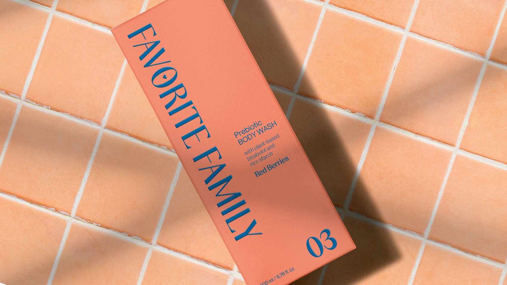
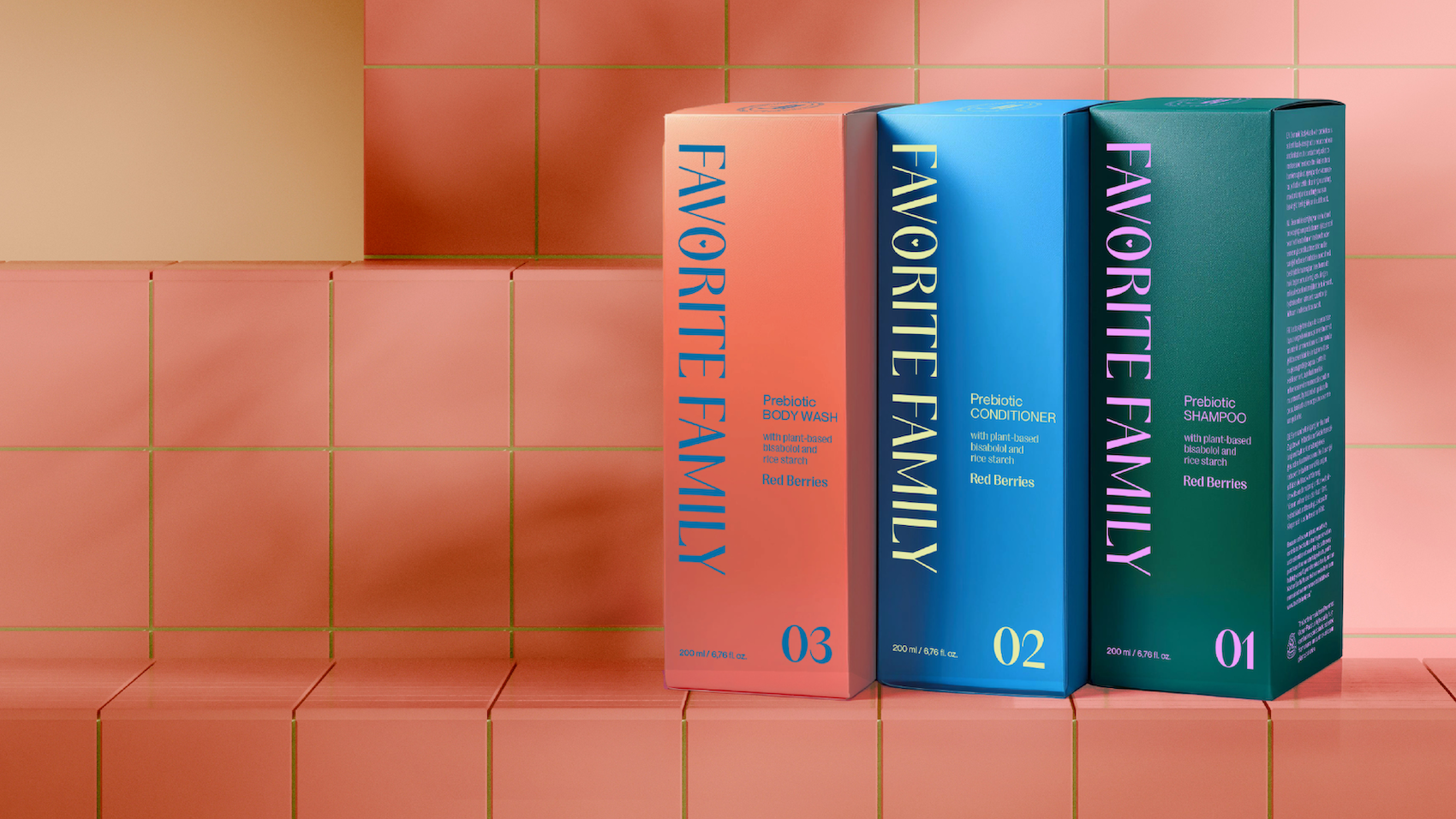
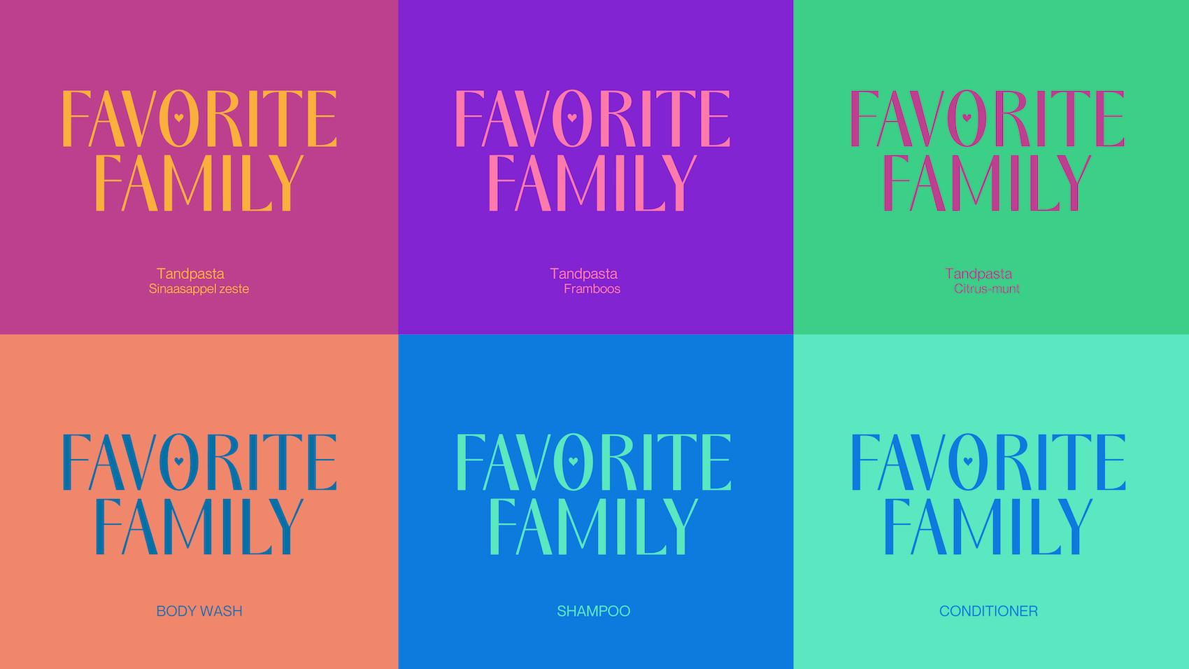
LOGO & COLORS
The logo is modern and sleek, with uppercase lettering that conveys a sense of reliability. At the same time, it incorporates a playful softness, perfectly aligning with Favorite Family’s core values. It is highly versatile and can be used in both monochrome and colorful variations.
The visual identity stands out through its use of vibrant, contrasting colors that enhance one another. These colors attract attention and ensure that the branding instantly connects with its audience.
WITH LOVE
The more refined FF emblem enhances brand recognition and adds a touch of prestige. At the same time, it forms a balanced duo with the playful heart icon. In one variation, the heart features a smiling face, making it particularly well-suited for products aimed at children.
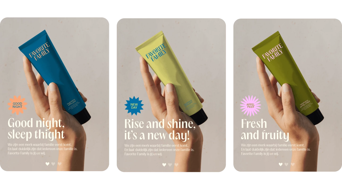
Additionally, we developed illustrative elements inspired by natural ingredients and product benefits, such as flowers, plants, and sunrays. These icons serve as labels or stickers, highlighting key features like eco-friendly or new.
FRAMILY PHOTOGRAPHY
The photography for Favorite Family centers around the "framily" concept—an inclusive representation of families in all their forms, from parents and children to grandparents and friends.
The imagery is warm and natural, with soft lighting that evokes a sense of authenticity and comfort. A playful mix of colorful packaging and black-and-white photography creates visual balance and reinforces the brand identity.
Inclusive. High-quality. Creative. With its new branding and an exciting lineup of upcoming products, Favorite Family is more than ready for the future.