Greenville
REBRANDING
From a black (coal) past towards a green(ville) future. We dug deep for the new branding of Greenville, incubator for cleantech and circular economy in Limburg — and struck gold instead of coal.
Website
greenville.be
Photography
Jennifer Kesteleyn
Iconic building
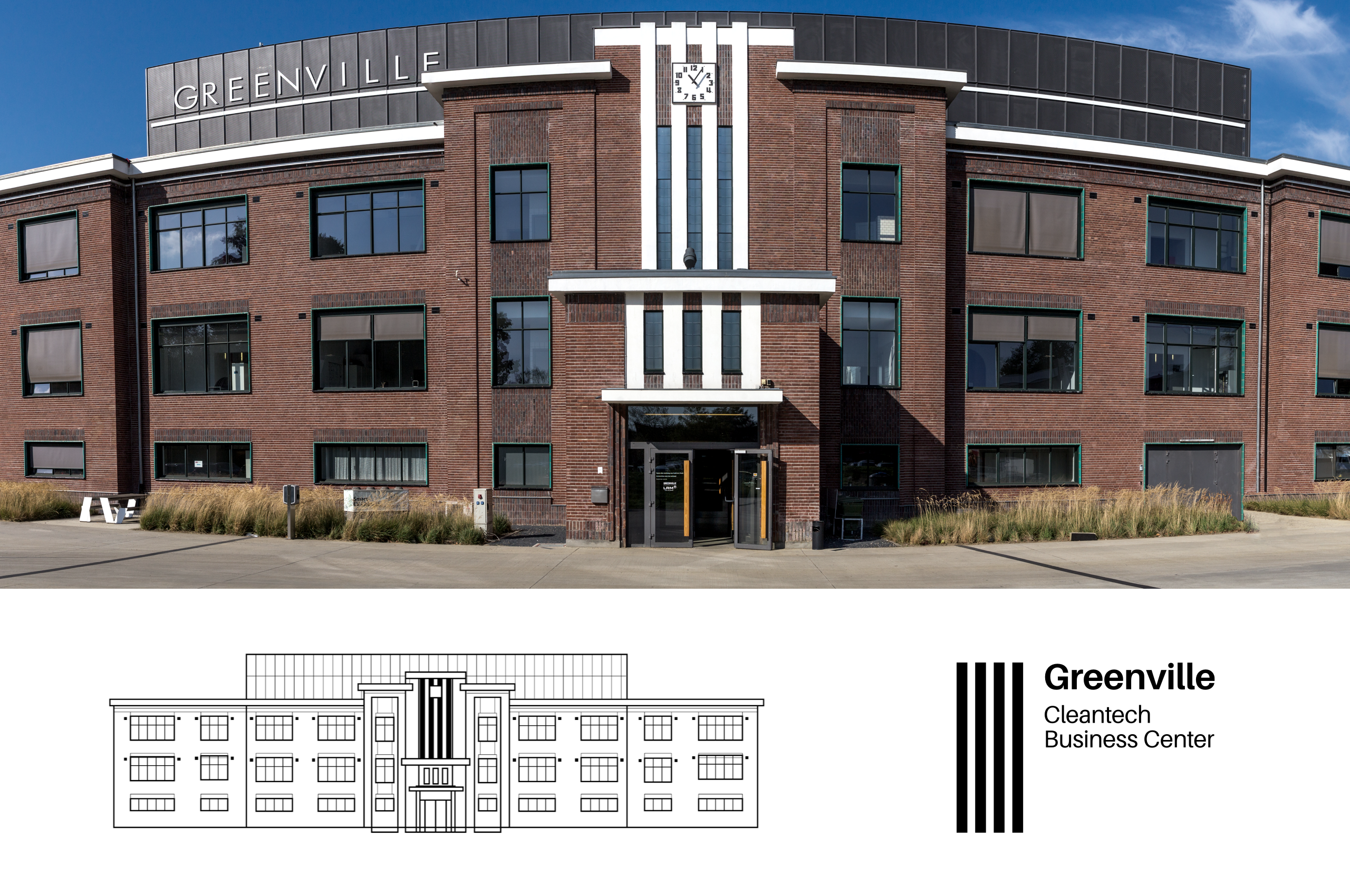
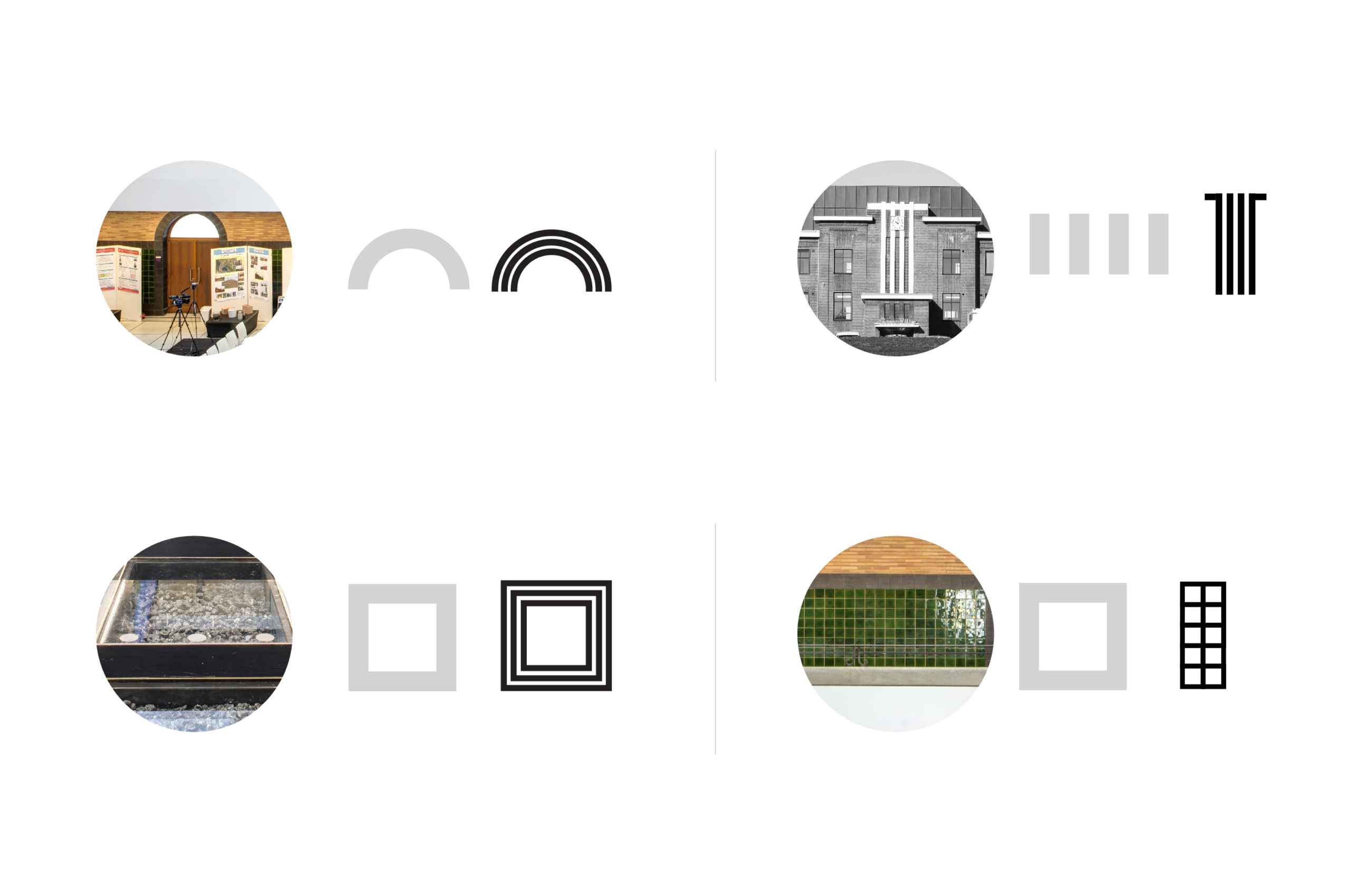
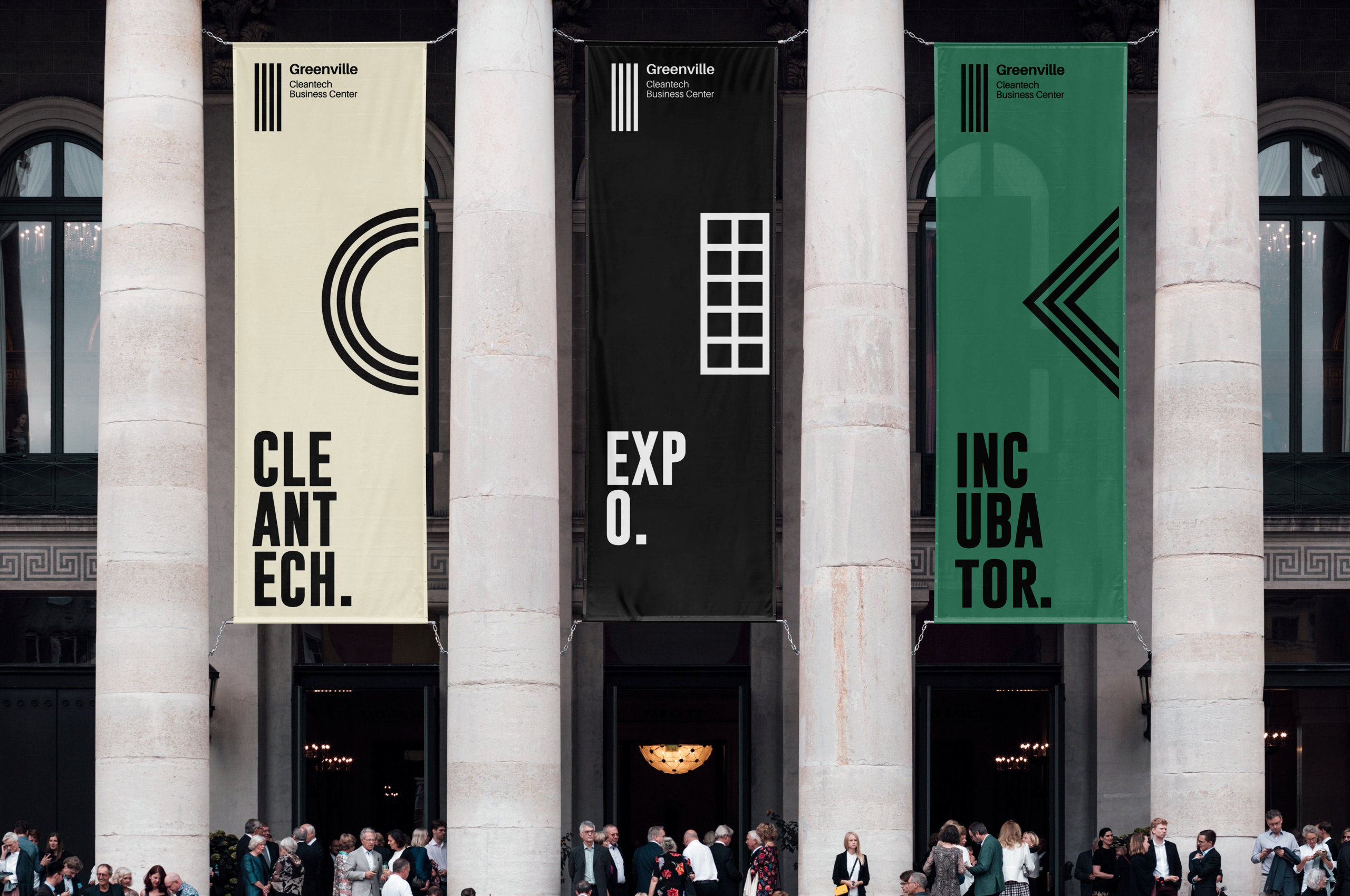
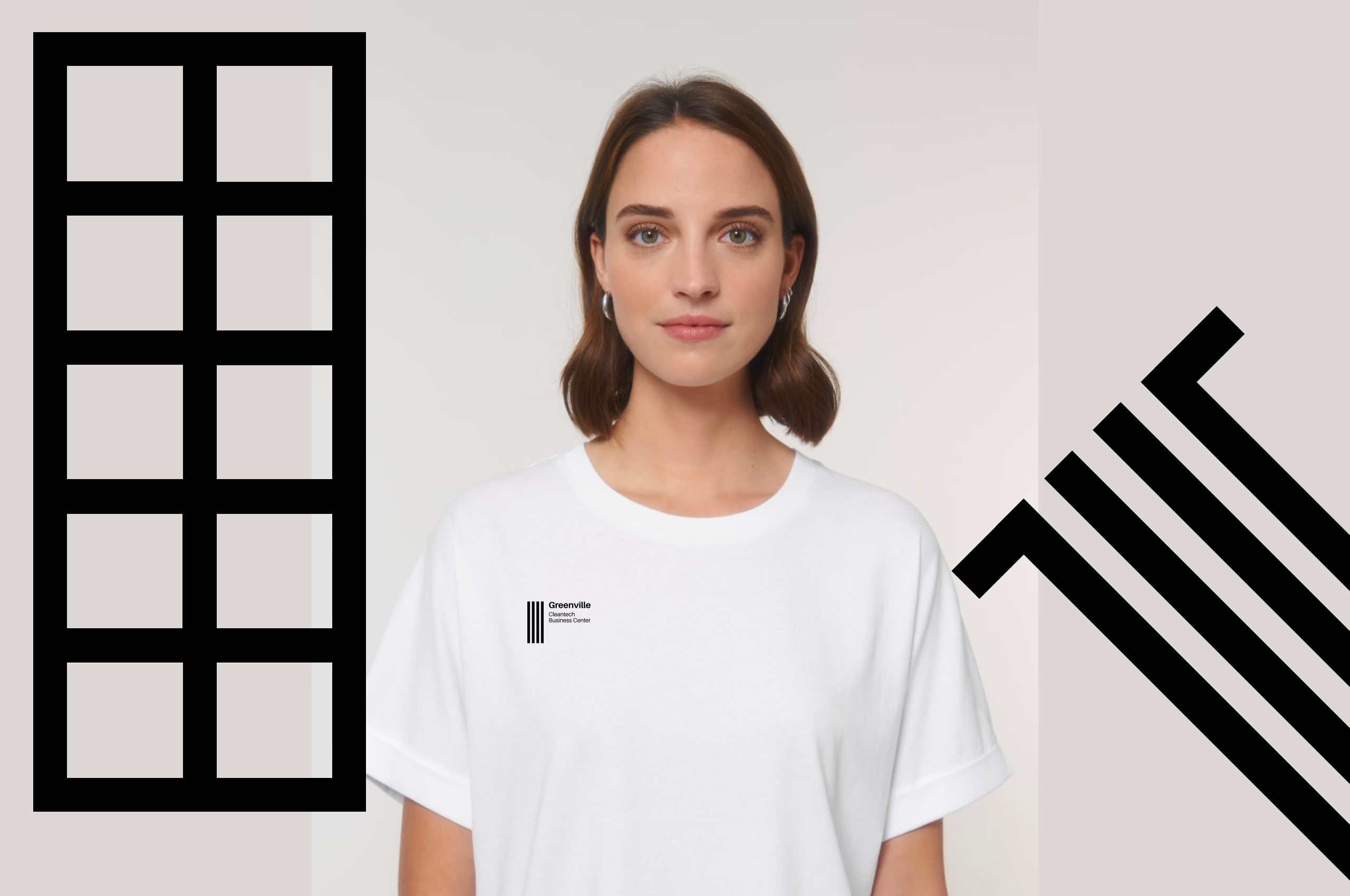
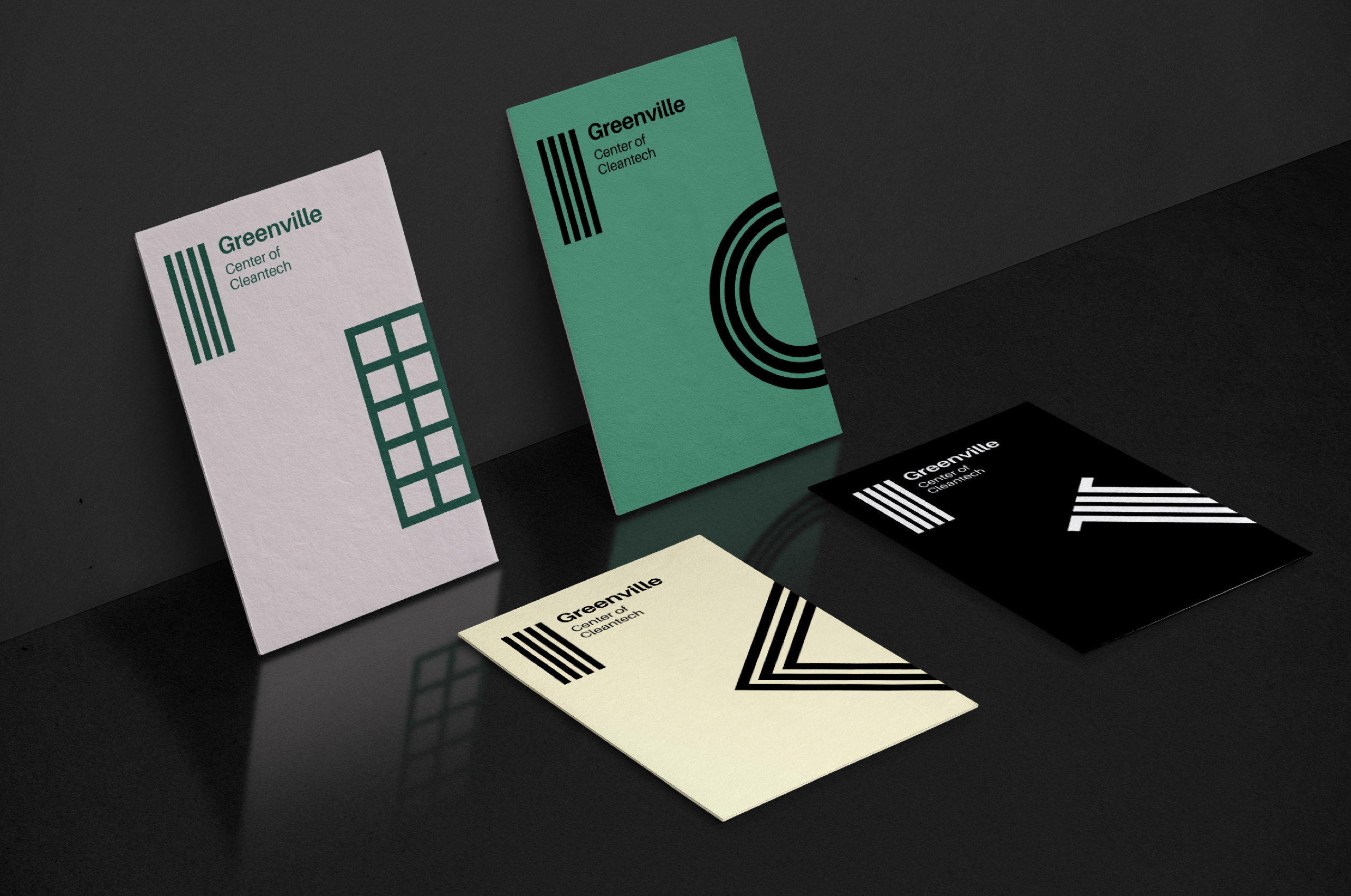
The iconic building of this former coalmine in Houthalen was the perfect starting point for us. We studied the building closely and used the different shapes and elements to create a unique visual branding for Greenville. For example, the logo was based on the four ‘pillars’ at the main entrance.
Visual identity
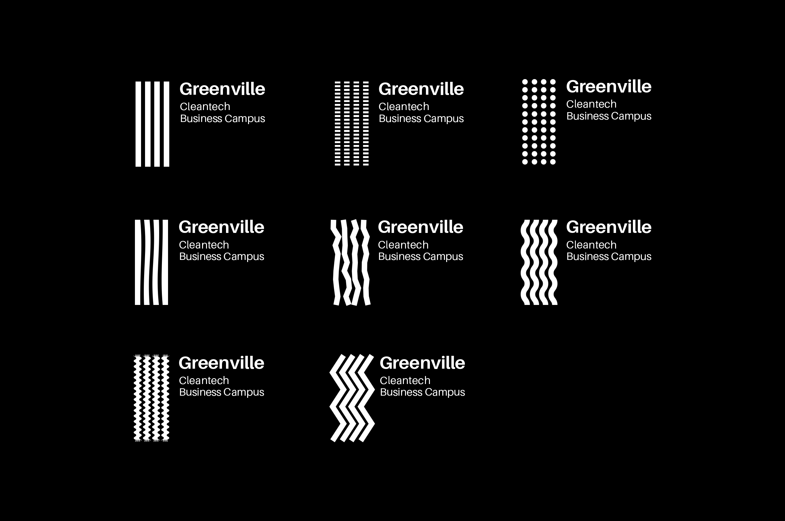
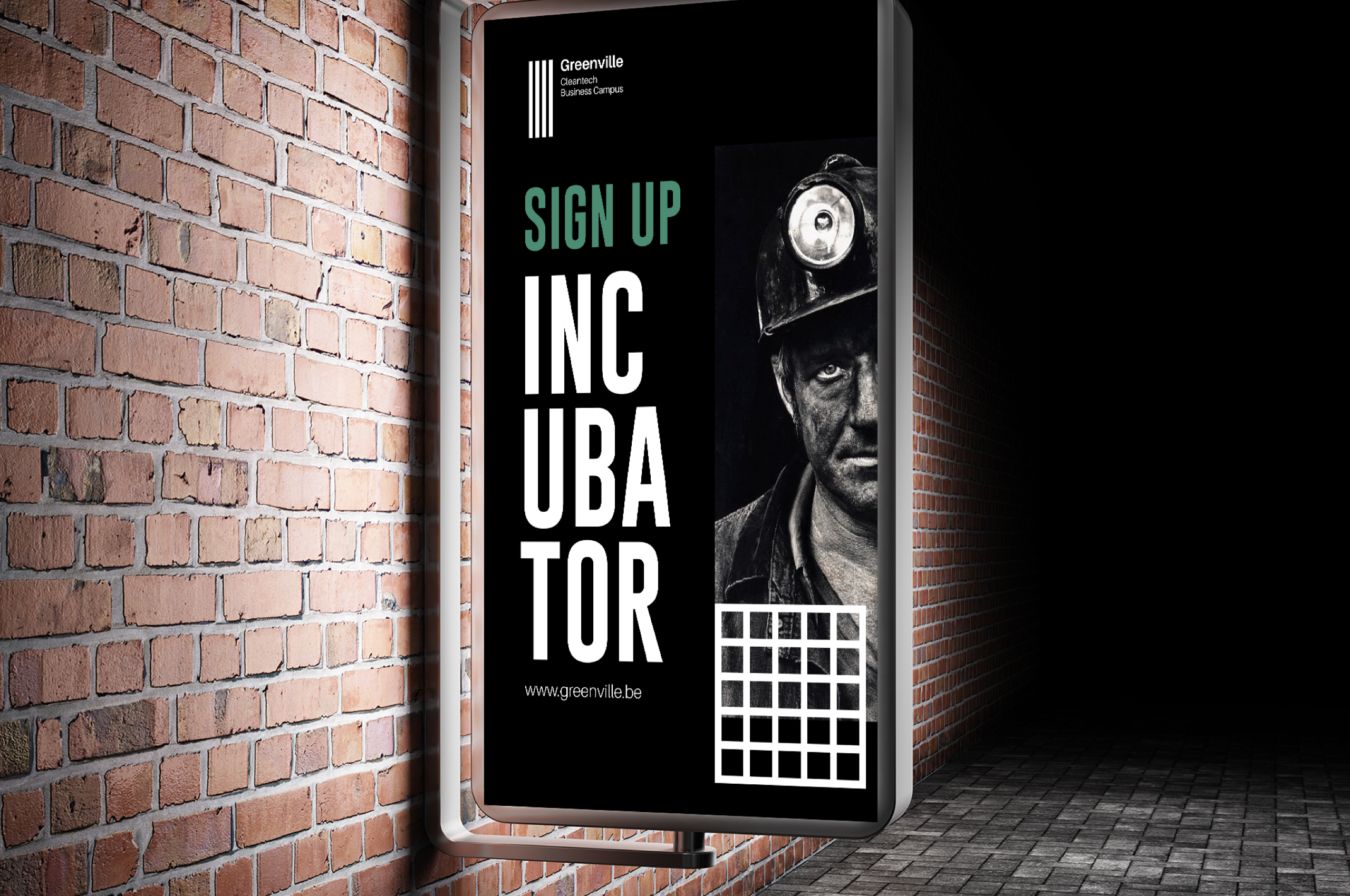
We got our hands dirty and went all out for this one: from designing all the stationary, (web)copywriting, photography and webdesign to creating invitations and thematic webmails.
Lab2Fab
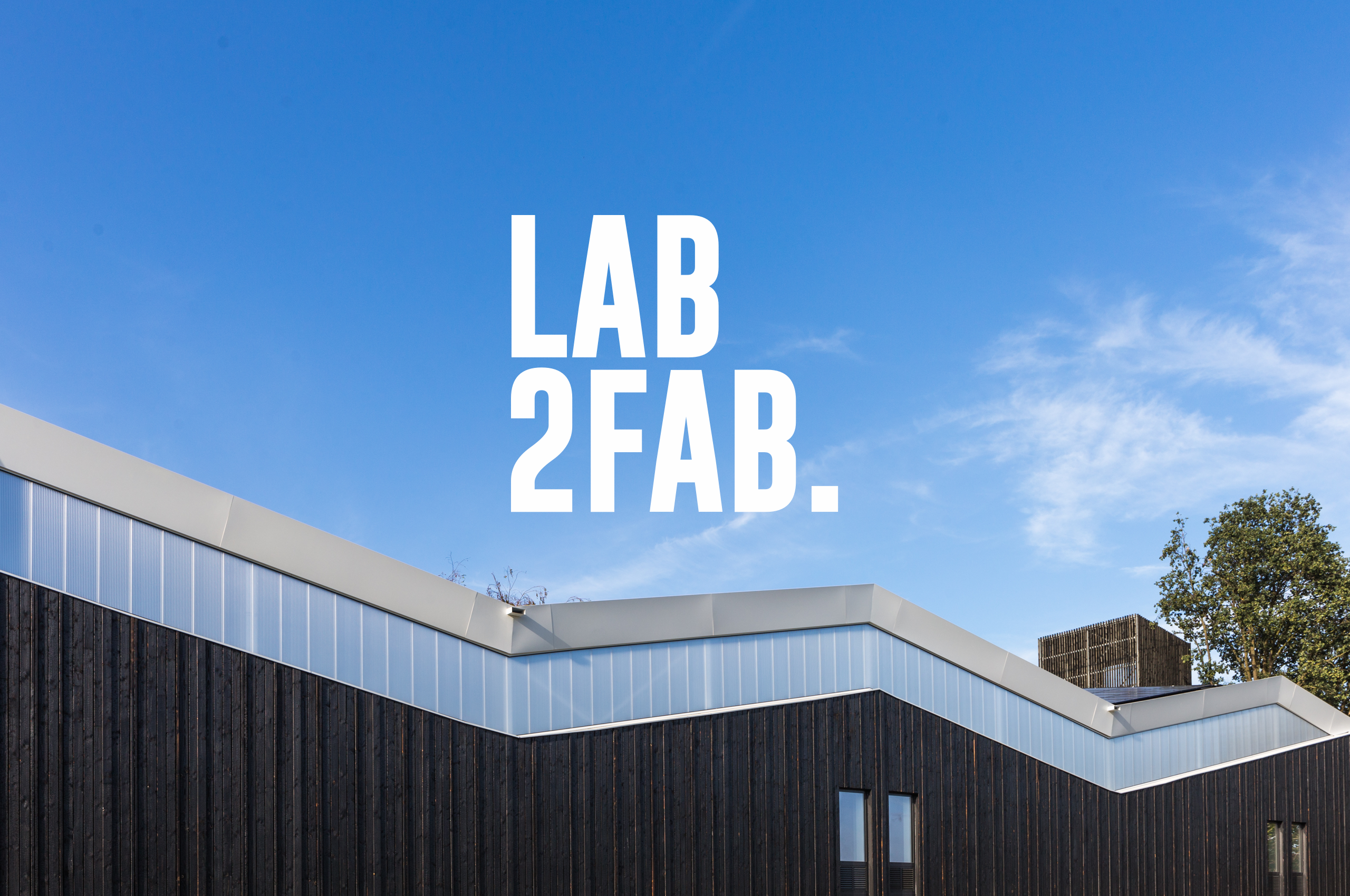
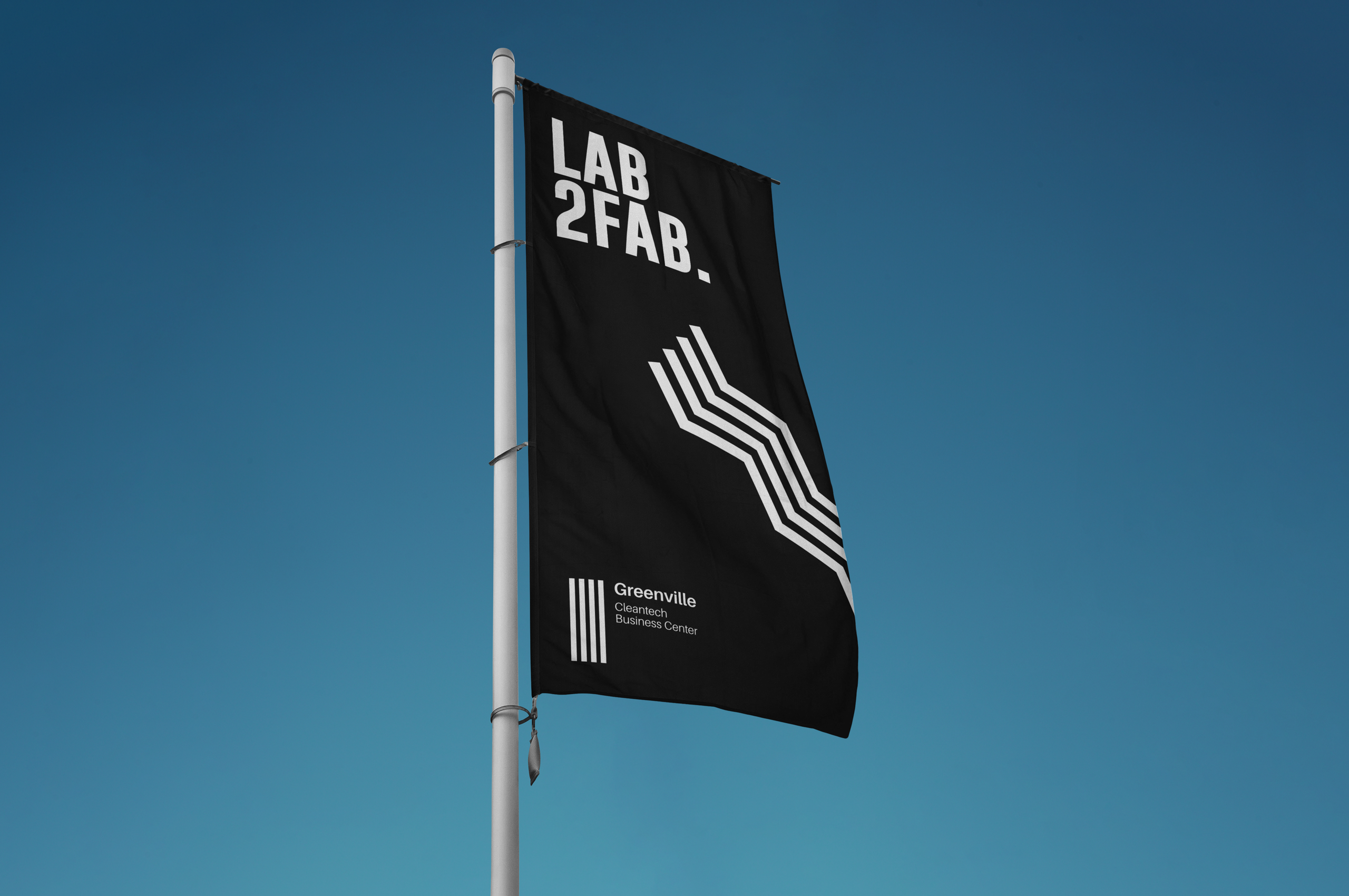
We were also involved during the opening of the second building, Lab2Fab, and came up with some of the building signage ideas. Lab2Fab is Greenville's factory floor. The state of the art units can be fully equipped as test or production space.
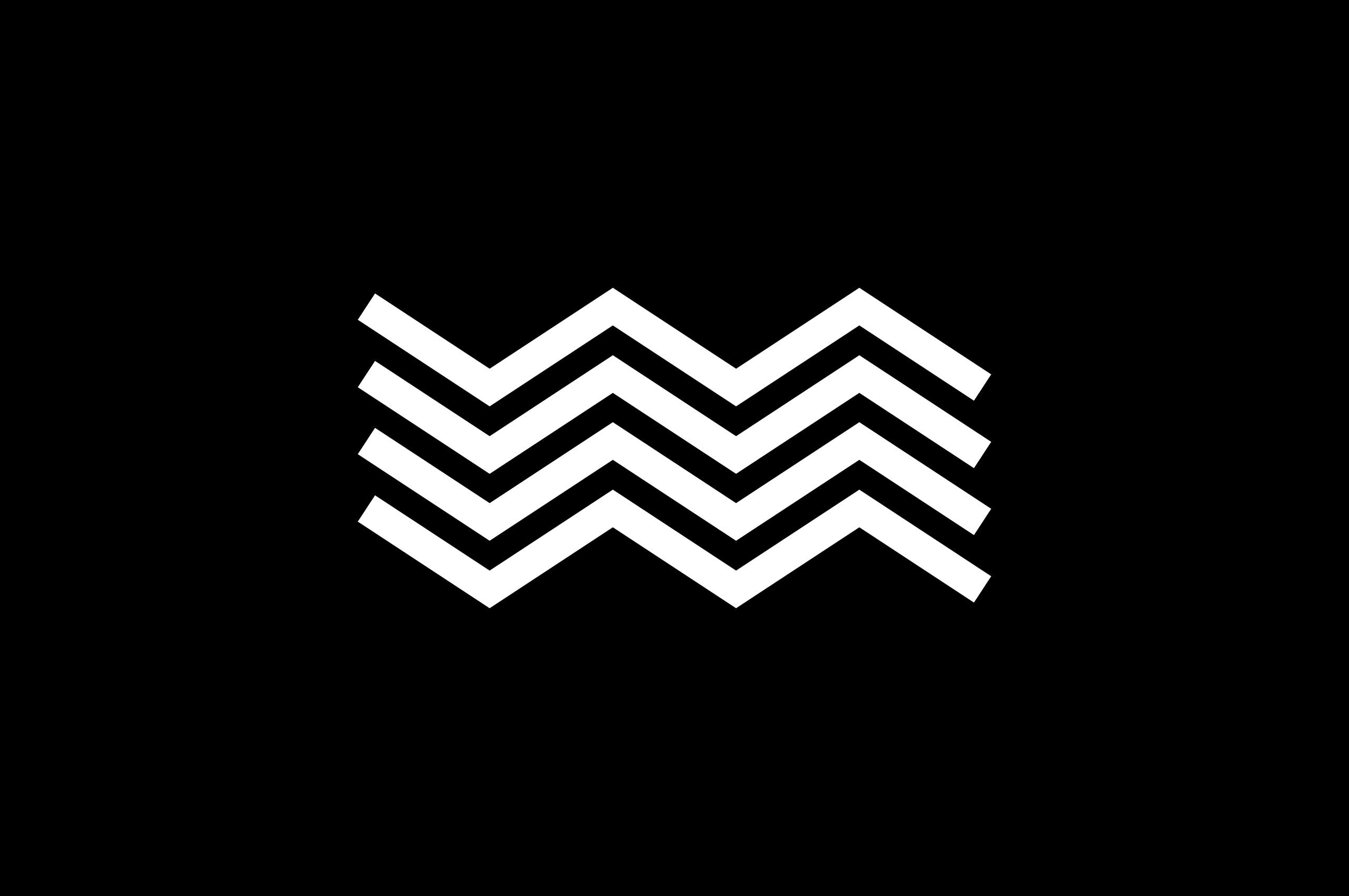
The 'zigzag' element refers to the roof of the building. This 'subbrand' fits nicely with the corporate identity of greenville.
