Kurago
REBRANDING & RENAMING
The success of an enterprise can bring about hurdles. This was the case for ‘Anthentiek’, which we helped them overcome with a brand new strategy, fitting name and brand identity. Hello, Kurago!
The obstacles
The company was faced with two major obstacles:
Their name was based on the founder An, back when she started out as a single-person business. Since then, they had grown rapidly to a team of 10+ people and needed a name that was representative of a larger team.
Business focus shift — the company had grown from a B2C psycho-therapy center to including B2B offerings and shifted its focus on career development.
Conclusion? Their brand at the time did not evoke this in any way. So they were in need of a new, representative, and all-encompassing brand identity. L&T to the rescue!
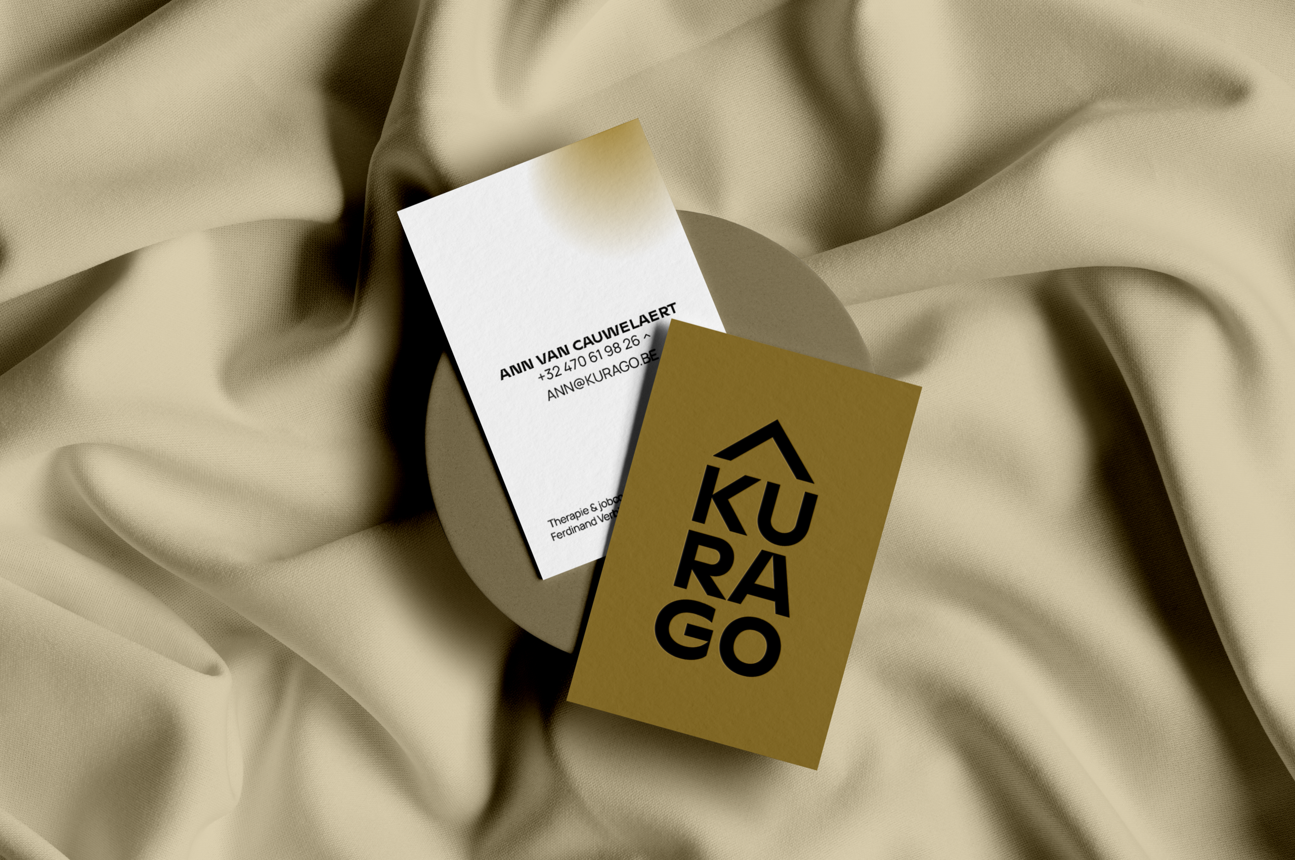
New name: Kurago!
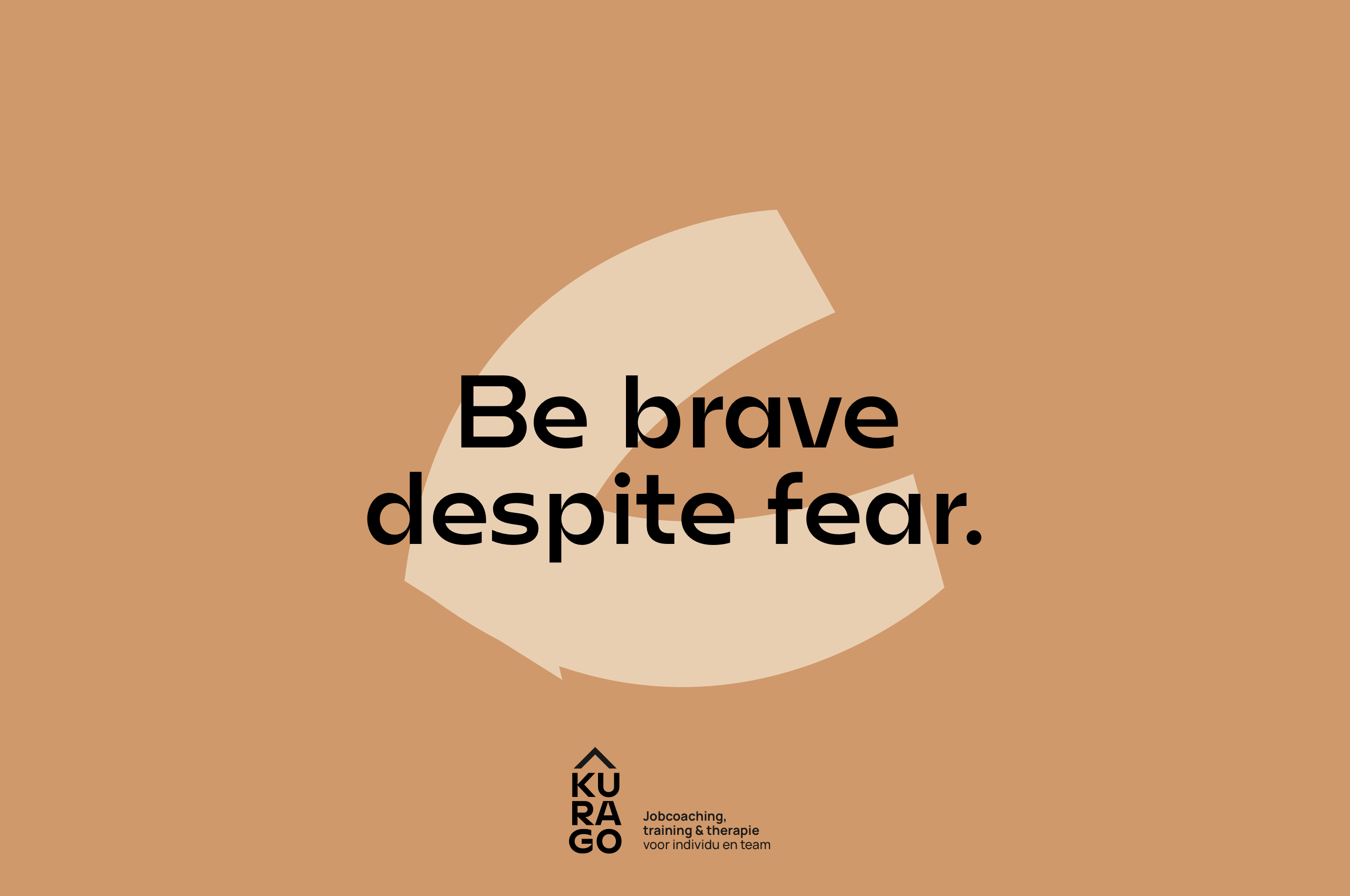
Kurago means 'courage' in Esperanto and stands for being brave and making brave choices. The 'Go' in Kurago emphasizes the activating character, the wanting to move forward in life.
This new name is a logical consequence of the strategic workshops in which we, together with the entire team, went in search of the company's core values and mission.


The logo
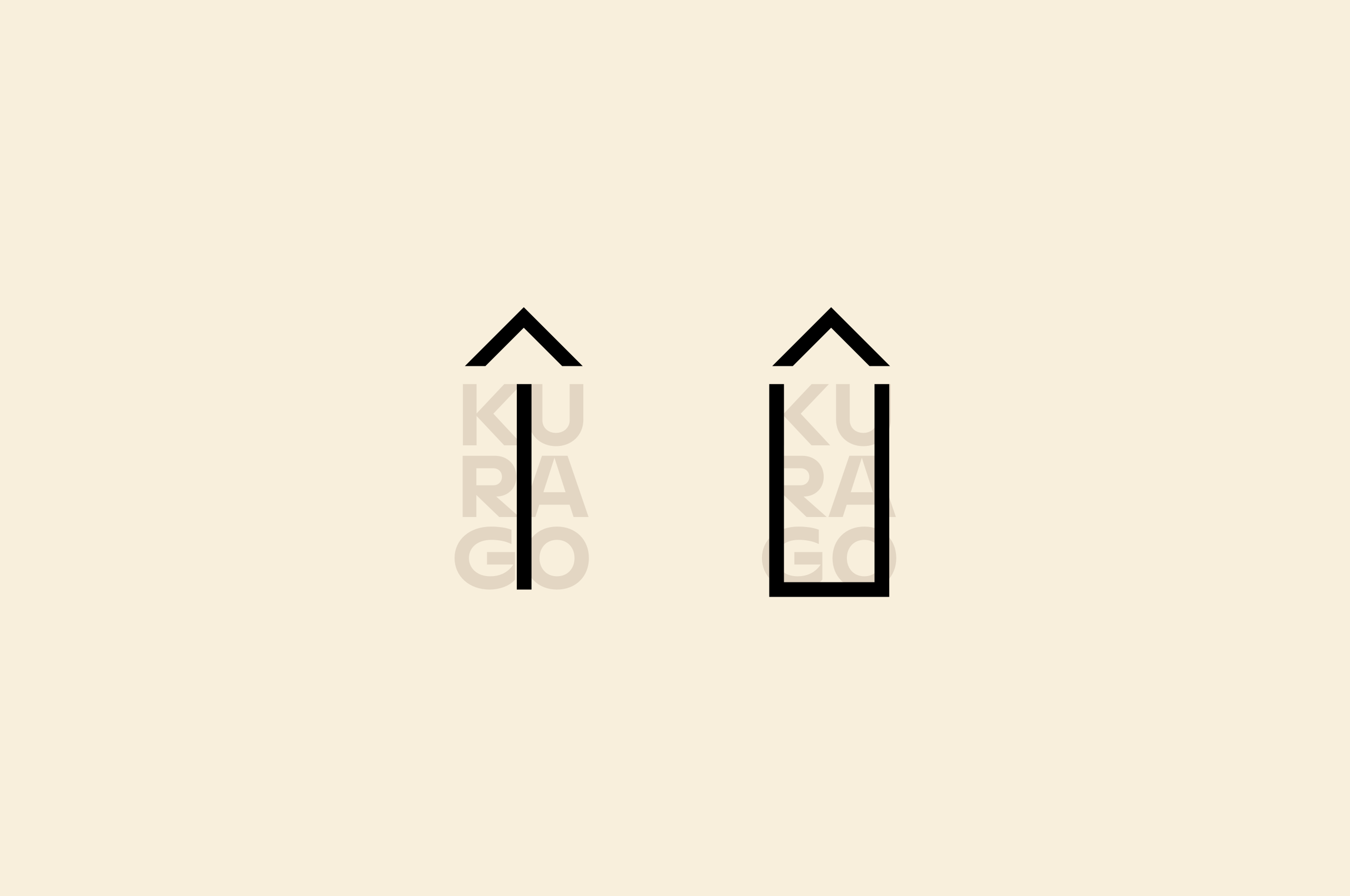
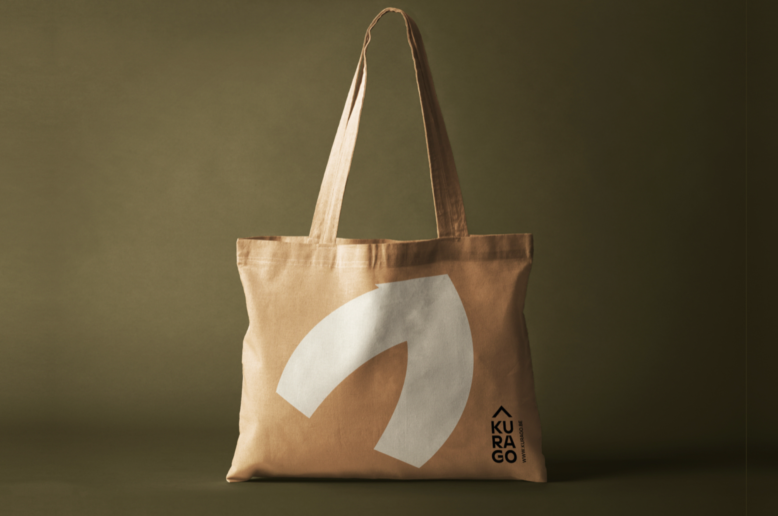
The logo is composed of 2 basic ideas. The shape refers to an arrow, which indicates the direction and - symbolically - acts as a direction blinker. At the same time, the roof symbolizes the warm and human character of Kurago.
Colors
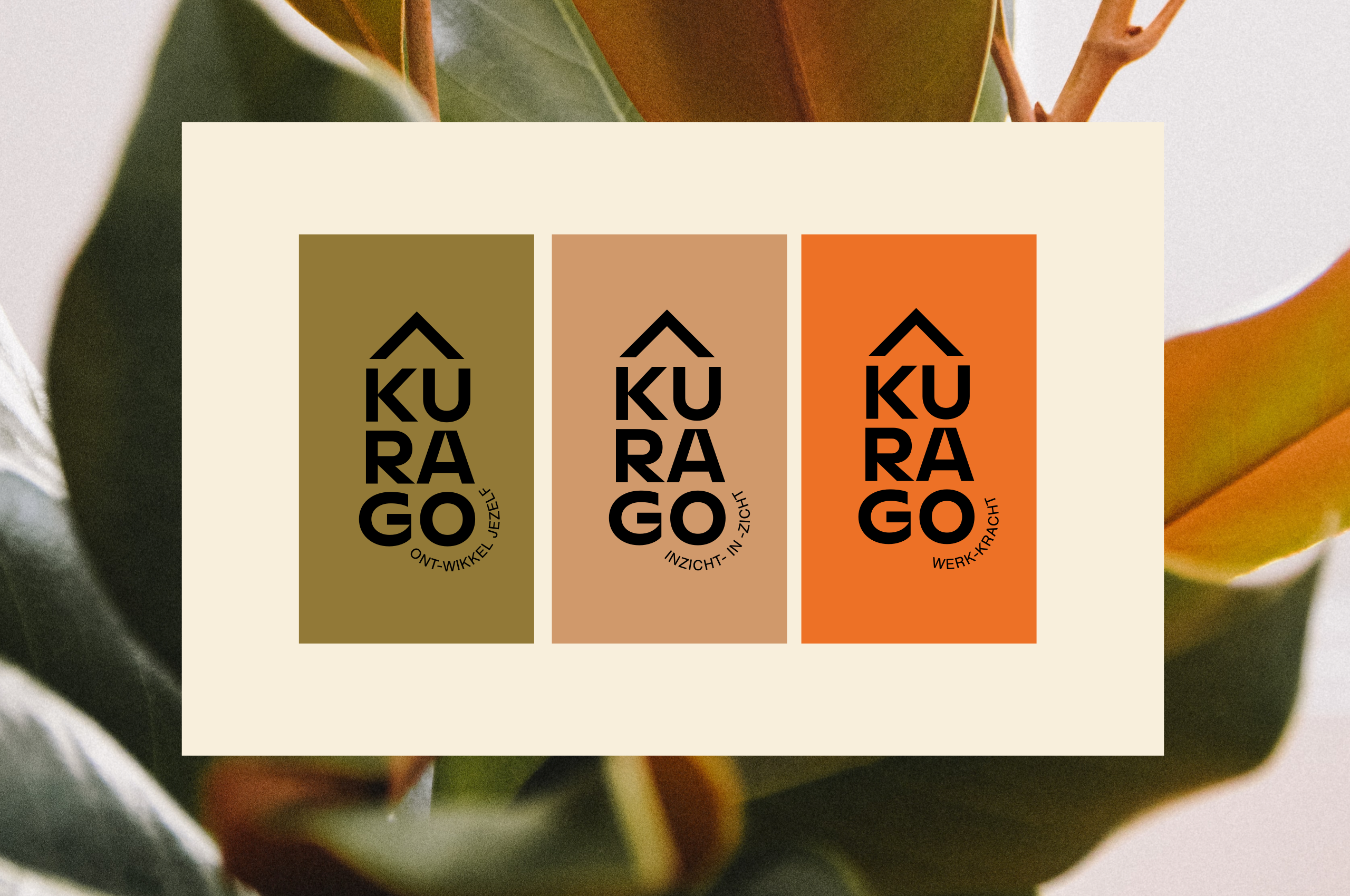
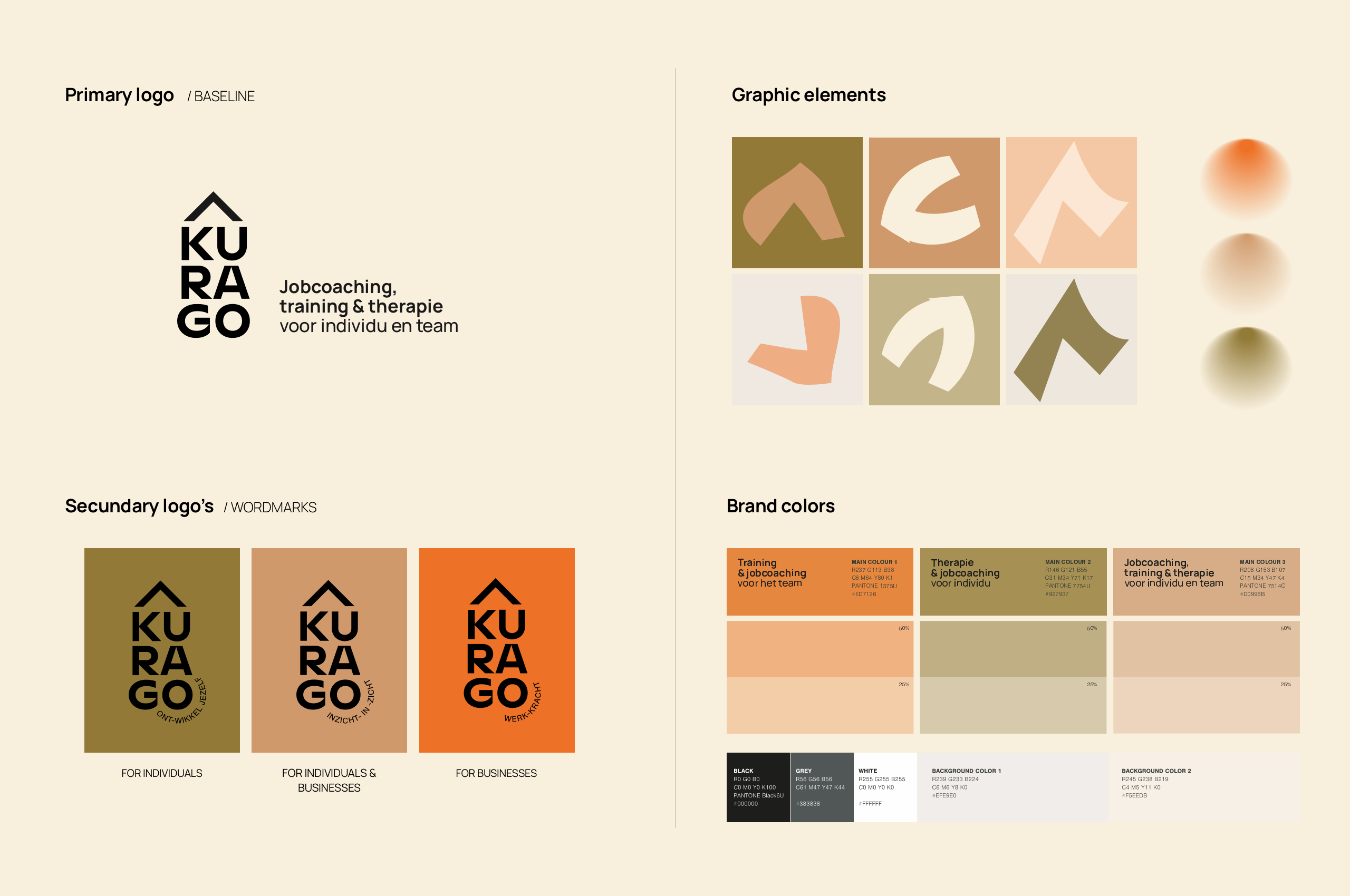
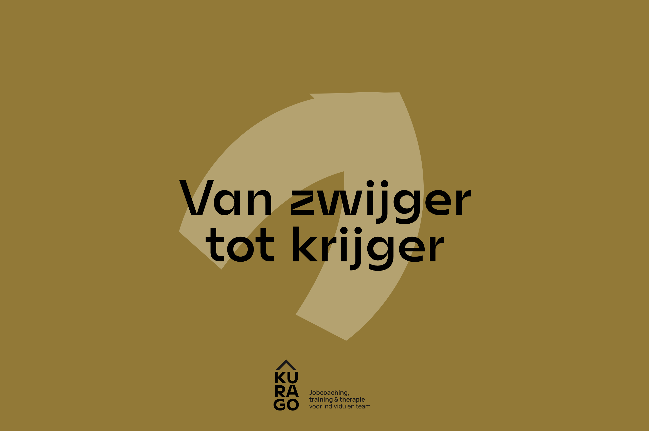
For the brand colors we chose 3 warm earth tones to underline Kurago's homely image. Each color has its own target group: business, individuals and both.
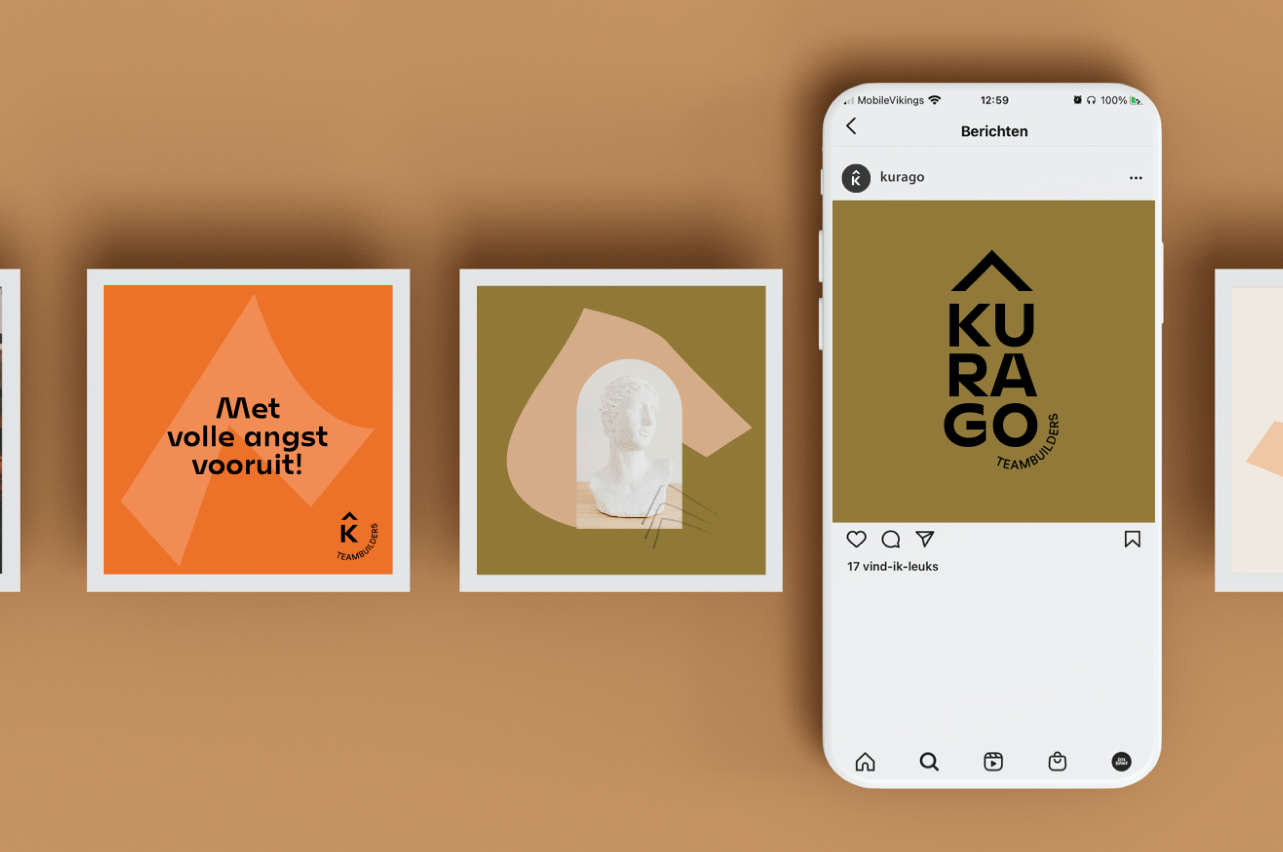
With this brand identity Kurago is armed for the future. Moreover, thanks to the different (graphic) elements, they are perfectly able to work with the corporate identity themselves.
