Leap
A FACELIFT FOR A CROSSFIT & SPORTS CENTER - REBRANDING & NAMING
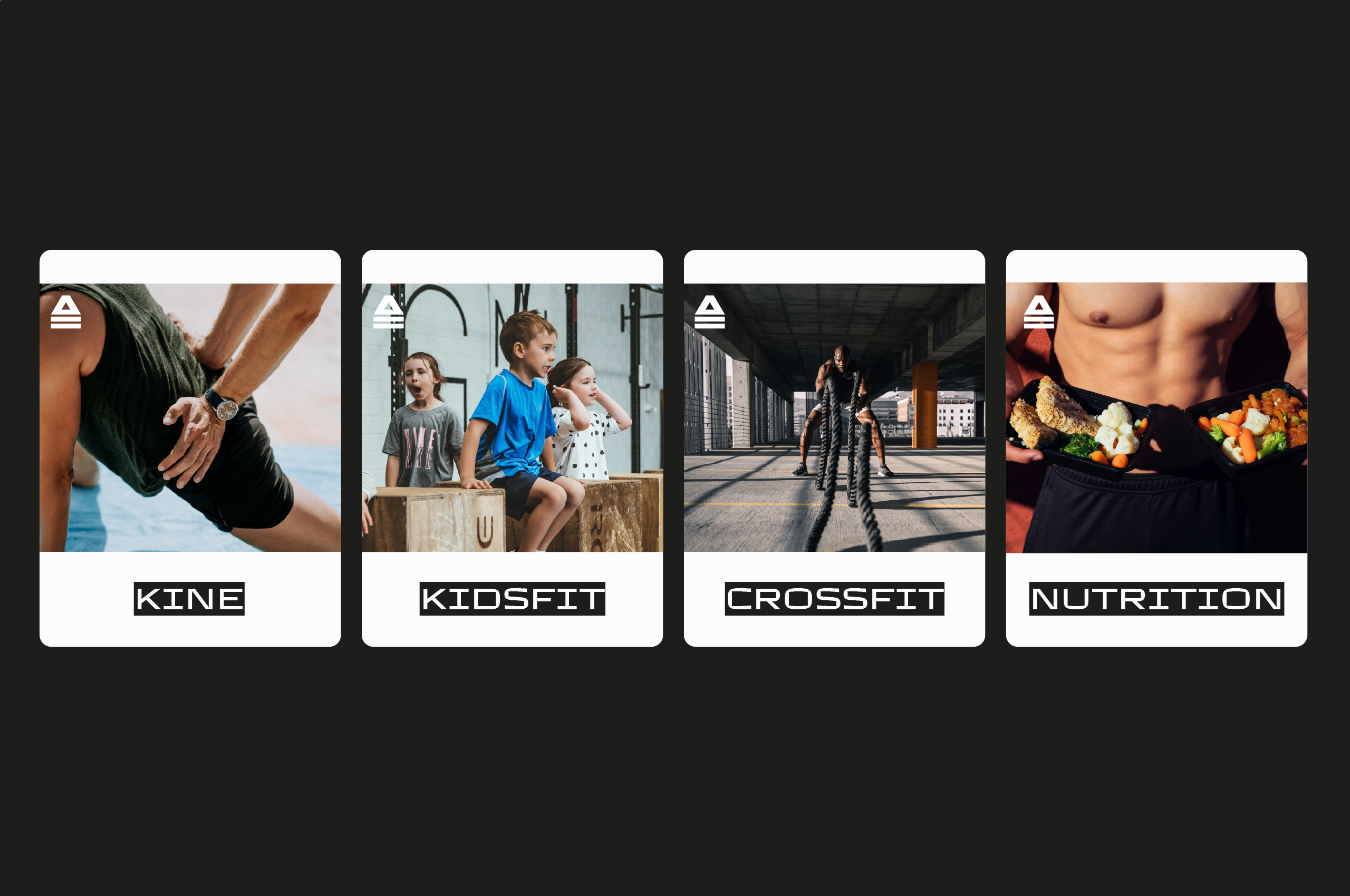
'Alife' was once thé place to be for crossfit in Hasselt. Well, it still is but has become so much more. They felt their old name didn't represent them accurately and asked us to develop a new one. You ask; we deliver. But while we're at it, let's do a complete brand overhaul and build something that works on all levels. The new brand name had to sound 'activating’.
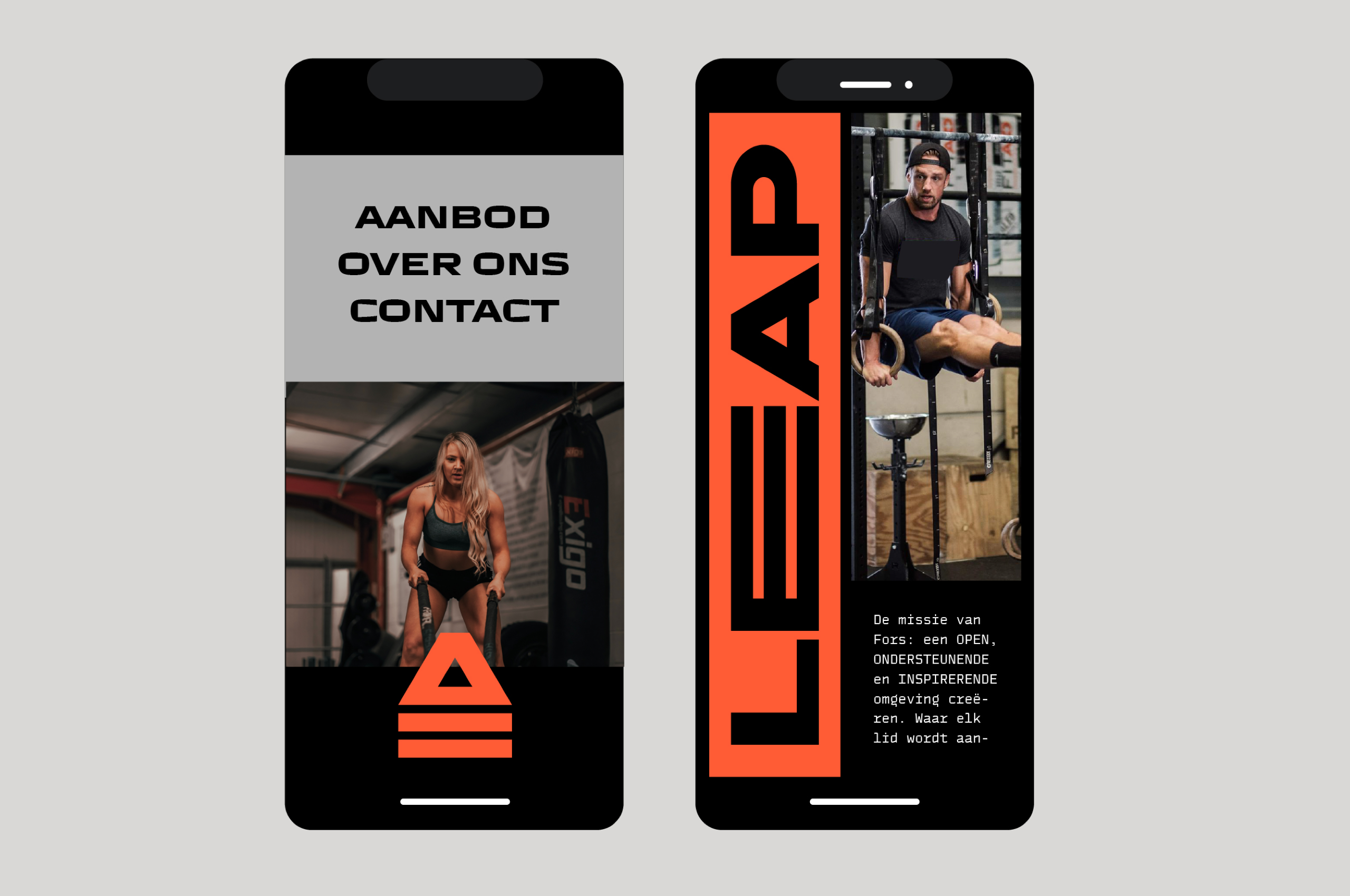
Website
leaphasselt.be
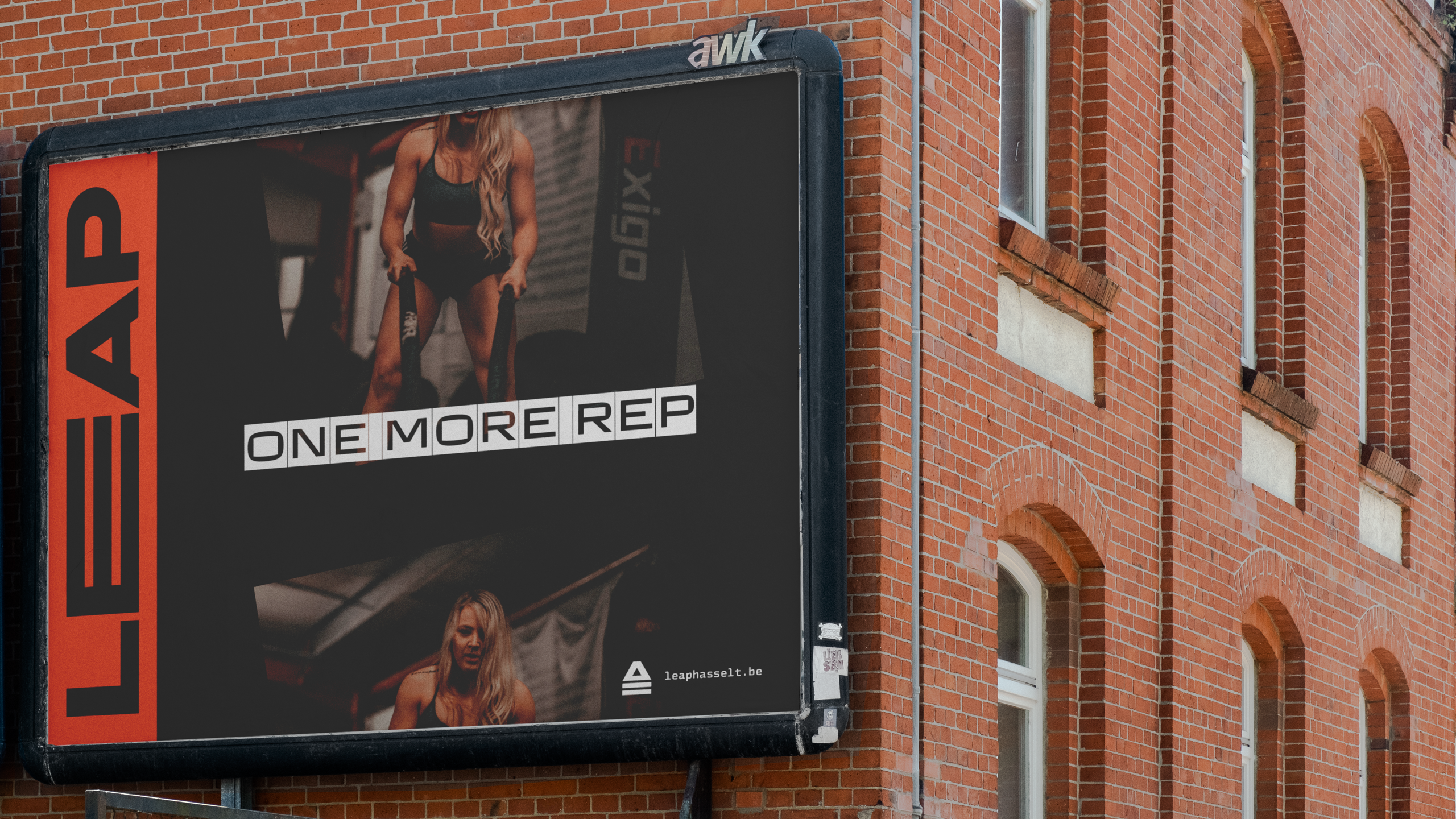
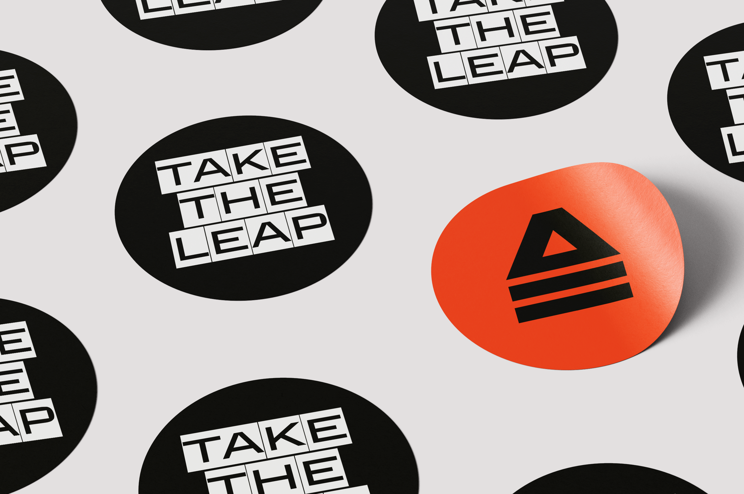
The client is all about motivating people to get out of their comfort zone physically and socially. With their two core values: 'community & commitment,' they ask people to 'take the LEAP'; to join their tribe for a serious workout.
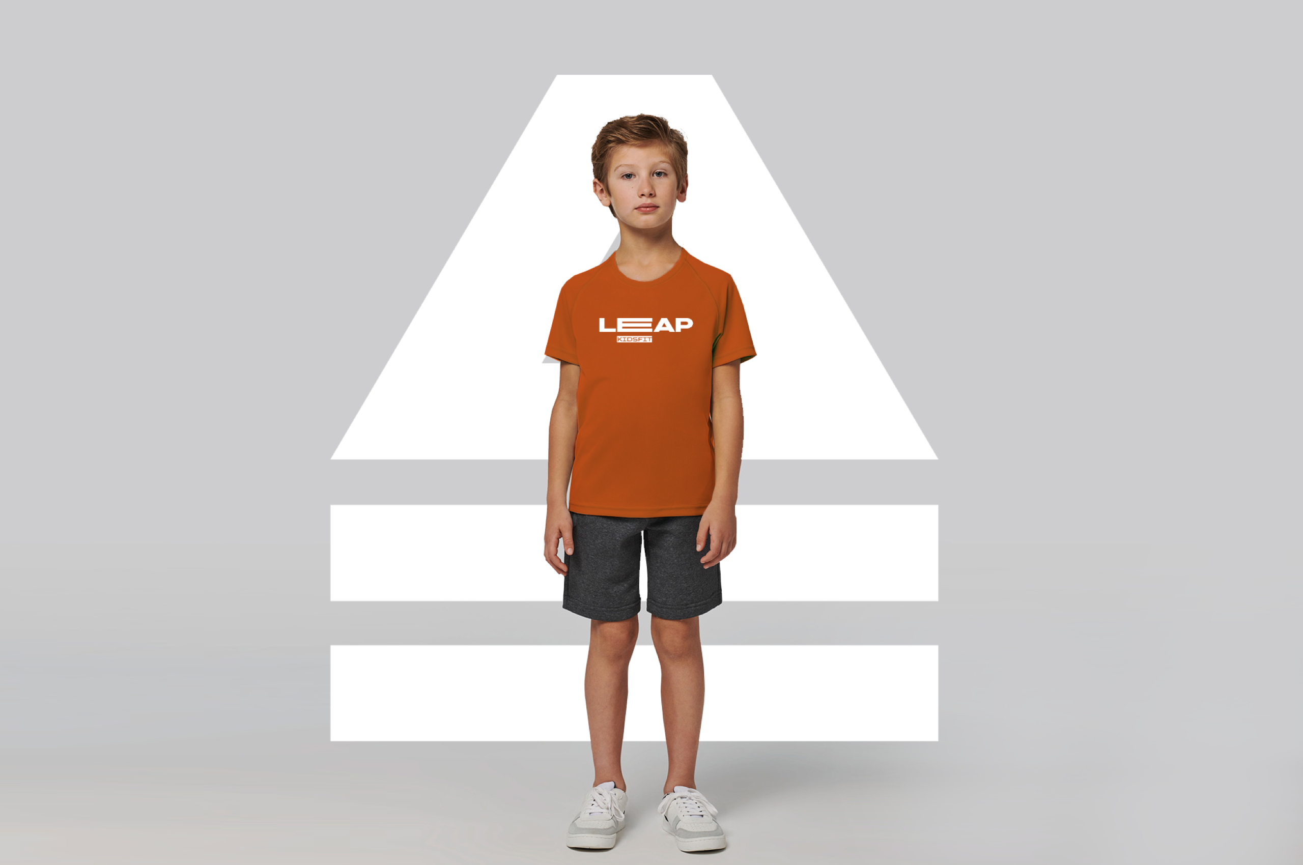
Some people experience a barrier when seeing the word 'crossfit', so we wanted to instill some playfulness into the 'leap taking'. The logo is leaping itself; you can catch it at different moments in its movement.

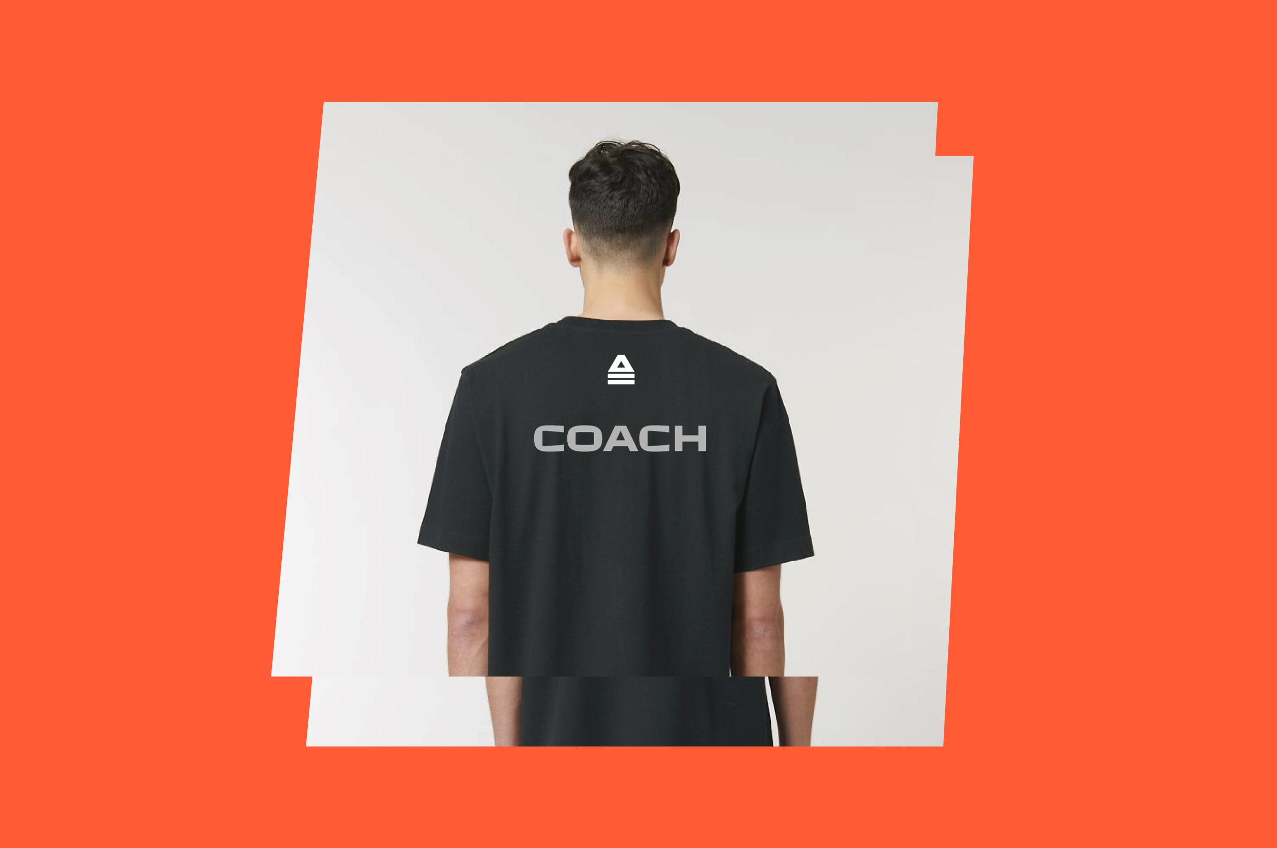
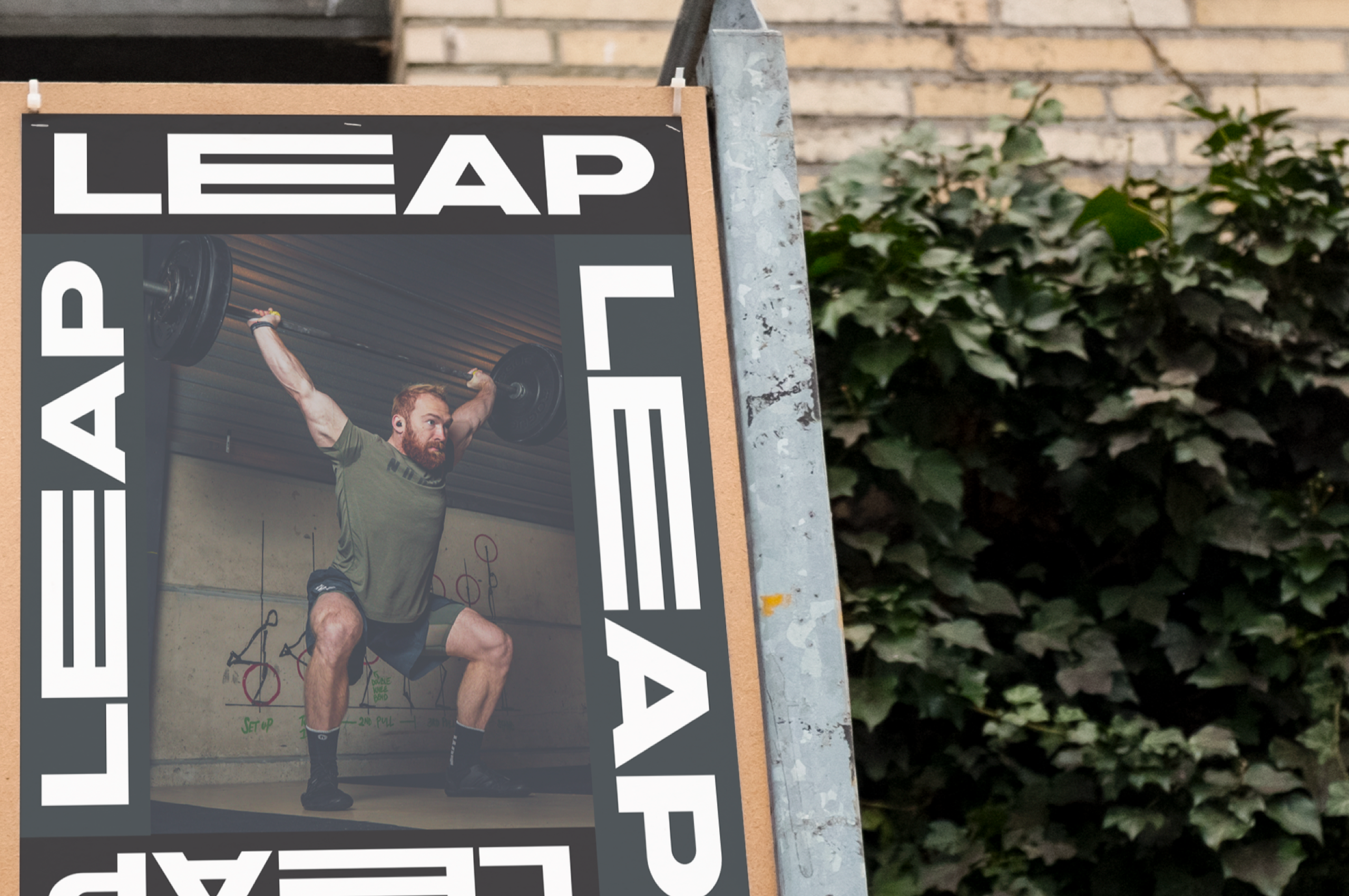
Leap's brand purpose is to improve people's quality of life through community & commitment by working out professionally while having fun.
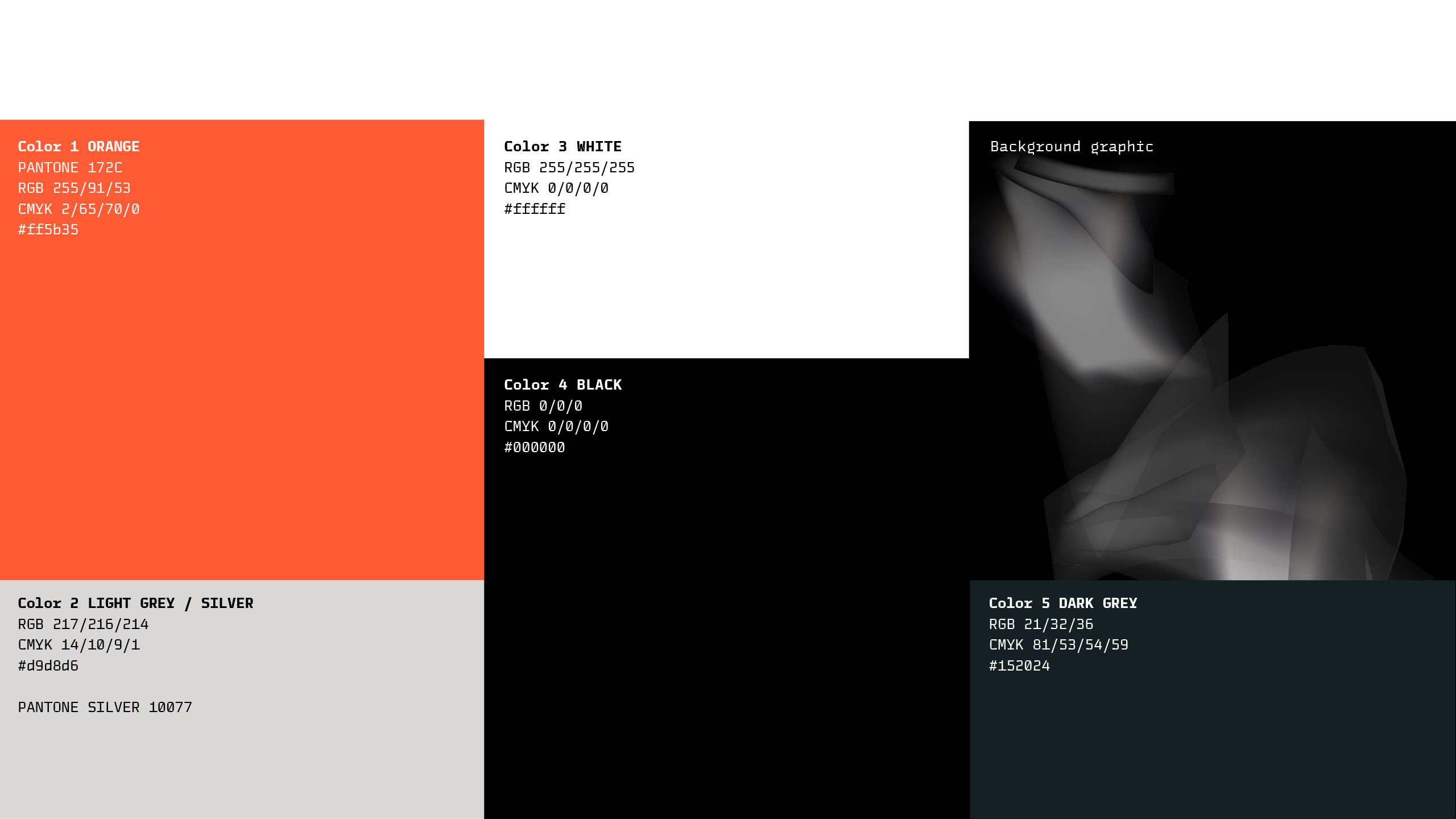
'Professional yet fun' is portrayed in the color pallet consisting of a sleek black & white base with a deviating pop of color.
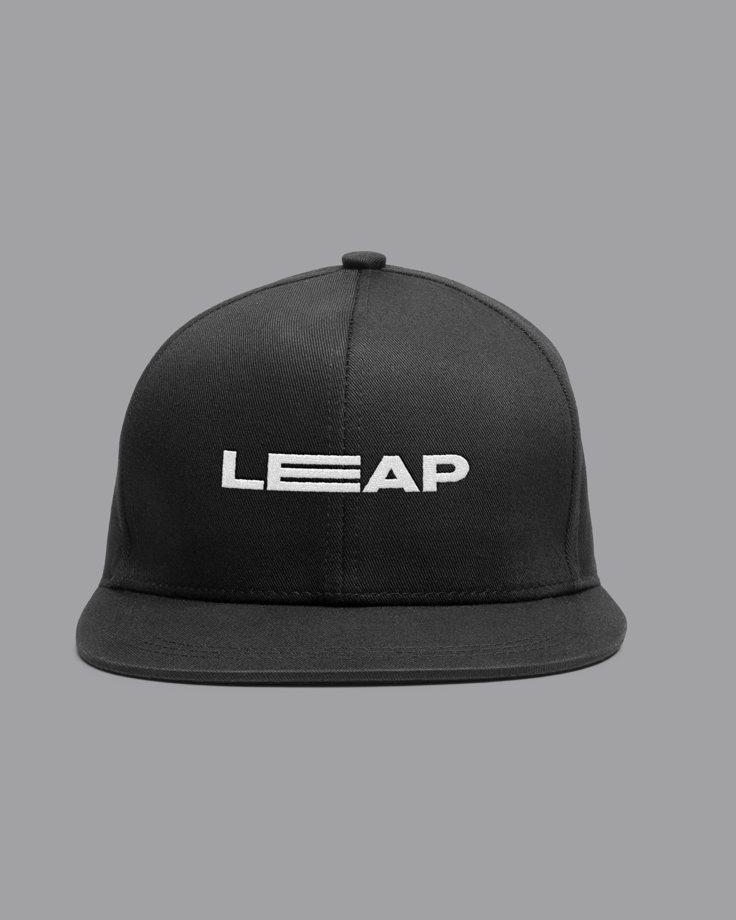
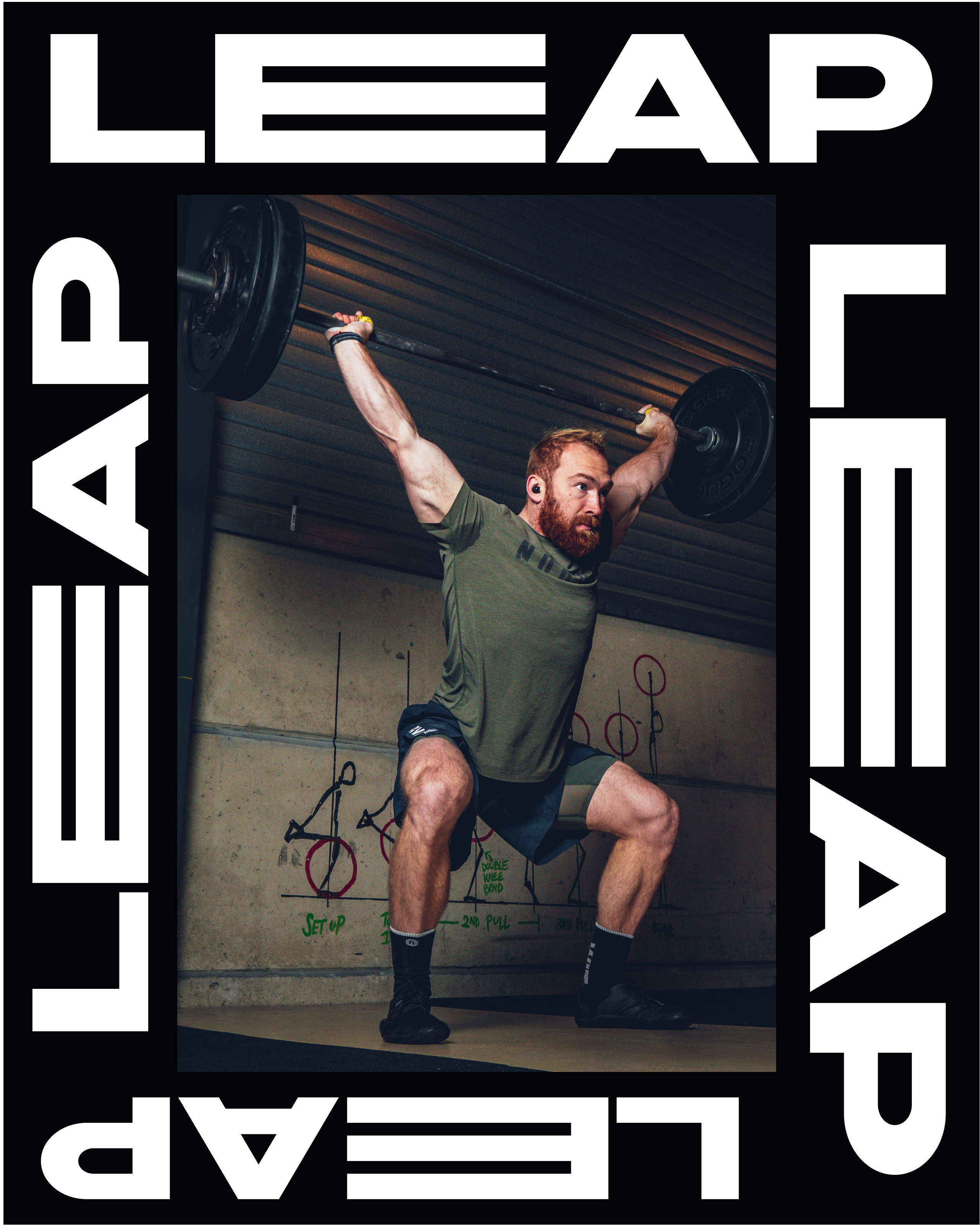
Similar to Leap motivating their customers to step out of their comfort zone, we often inspire clients to step out of theirs. To 'take the leap' and rebrand your company to grow more muscle and become stronger.
