PAS
STRATEGY, BRAND IDENTITY AND WEBSITE
PAS was a bit stuck. It was dealing with some wrong perceptions, as the first conversations we did with the interior design studio revealed. Some felt they were ‘too expensive’. Other clients thought they were ‘too small’. Yet others didn’t know clearly what PAS did.
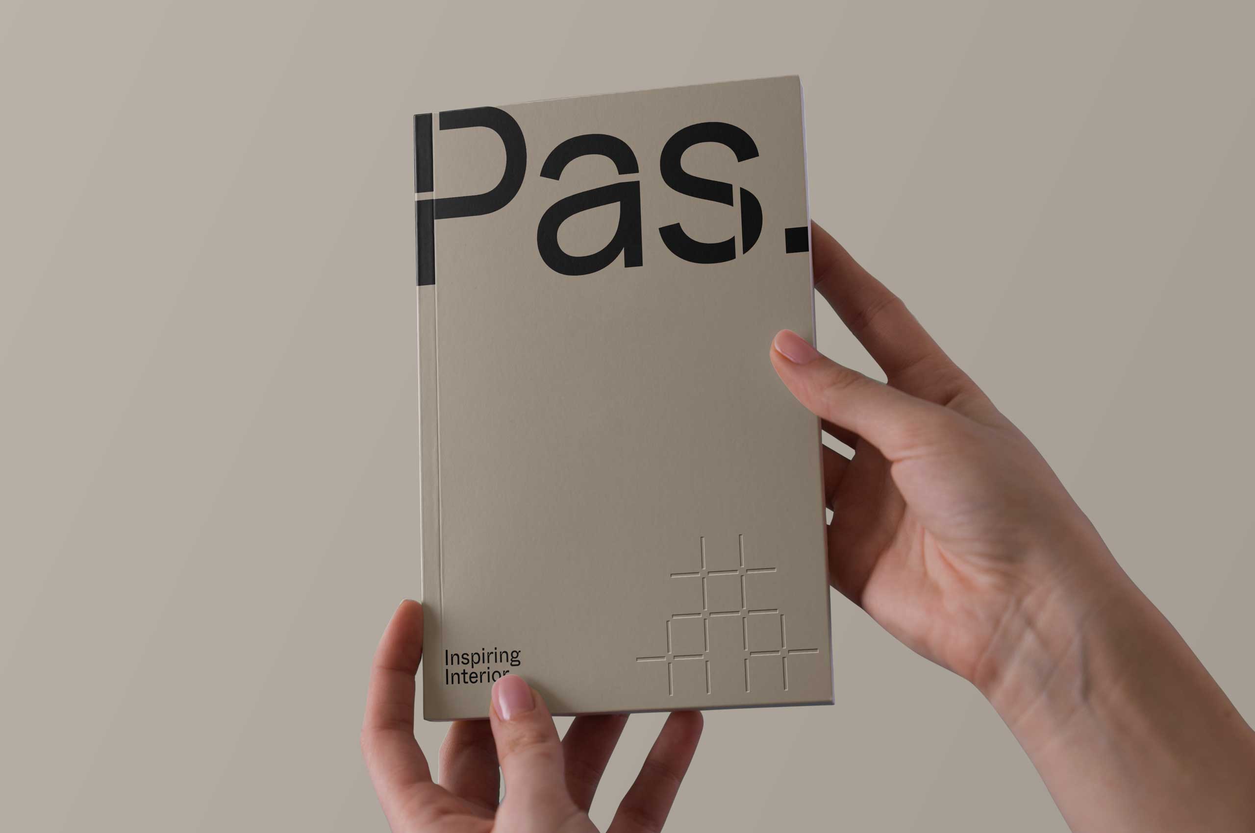
So it made perfect sense to first define their core values and target audience. Even before there was a pixel design, we did a comprehensive strategic exercise with the entire team at PAS. The result provided the briefing to create a creative brand identity.
The biggest challenge for PAS? A brand identity that perfectly matches their core values and different target groups. Qualitative, yet creative. Minimalistic, yet atmospheric.
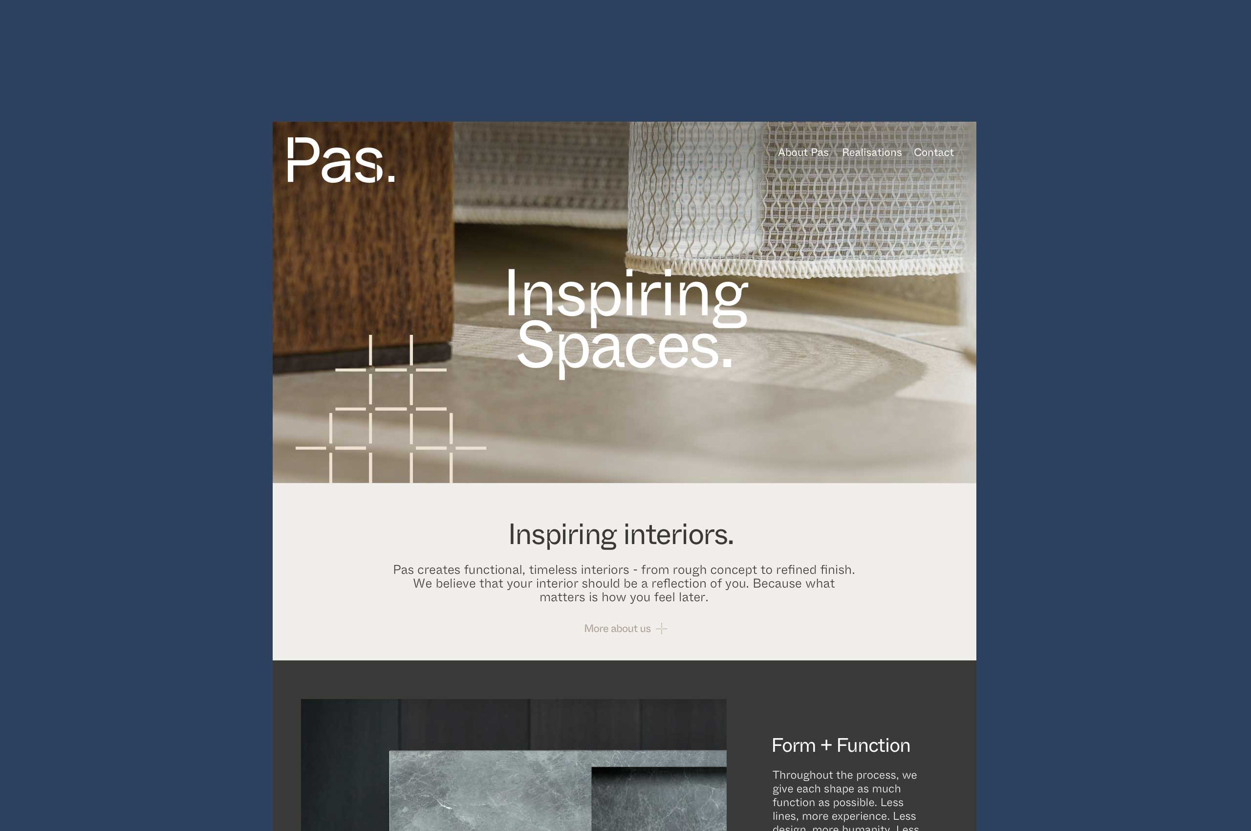
Website
pas-interieur.be

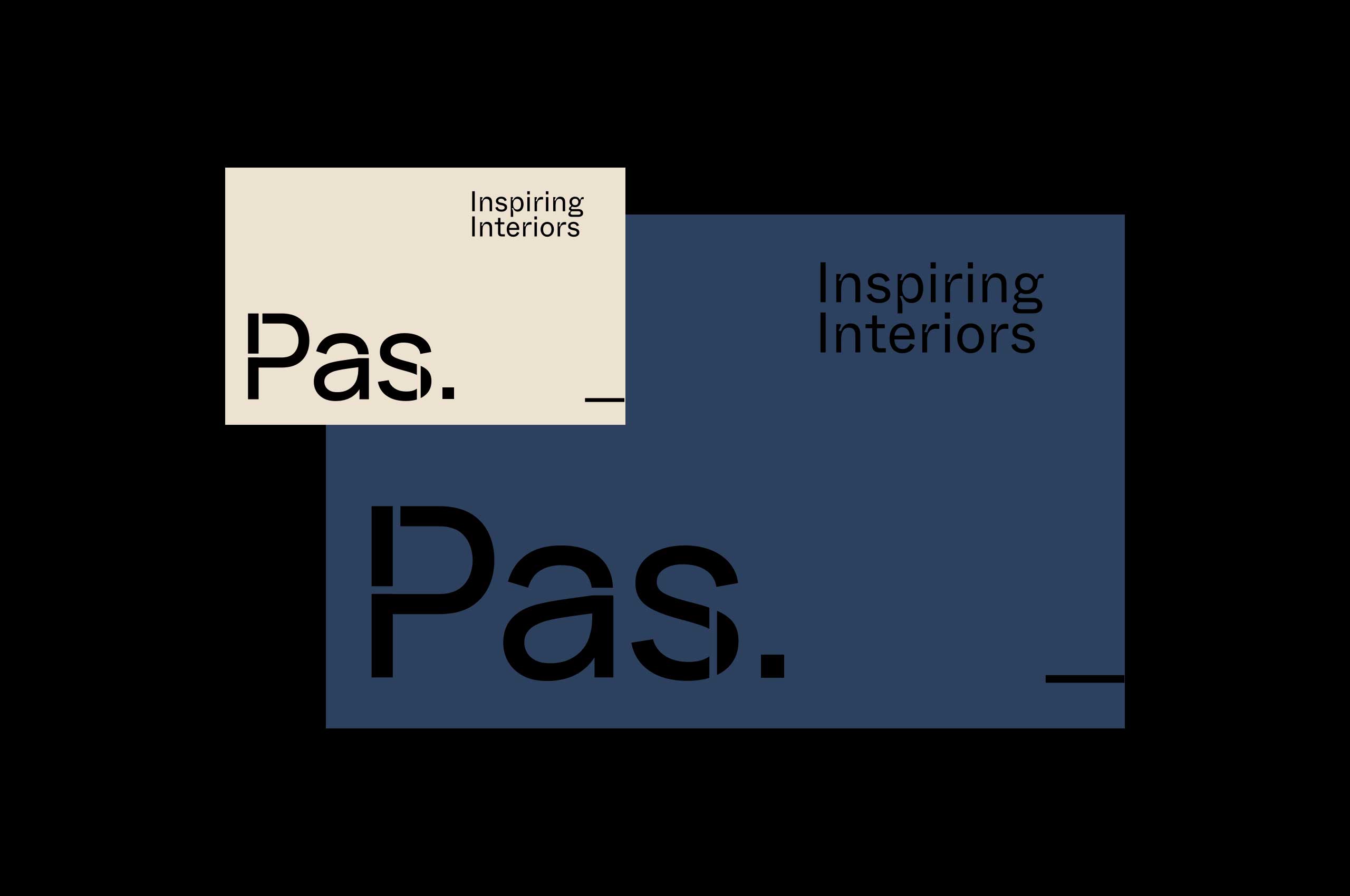
Logo
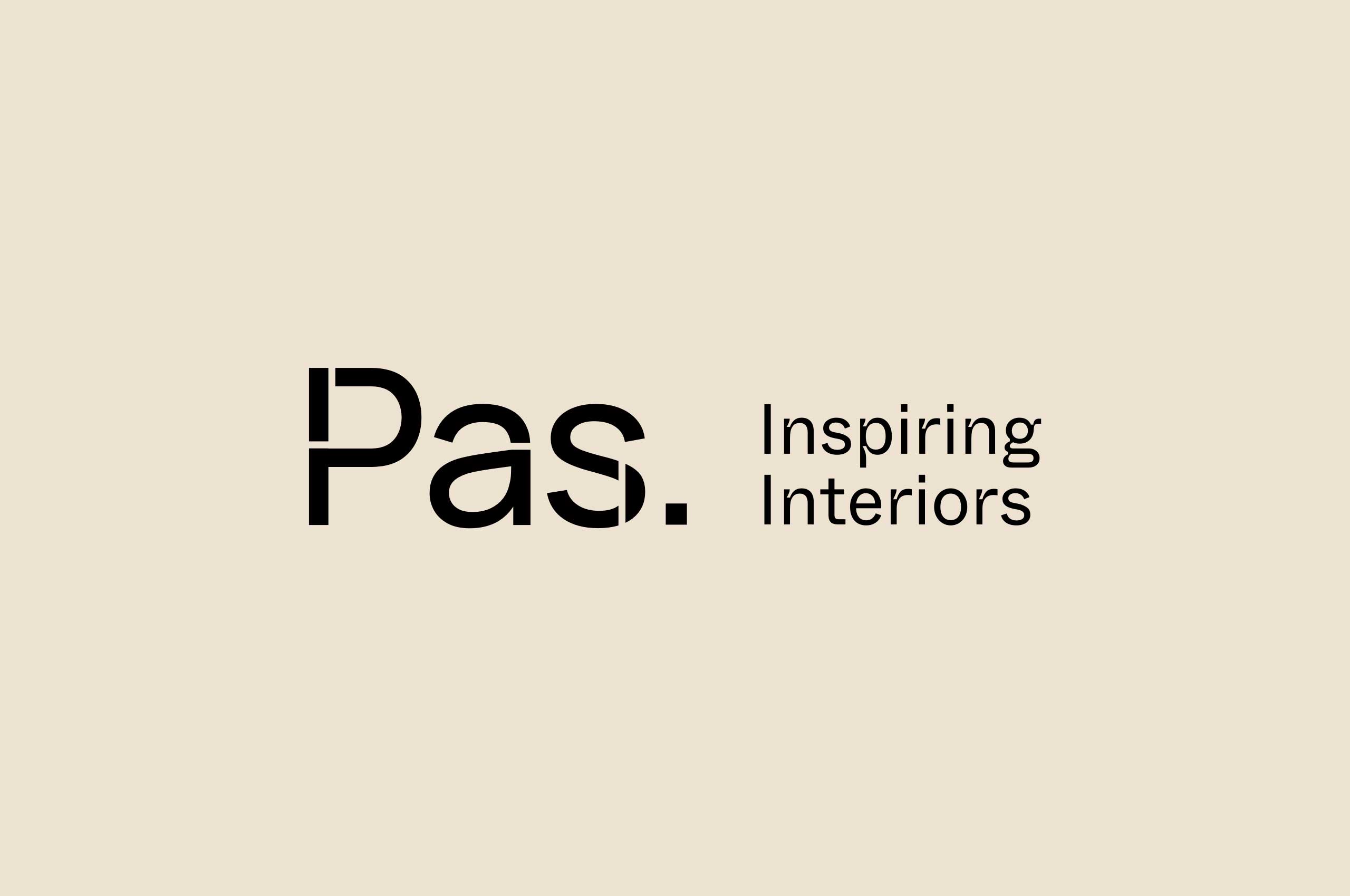
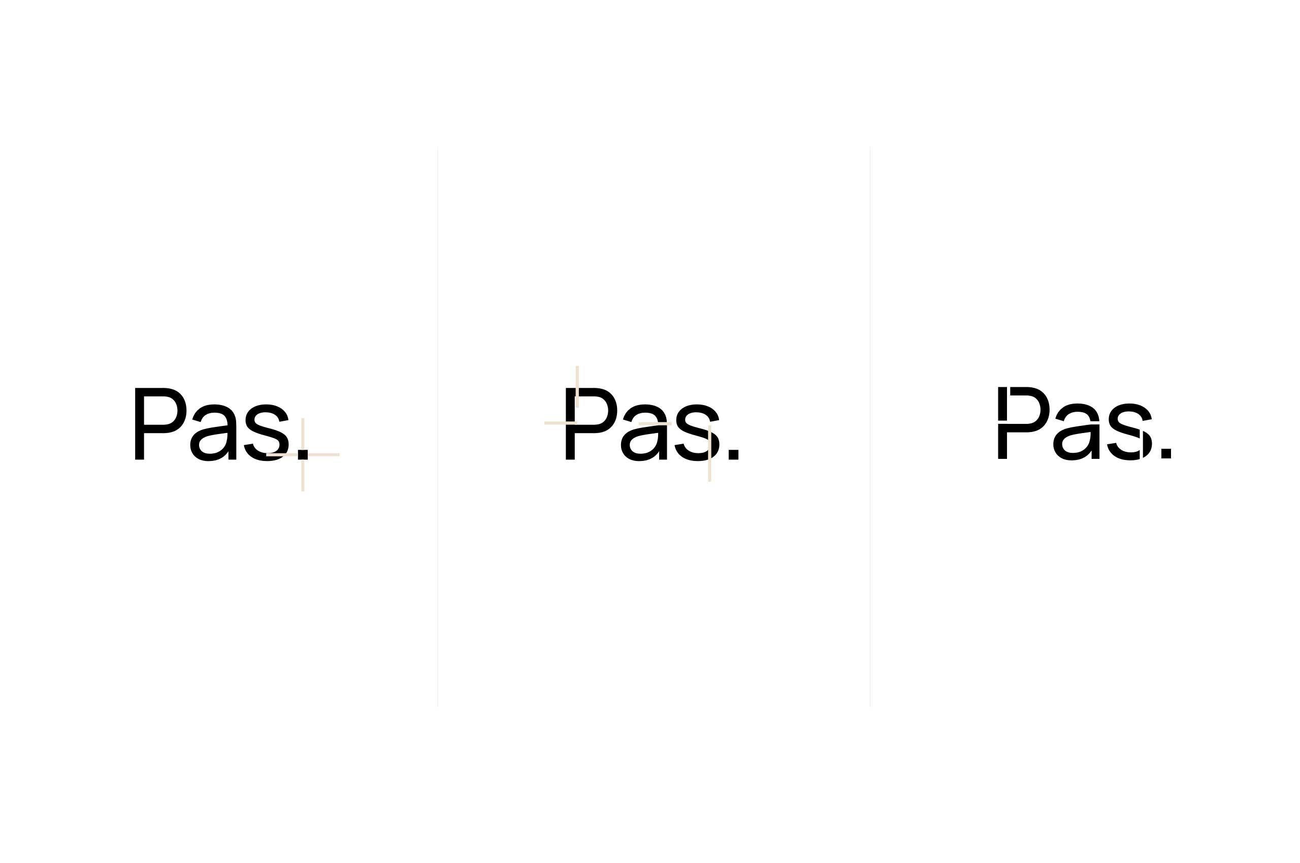
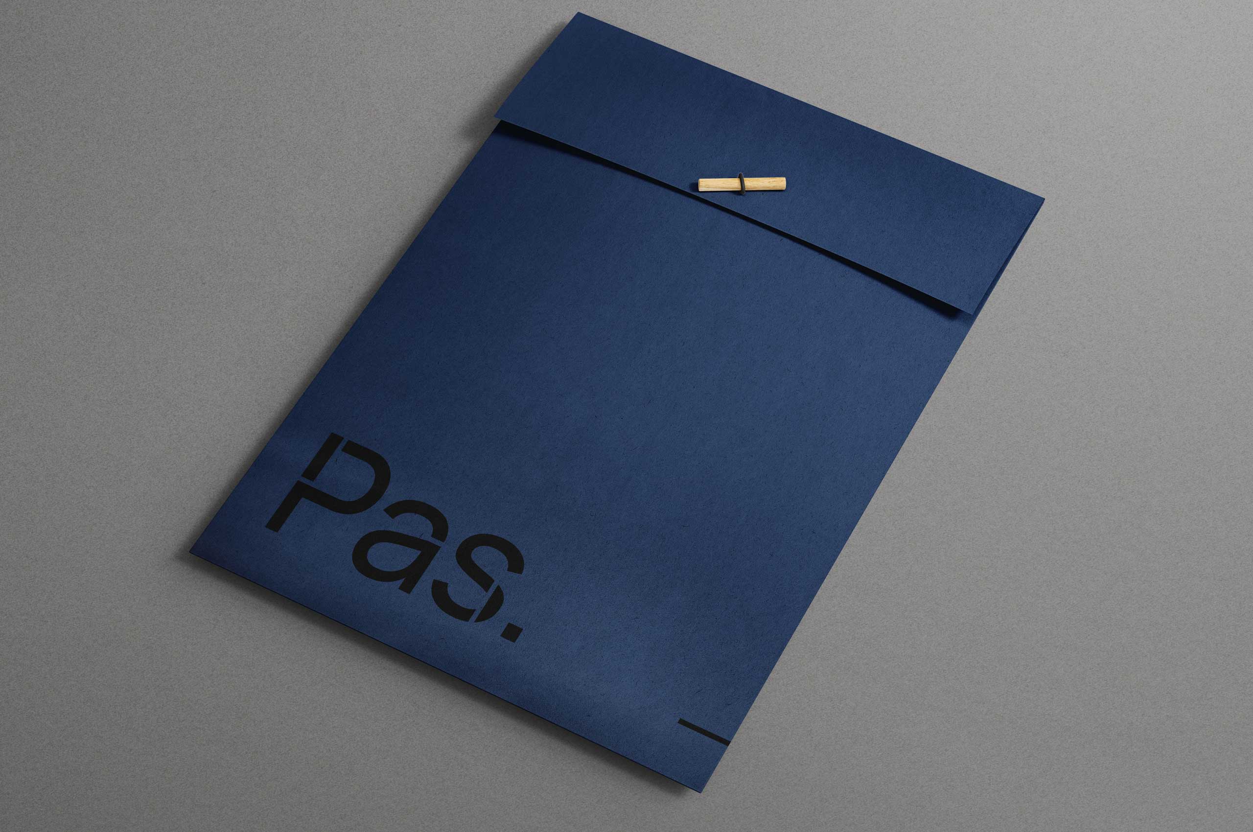
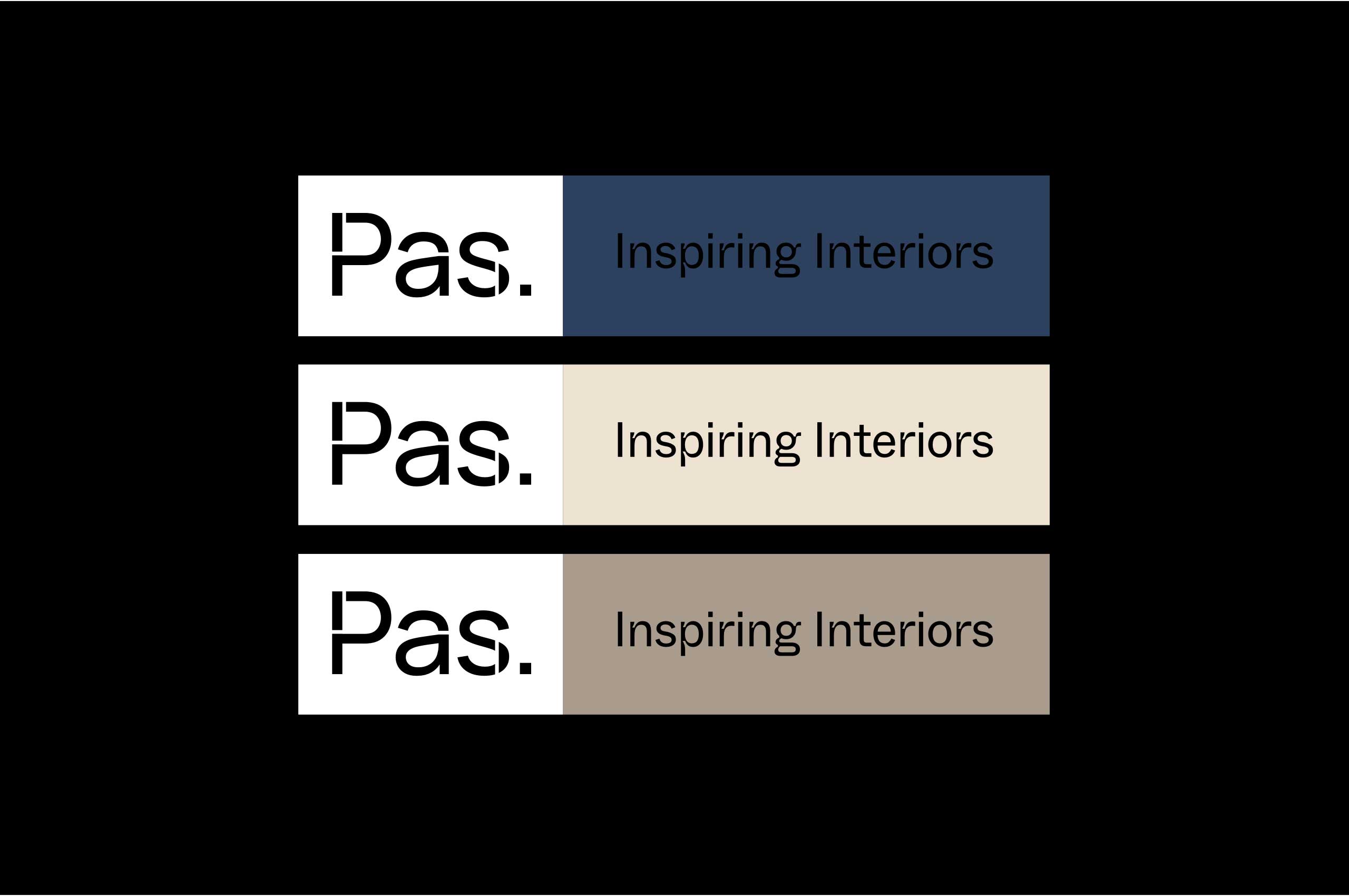
The new logo was constructed from a plus sign, which cuts the logo in half like the golden ratio, the symbol for architecture and art in the broad sense of the word.
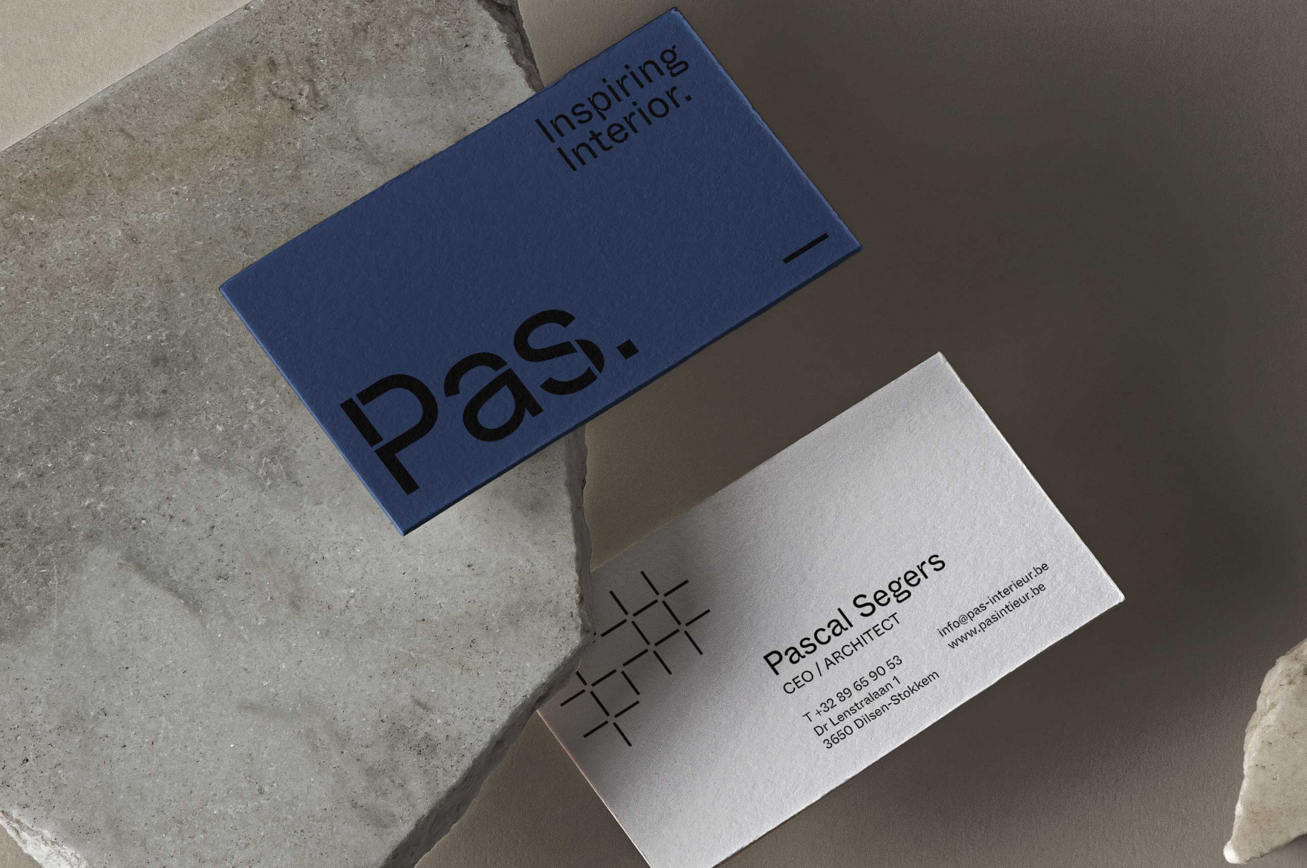
Colors
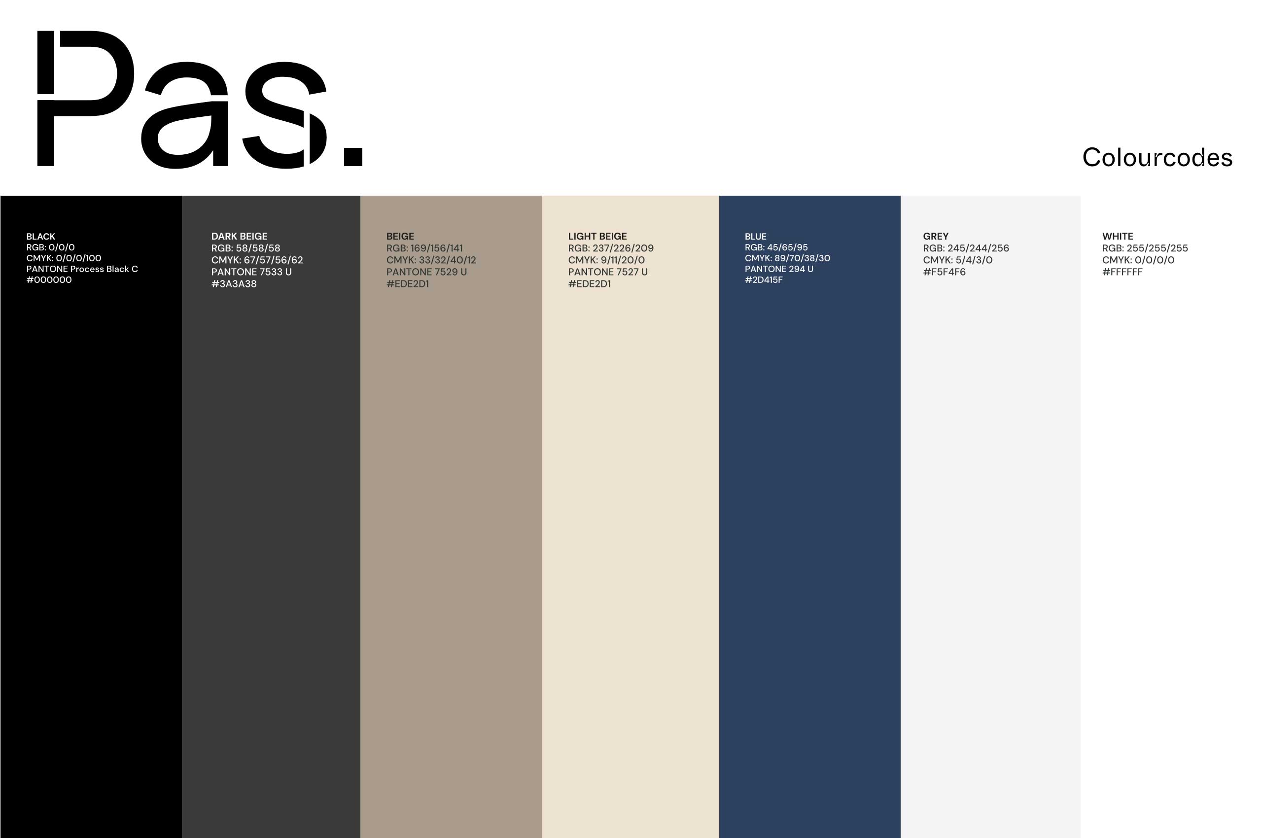
For the colors, we chose a mix between warm and cozy, without being too corny.
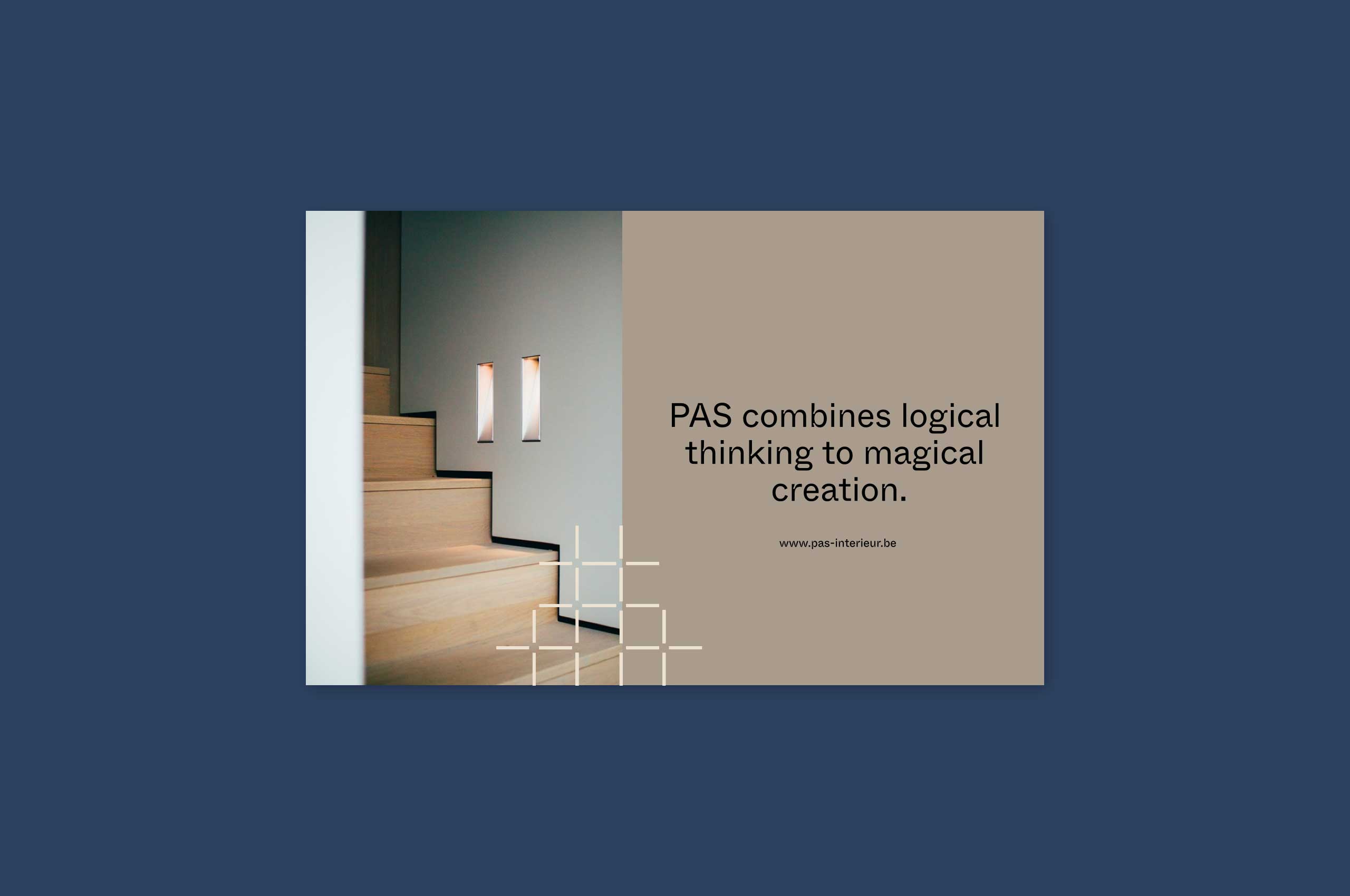

Website
The website had to be simple, yet exude atmosphere. What PAS didn’t want was another portfolio website, typical of most interior designers. To achieve this we first worked on the structure, which had to be a lot simpler and clearer.
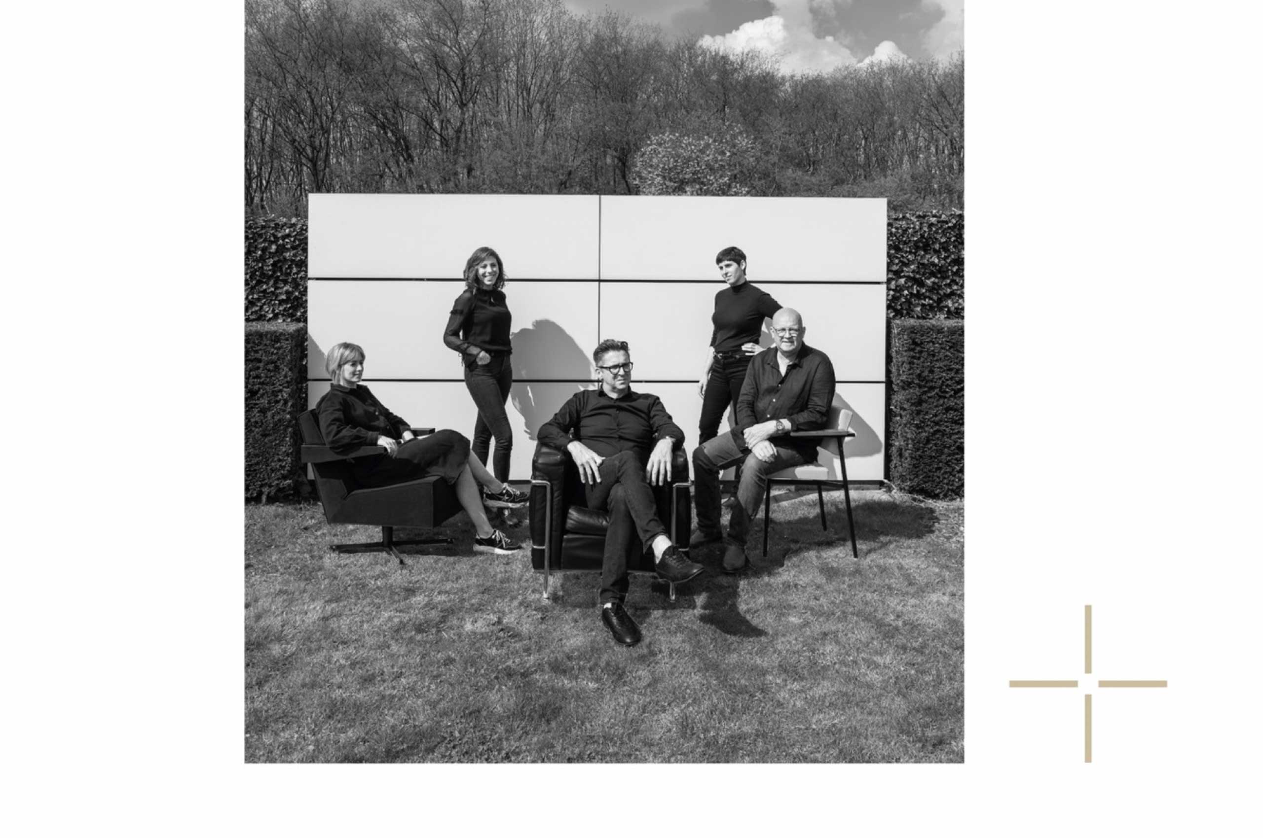
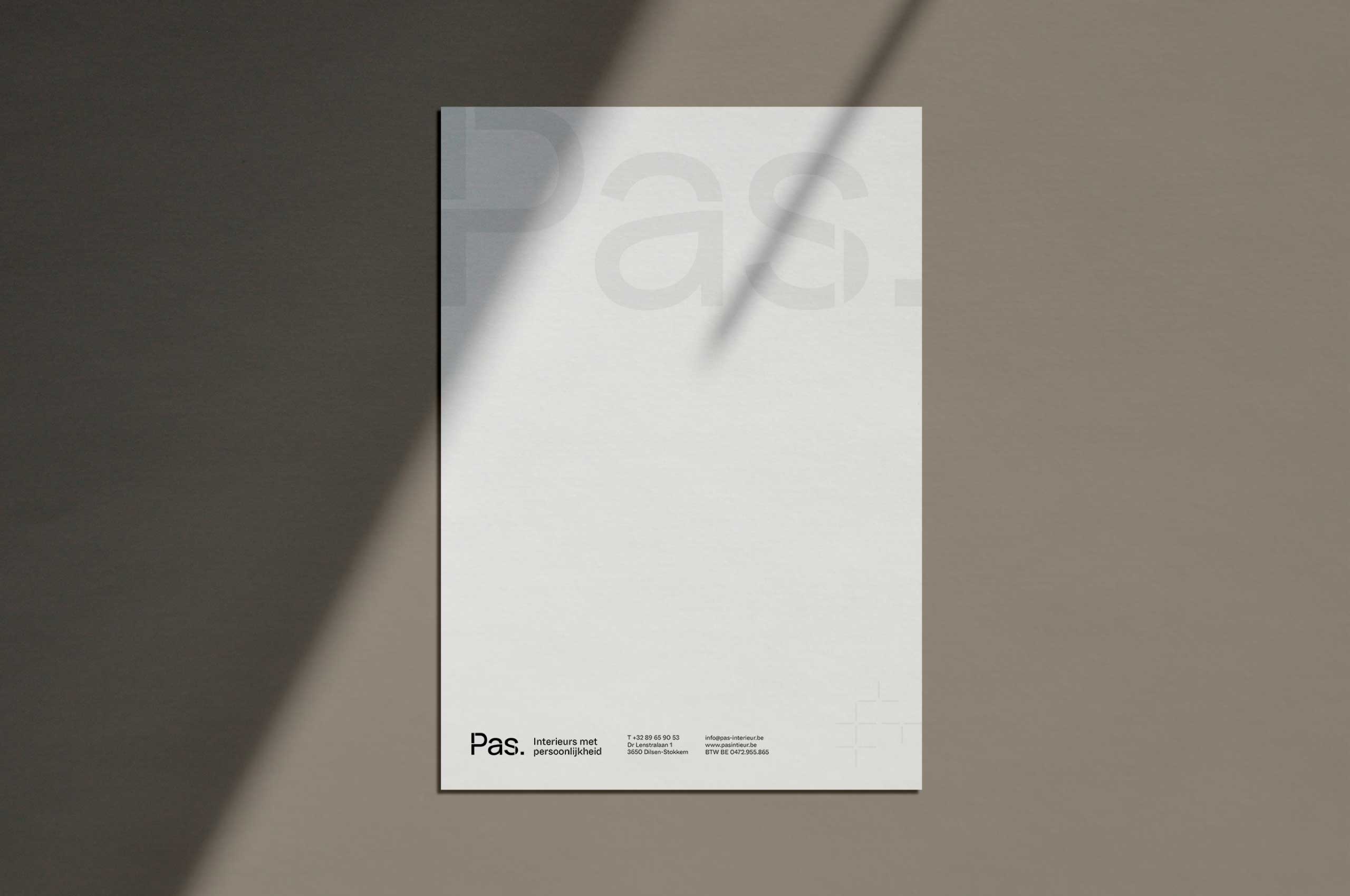
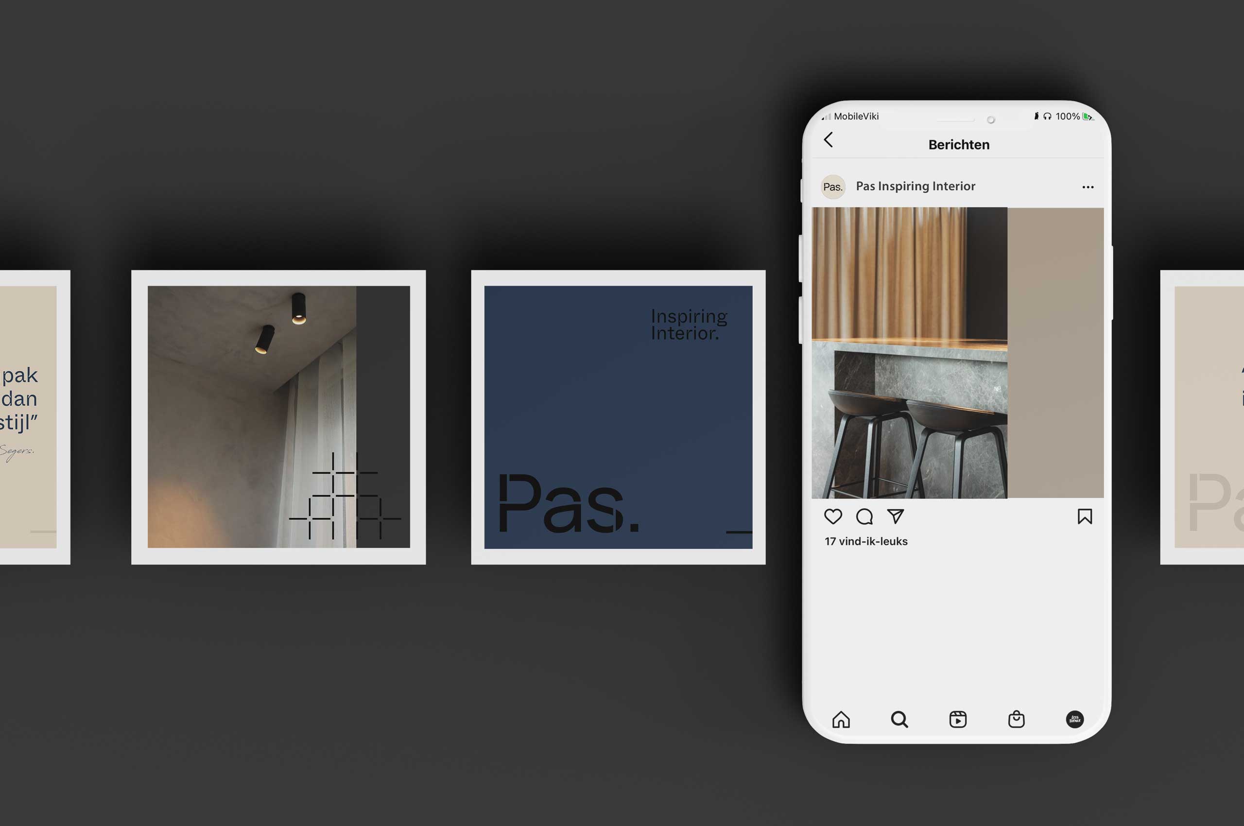
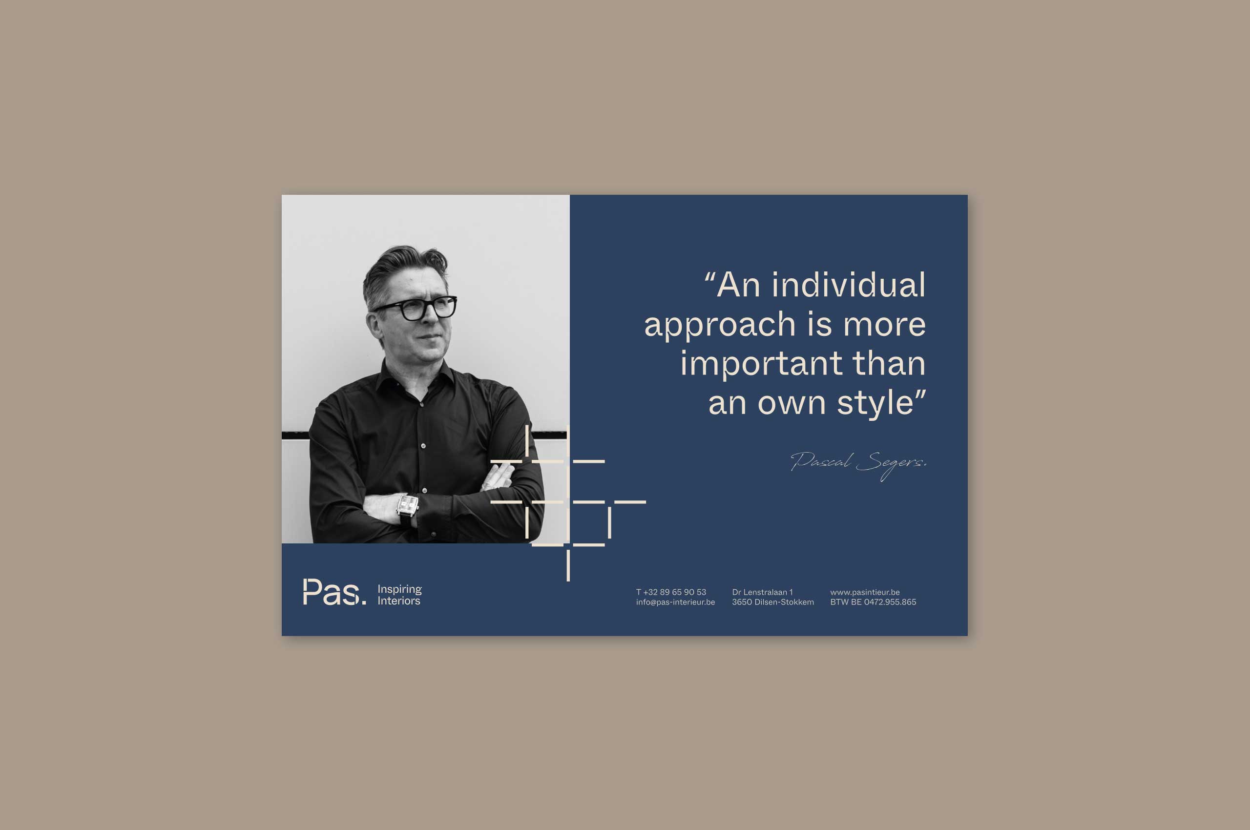
The new brand identity ensures that PAS today communicates a lot more clearly, has the right look and feel and thus attracts the right target group for their high-profile interior projects.
