RITCS & KCB
REBRANDING & BRAND ARCHITECTURE
RITCS and KCB are renowned academies that have yielded some of Europe’s most incredible talent. As such, this project presented us with two different challenges:
Revamp both brands’ visual appeal and presentation.
Create a visual system that represents the brand architecture, logically connecting the different brands (EhB, RITCS and KCB).
Website RITCS
www.ritcs.be
Website KCB
www.kcb.be
Logos: starting point
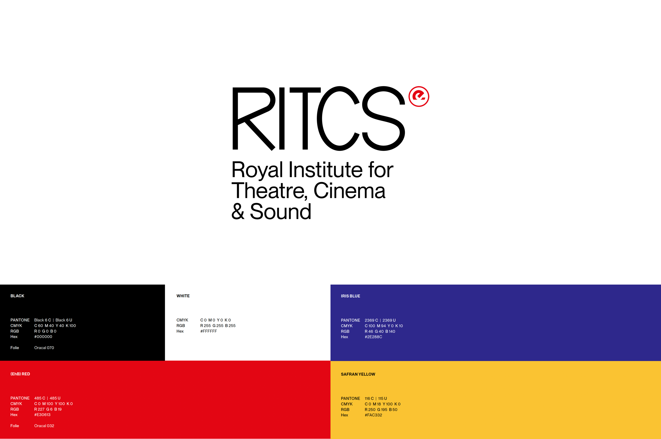
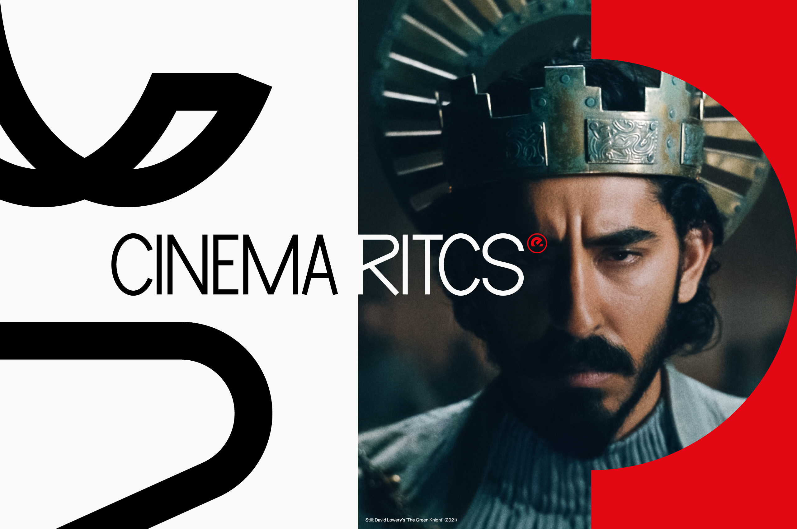
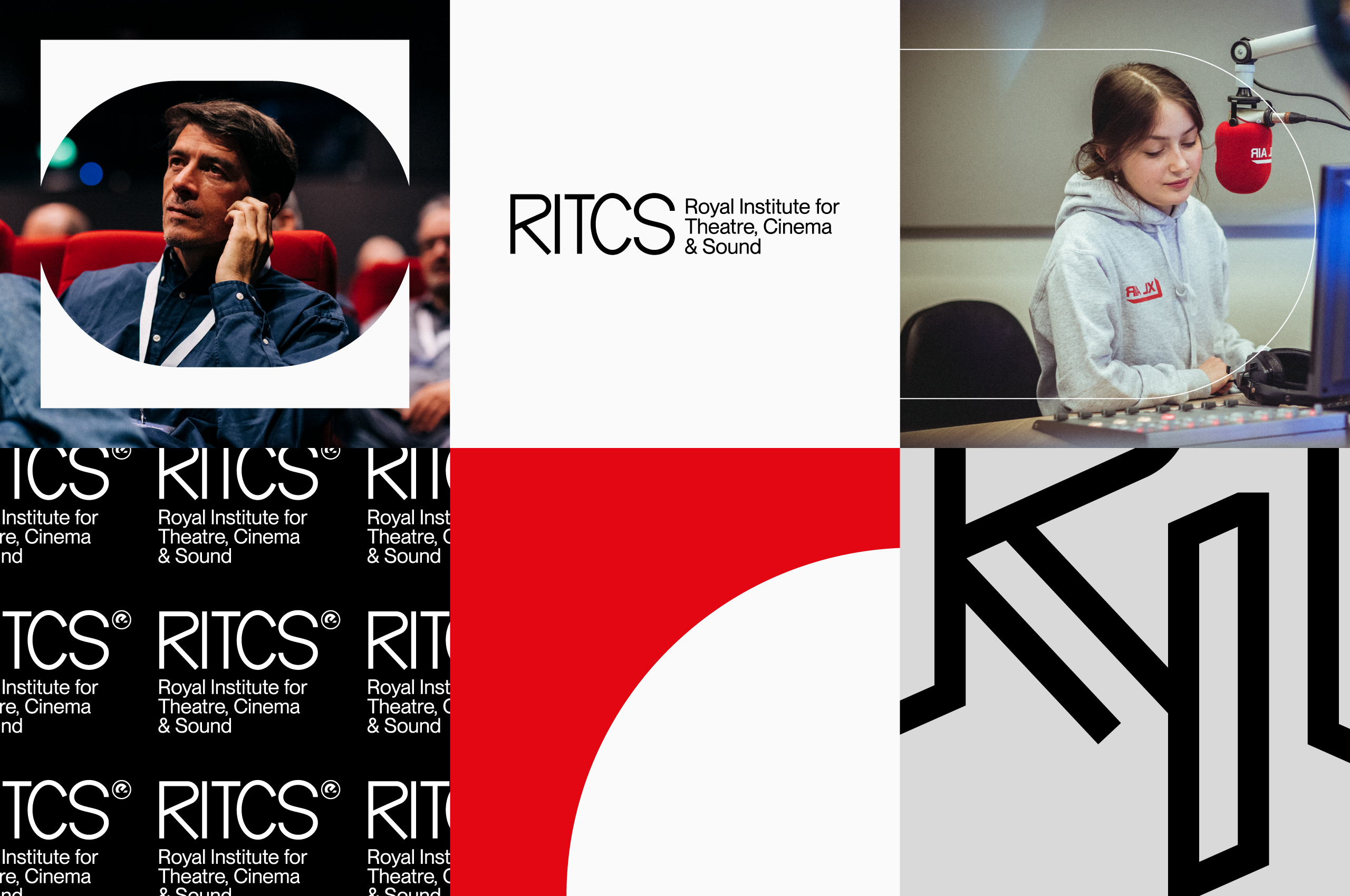
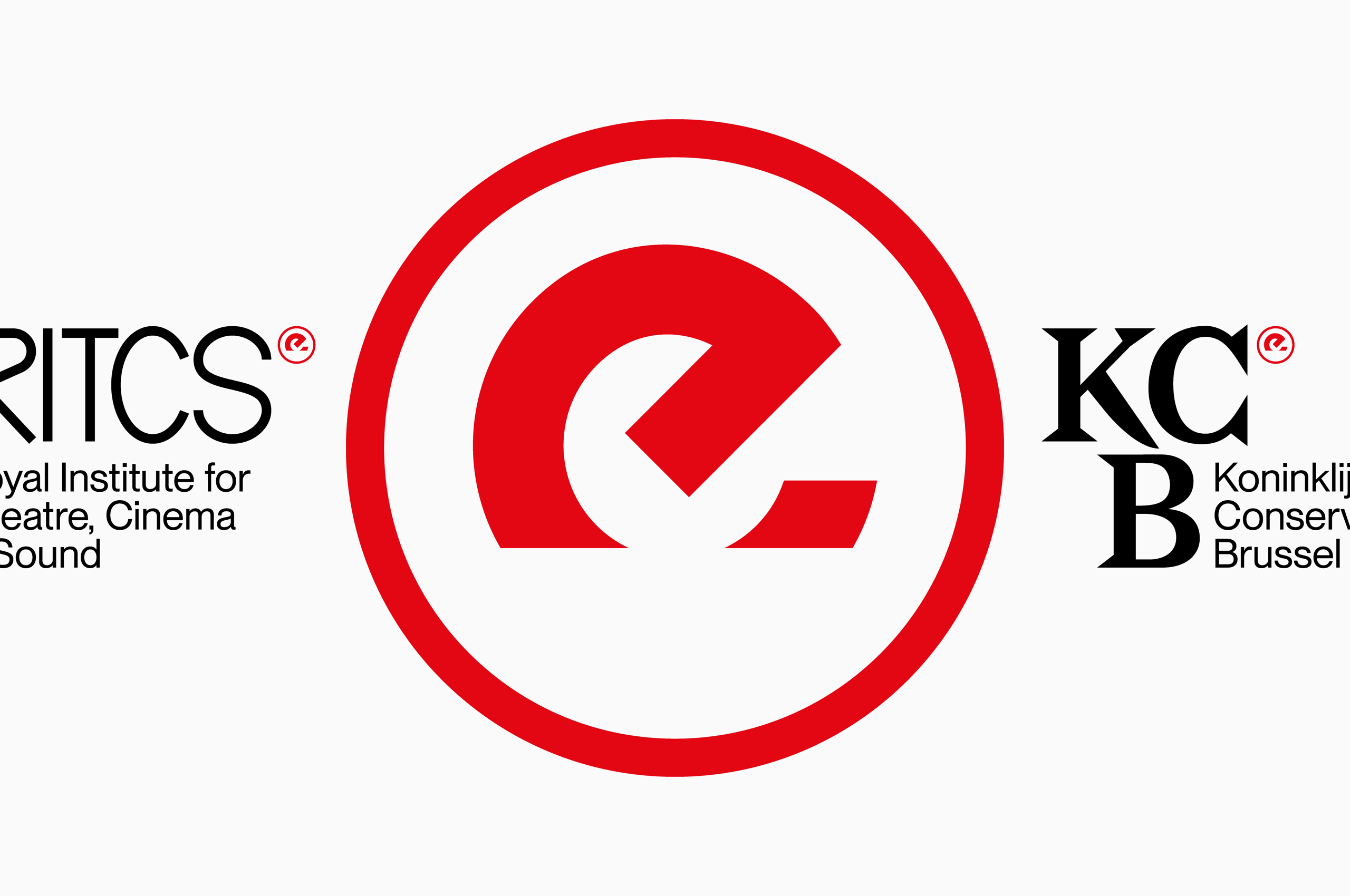
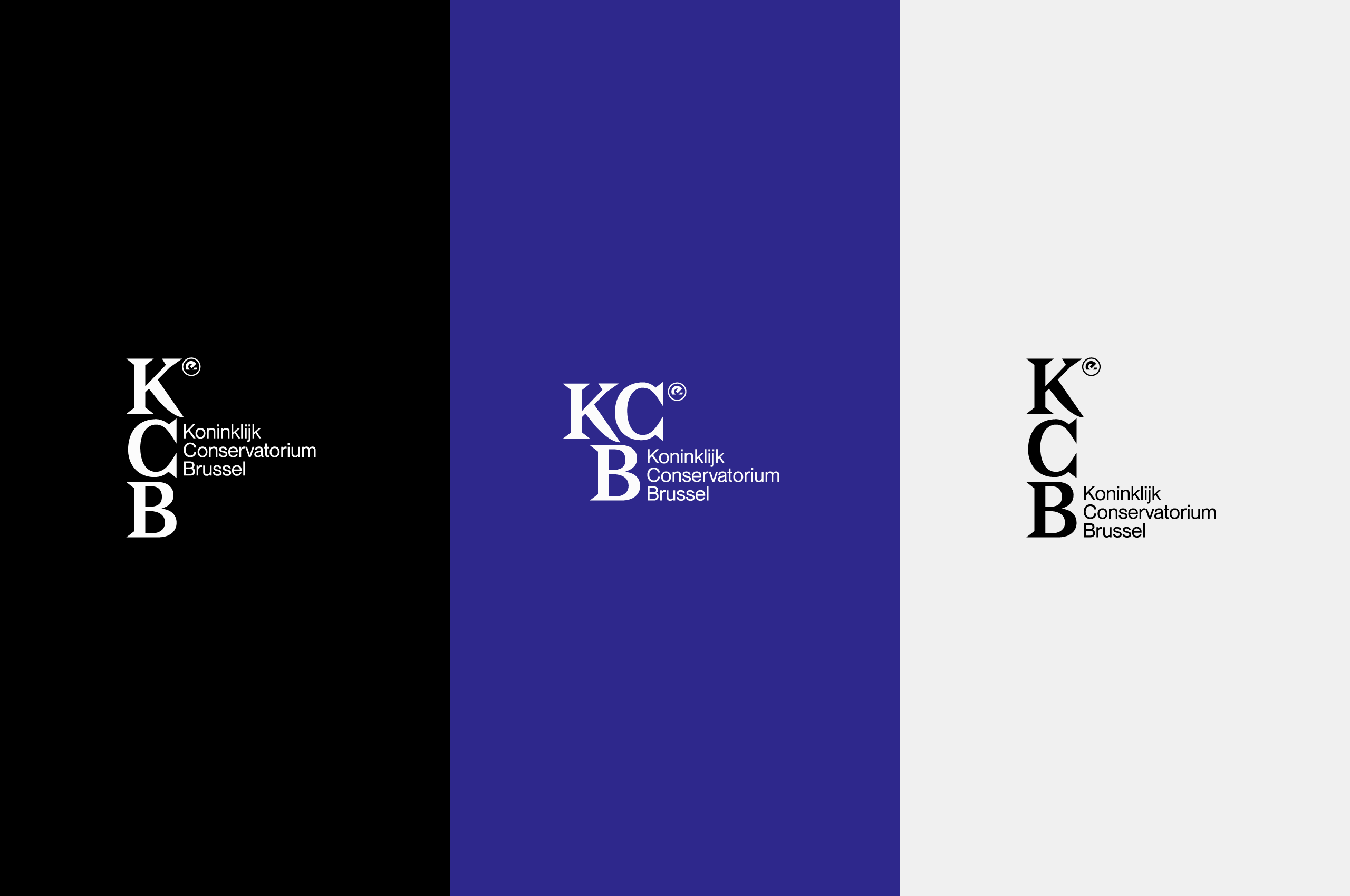
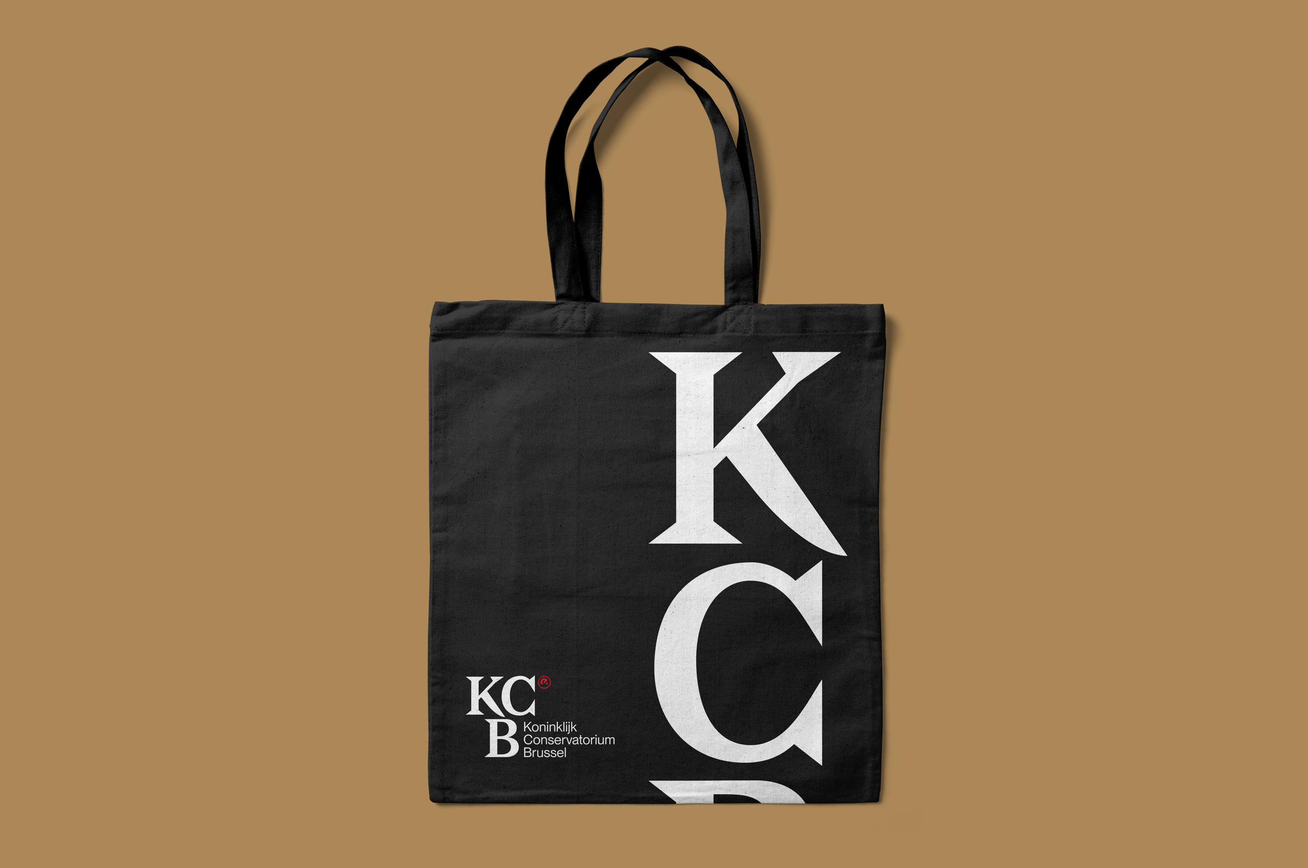
We decided to give the logo's a little bit more personality and individuality while at the same time reinforcing the link between them. By turning the existing parent company’s logo (EhB) into a sort of ‘copyright-symbol’, we created a subtle yet ever present visual connection.
Color palettes
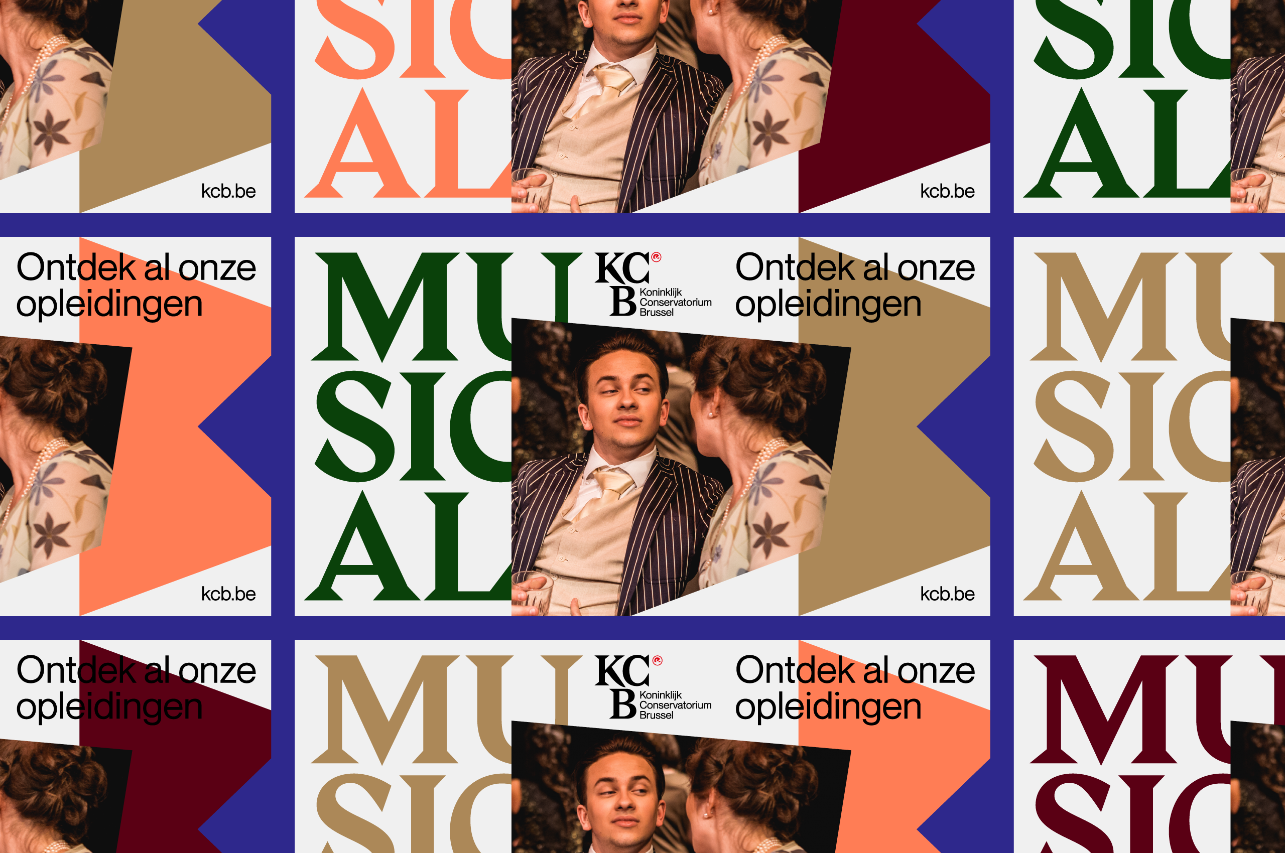
Continuing the mission to balance out each school's unique personality and the relationship between them, we selected several shared base colors and added a couple of unique ones to each as well.
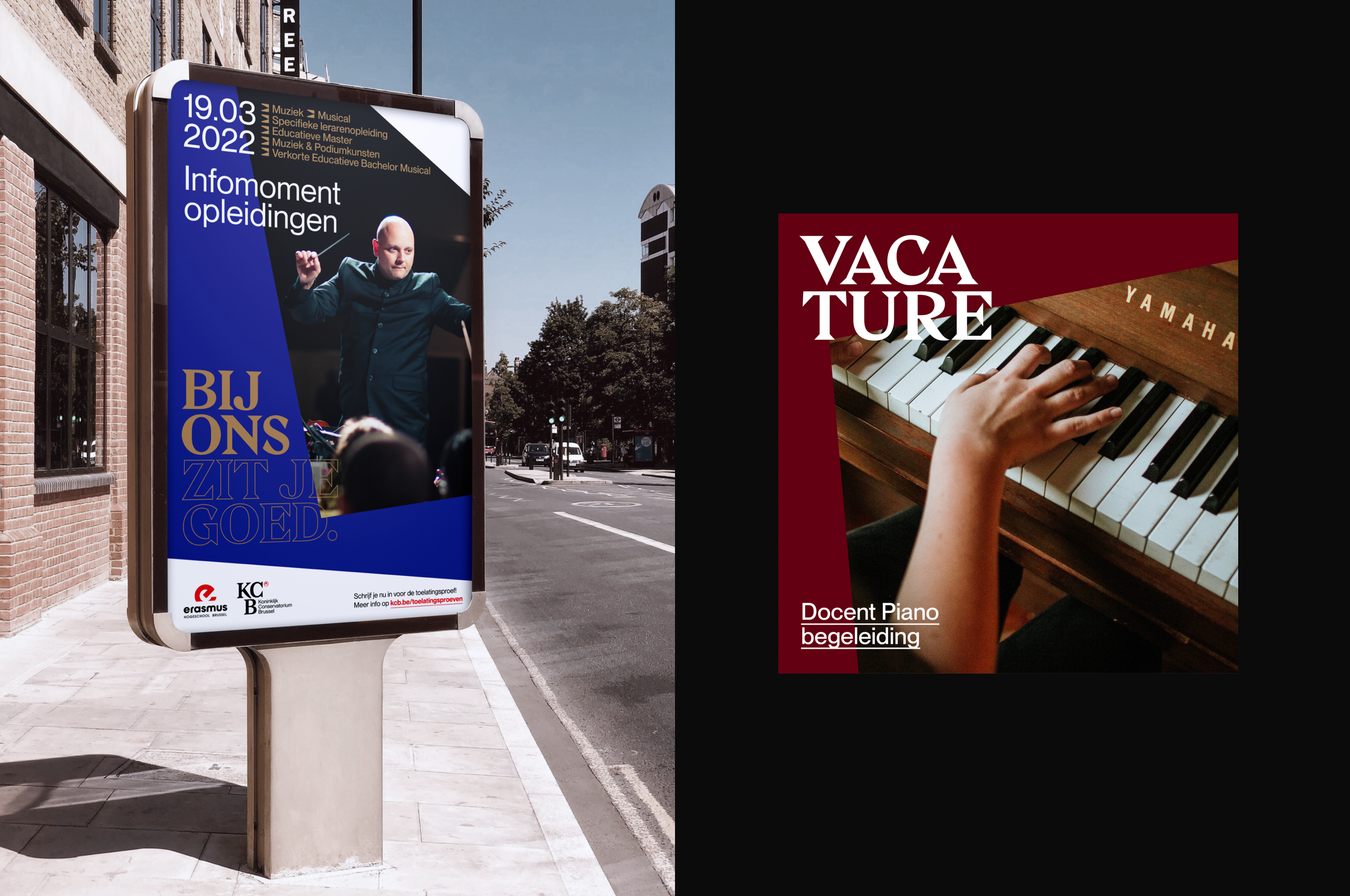
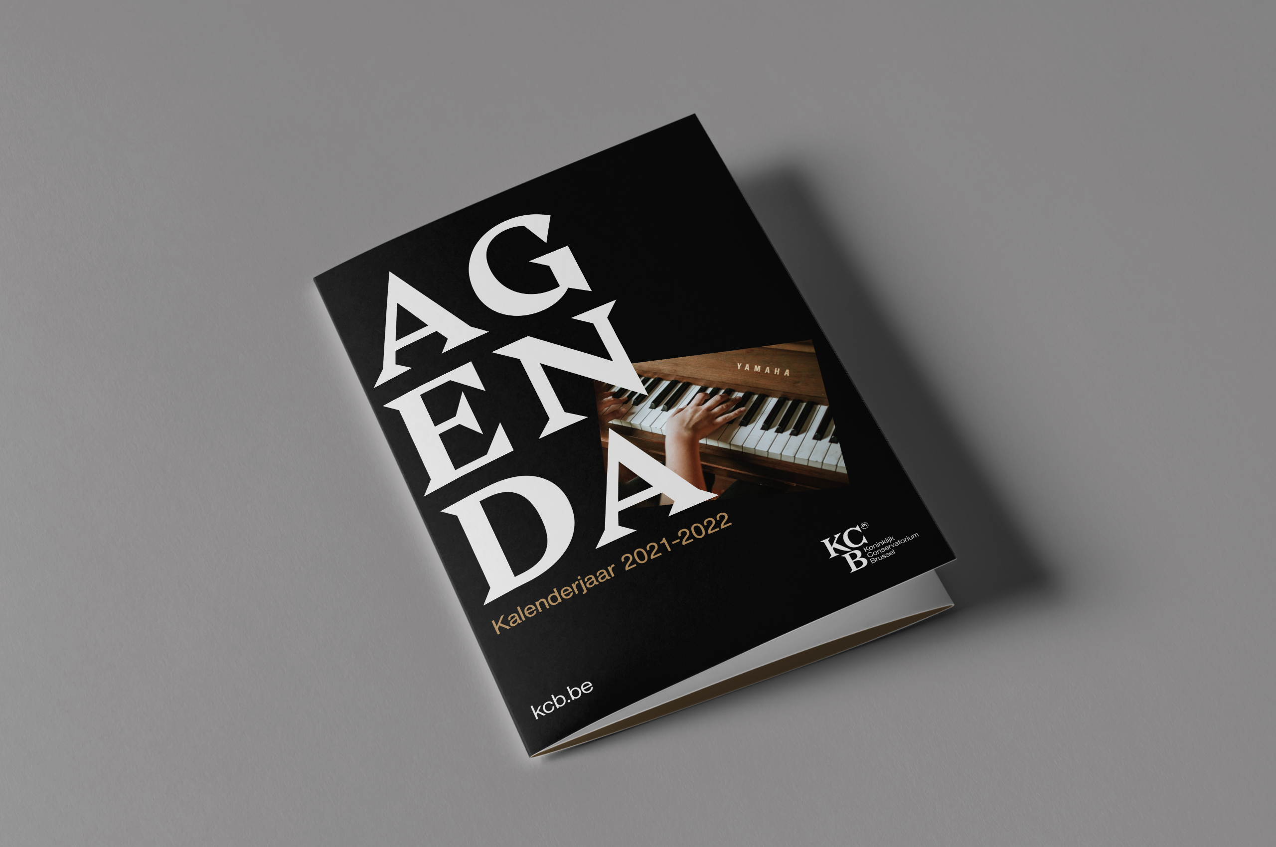
The burgundy and bronze for KCB evokes an appropriate regal feel and mentally connects to classic theater surroundings and brass instrument sections. For RITCS, it’s a burst of yellow that accentuates their slightly more modern approach to the performing arts.

Graphic elements
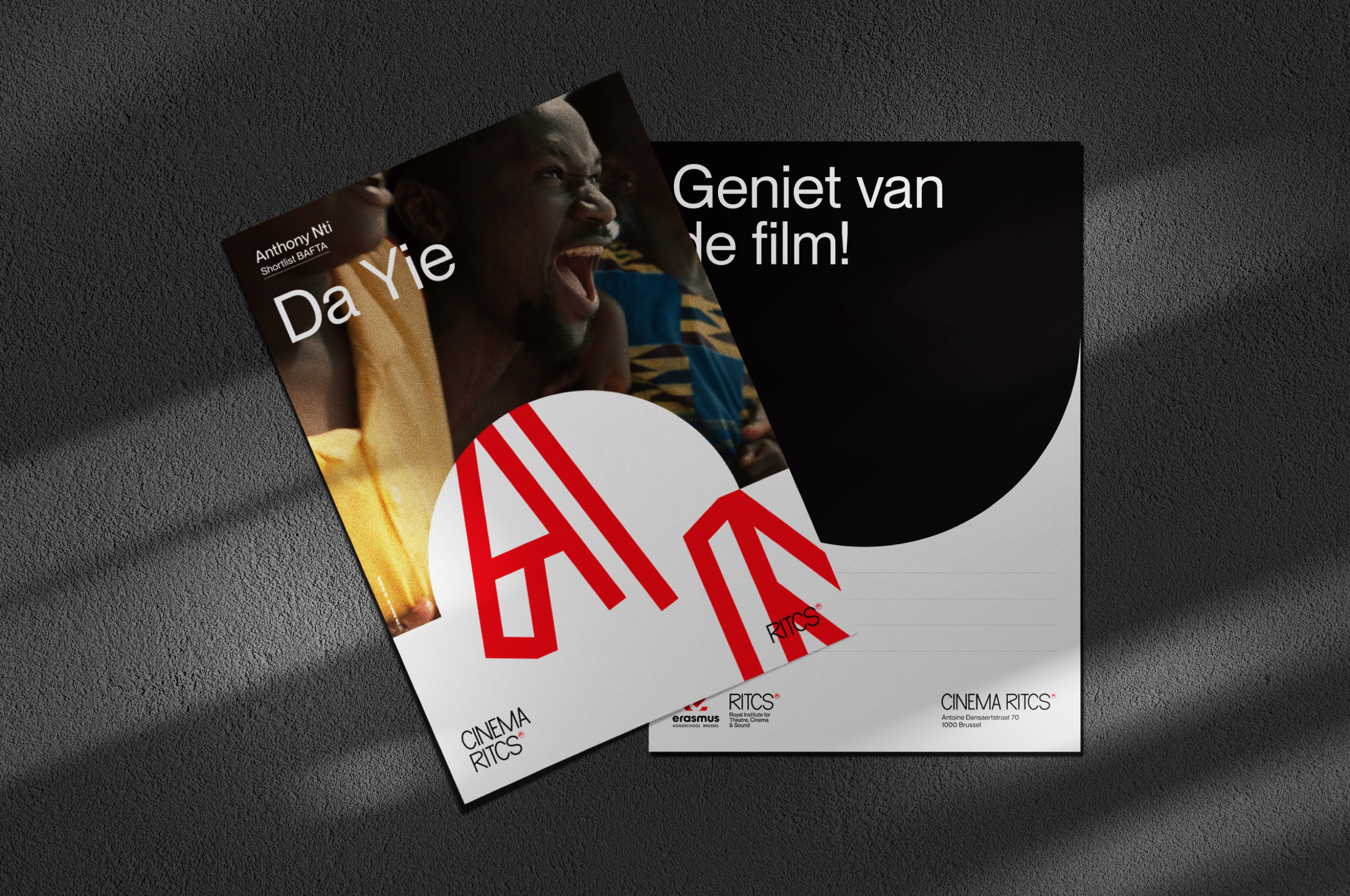
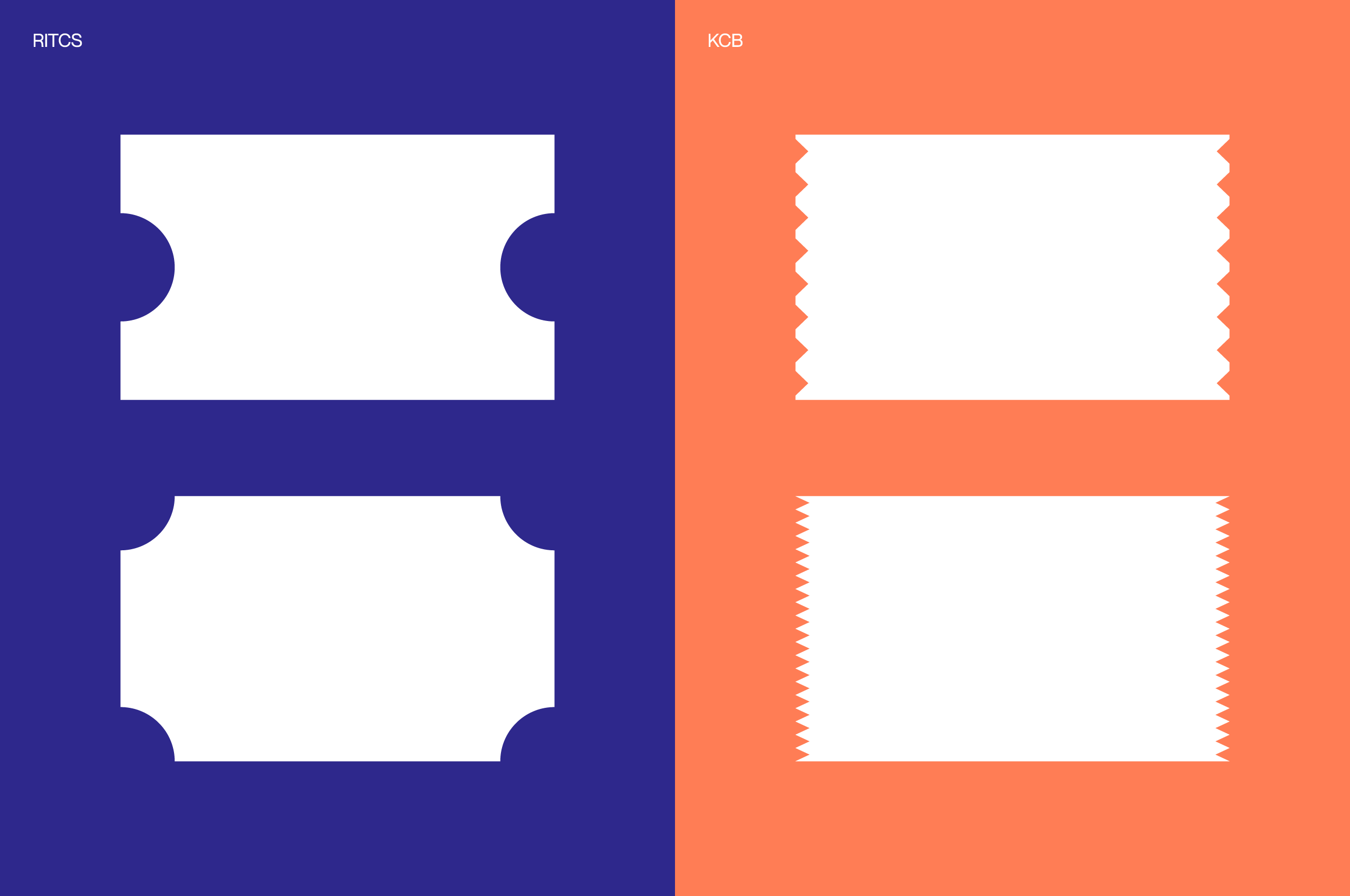
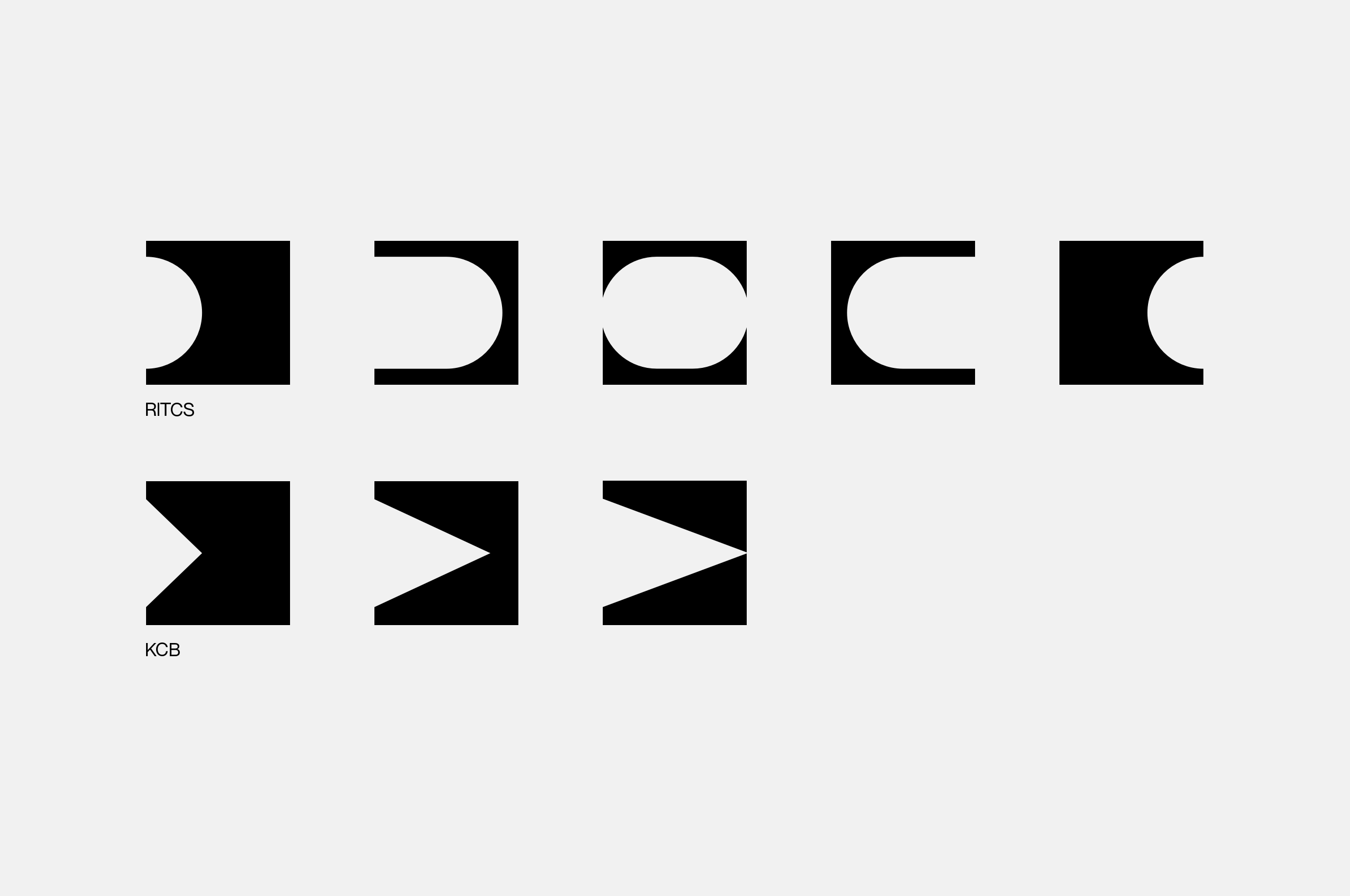
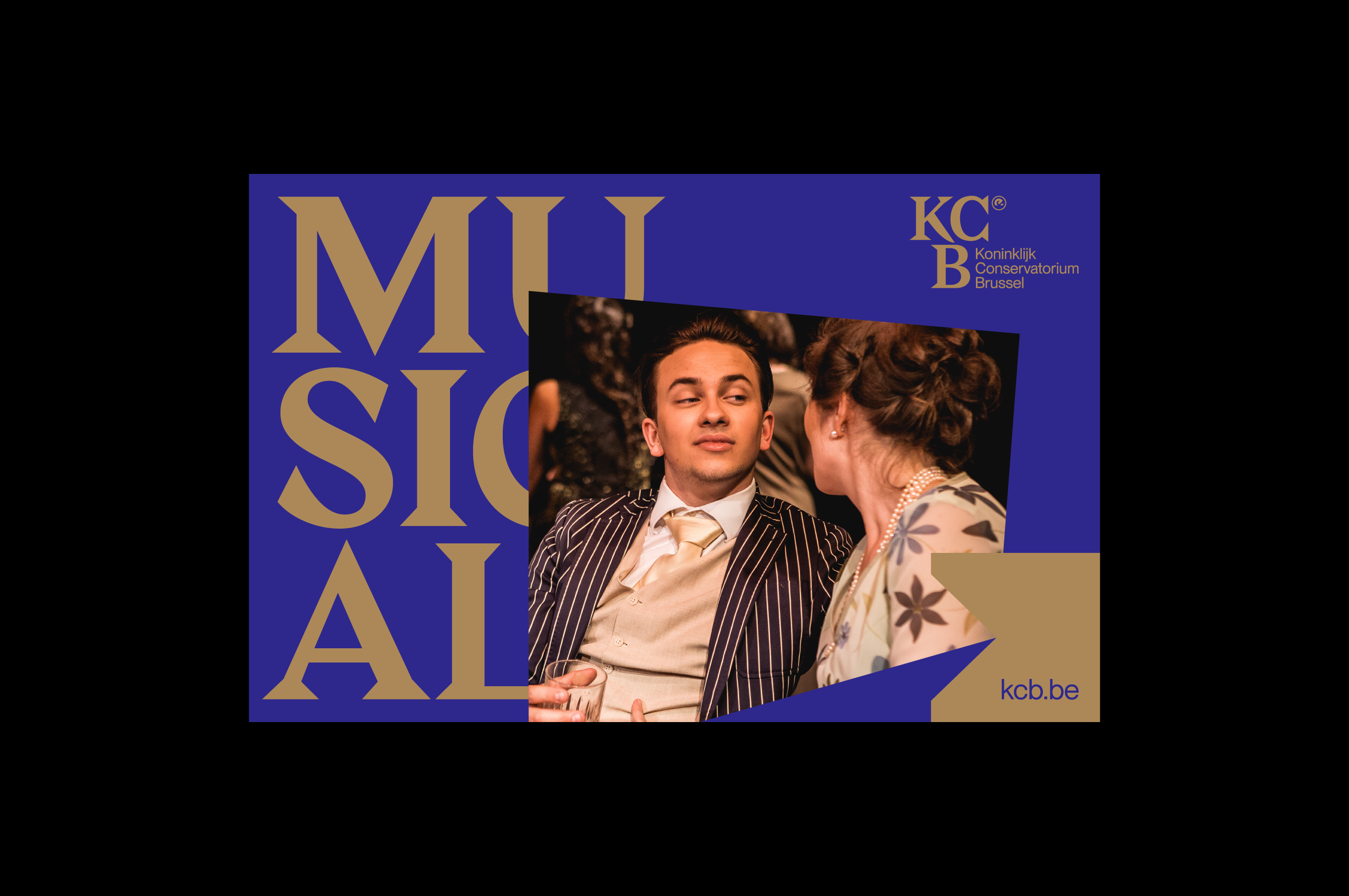
Inspired by old-school theatre tickets, we derived a set of abstract graphic elements that add a particular dynamic to the whole.
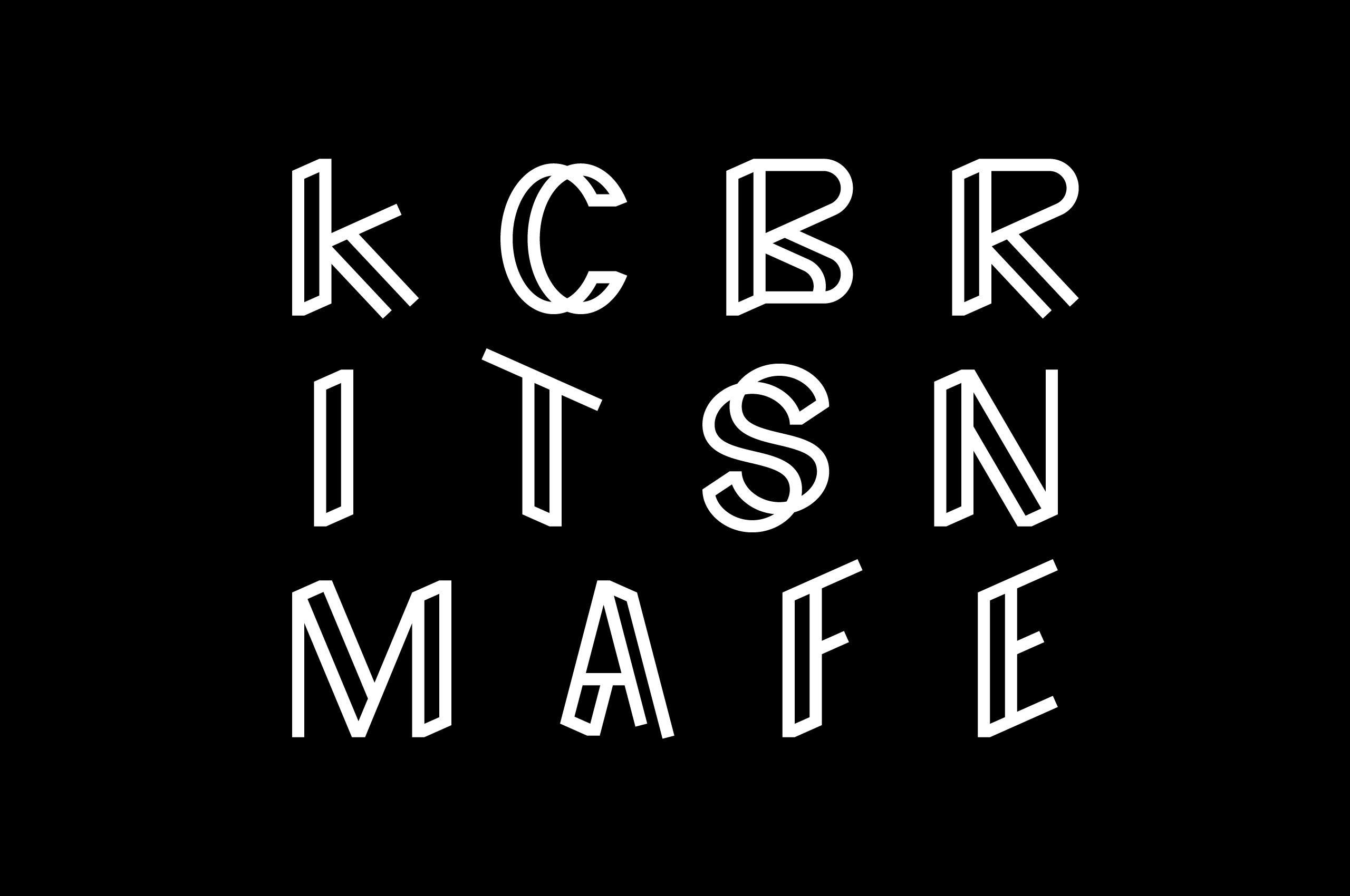
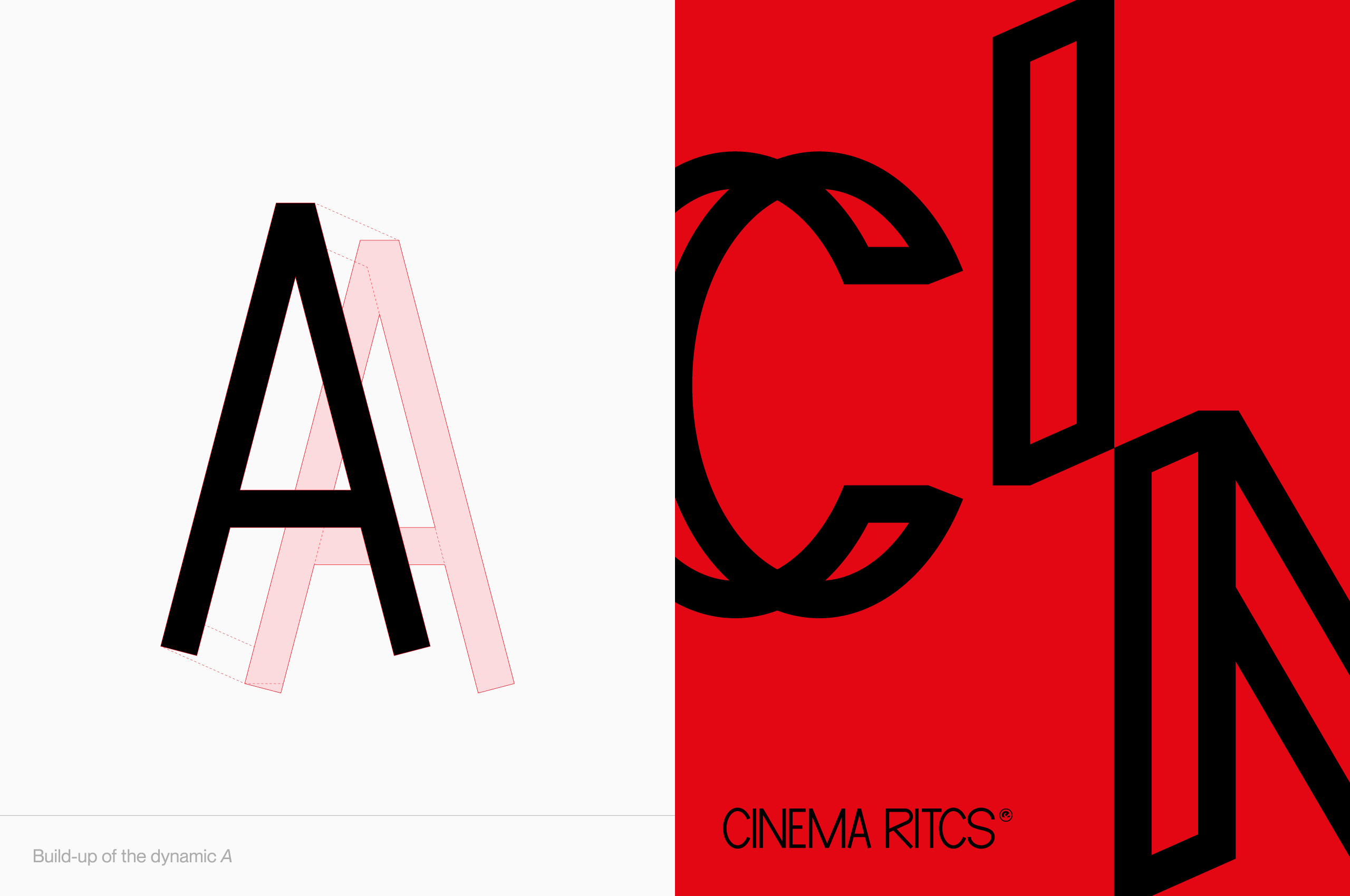
Decorative typography
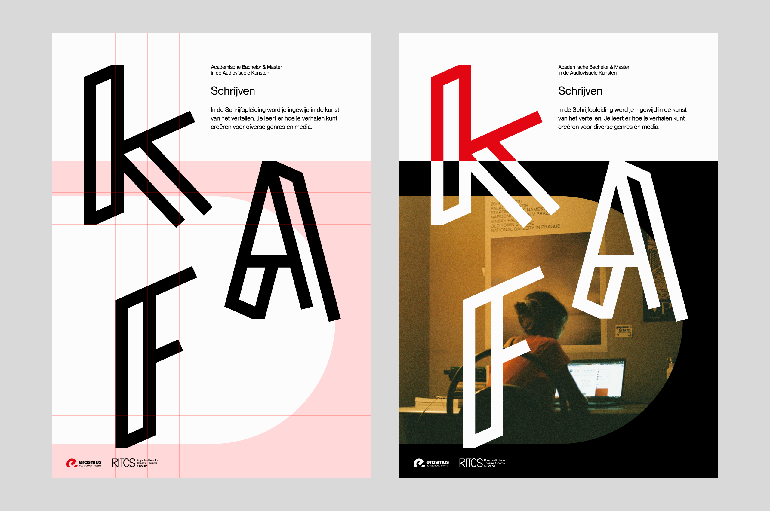
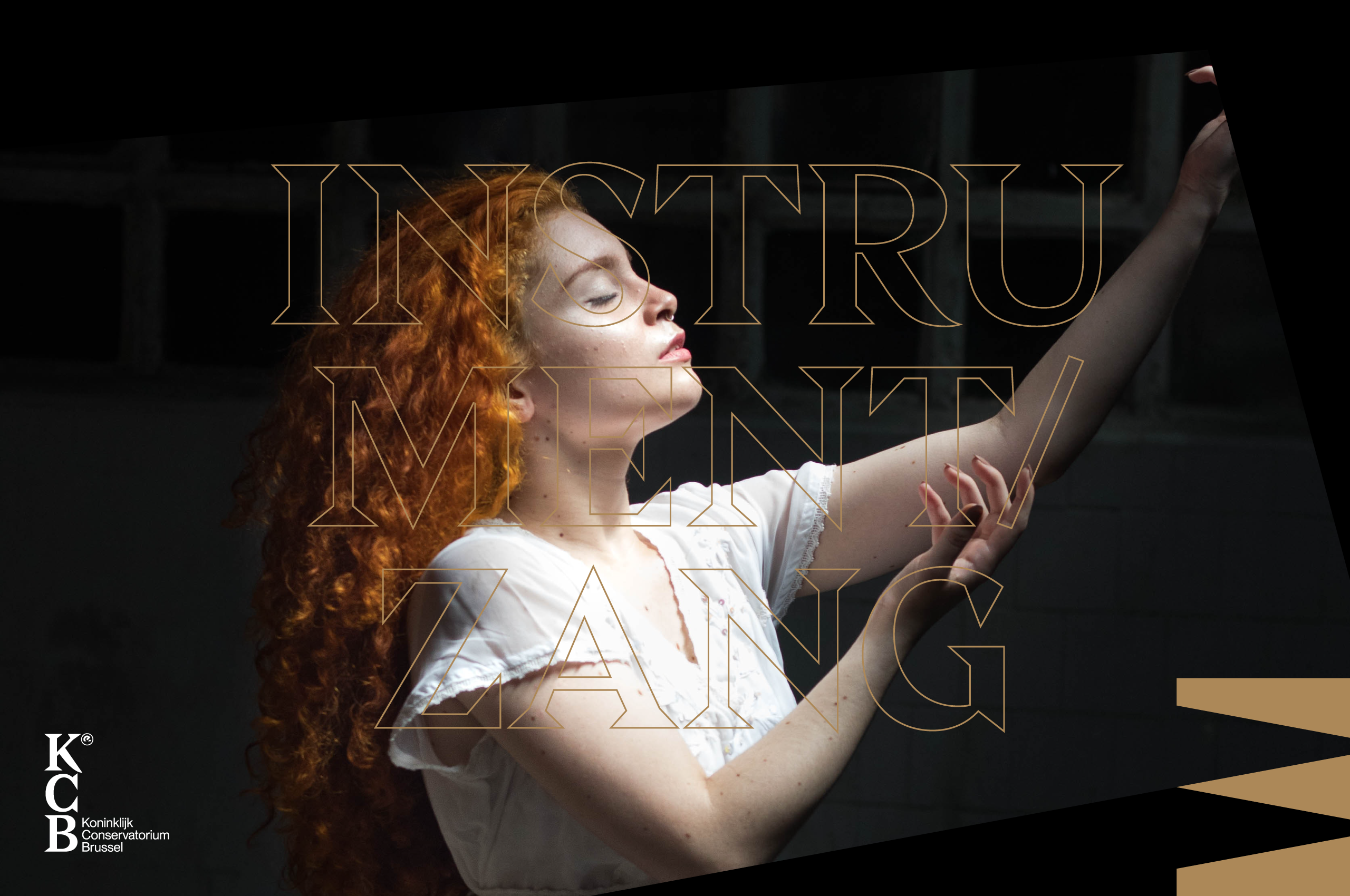
Both brands make use of typographic decorations, finding unison in approach. Yet each has its own unique style. For RITCS we even designed a complete unique letterset.
With a brand identity that is as much contemporary as it is timeless, we’ve helped RITCS & KCB to start being perceived as the exceptional schools they are.
