Sfar
REBRANDING & WEBDESIGN
Sfar architects almost exists a decade. This is the ideal moment to perfect their new branding. The conditions? Everything has to look professional & inspirational. And there must be a clear identity, that reflects Sfar's core values.
Webdevelopment
Clicketyclick
Website
sfar.be
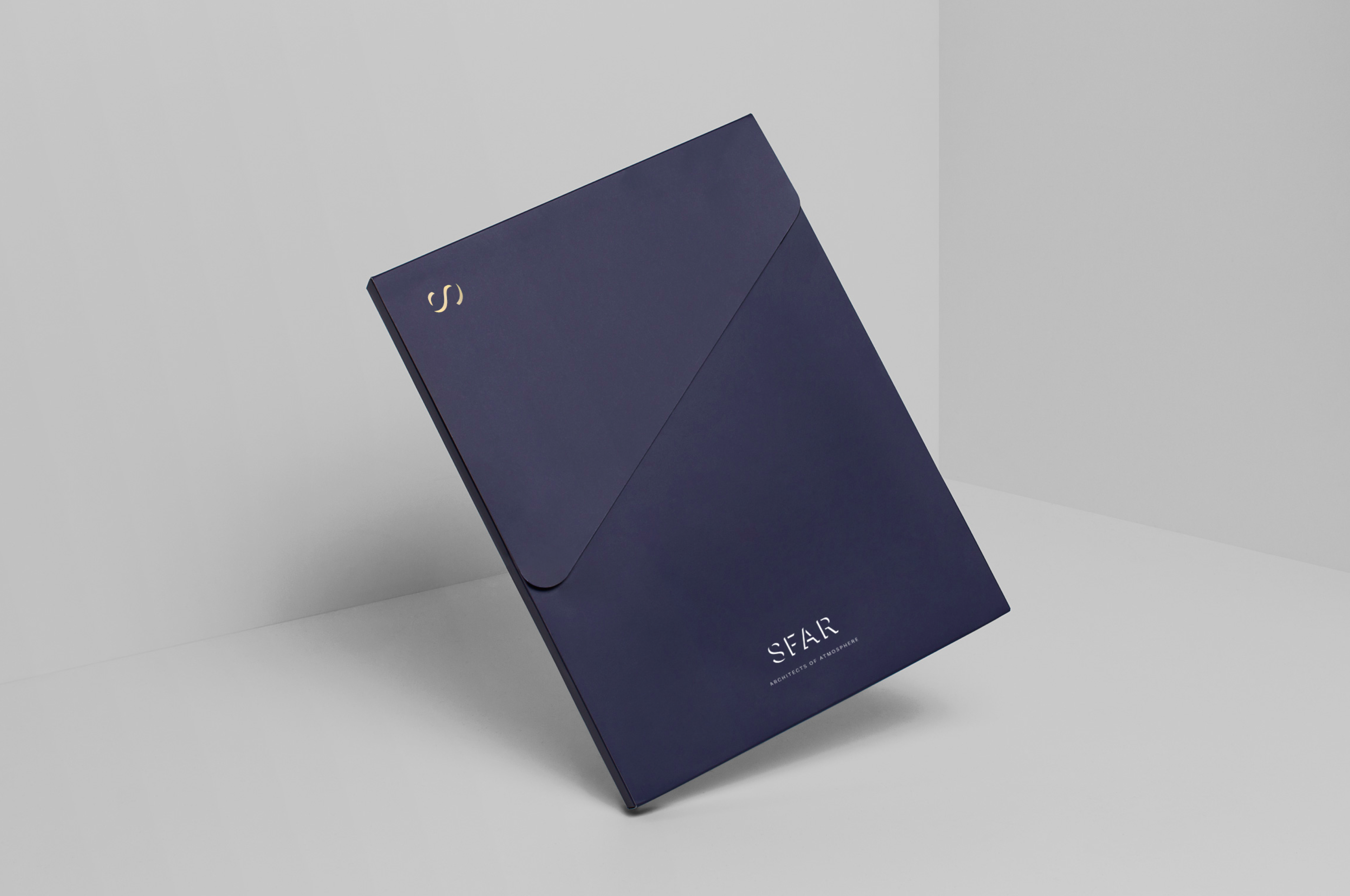
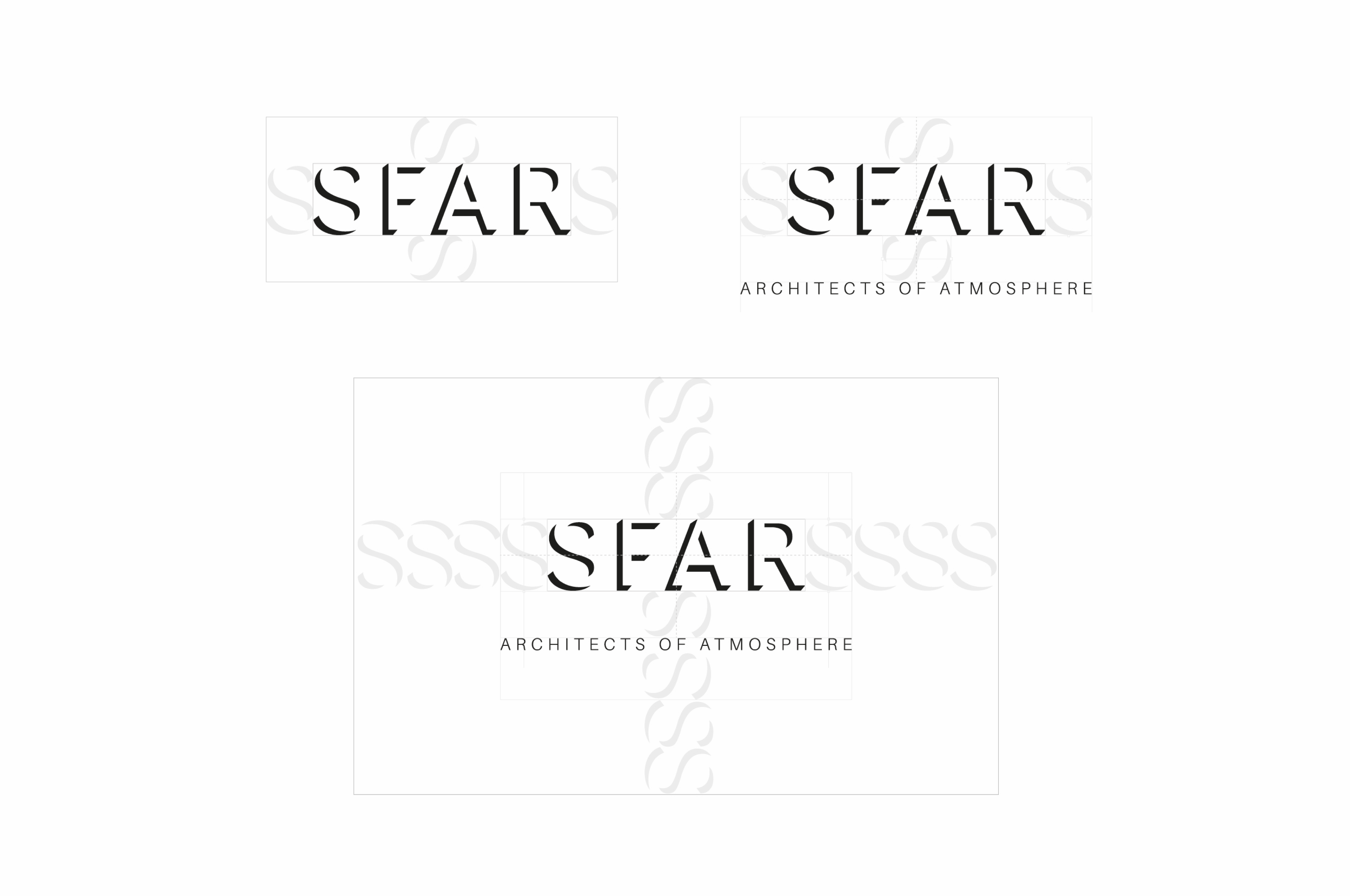
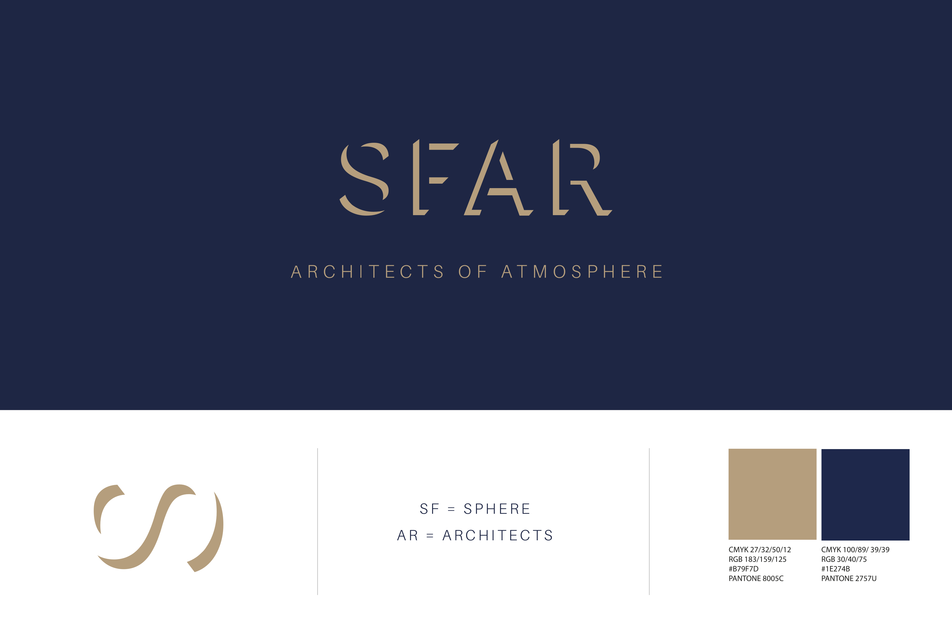
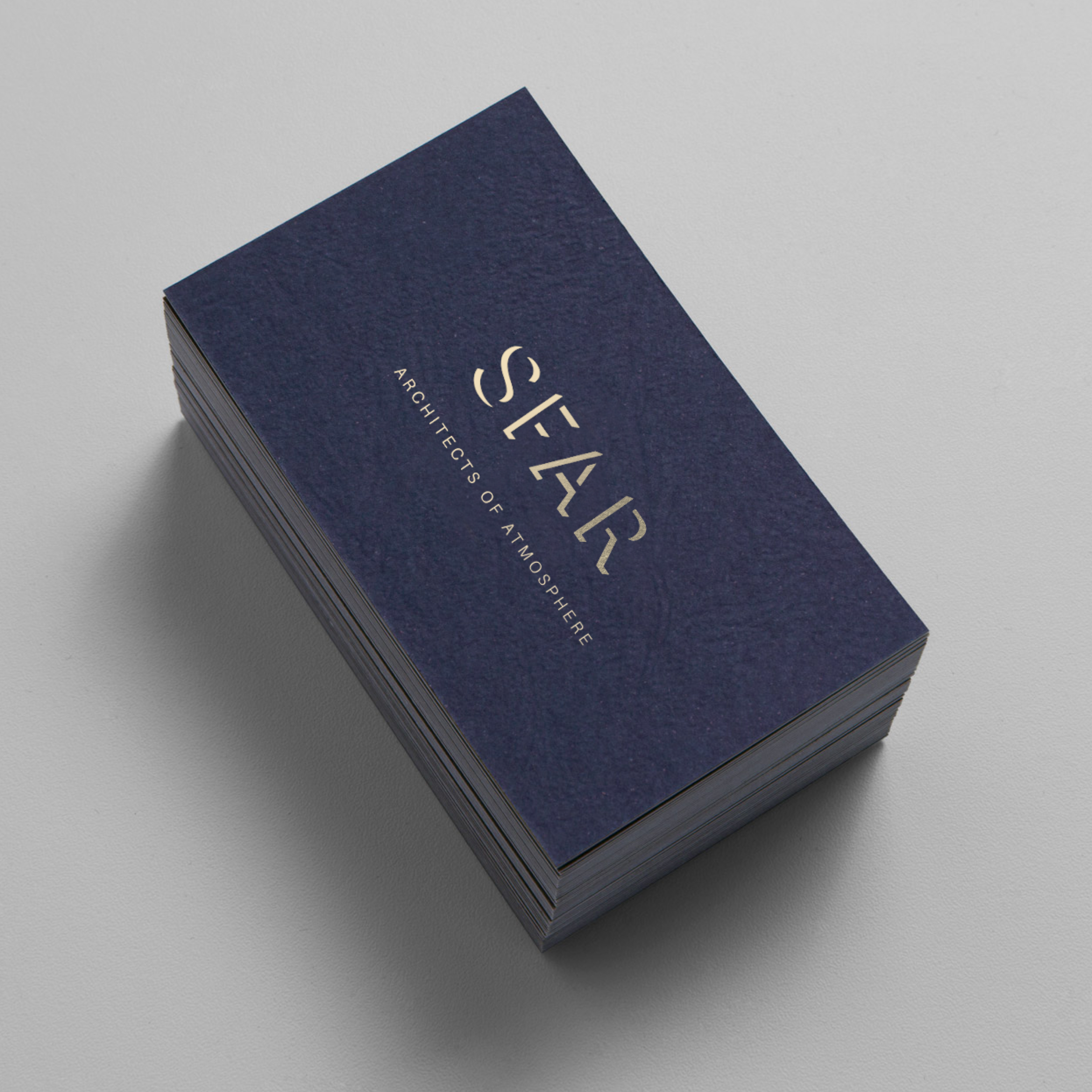
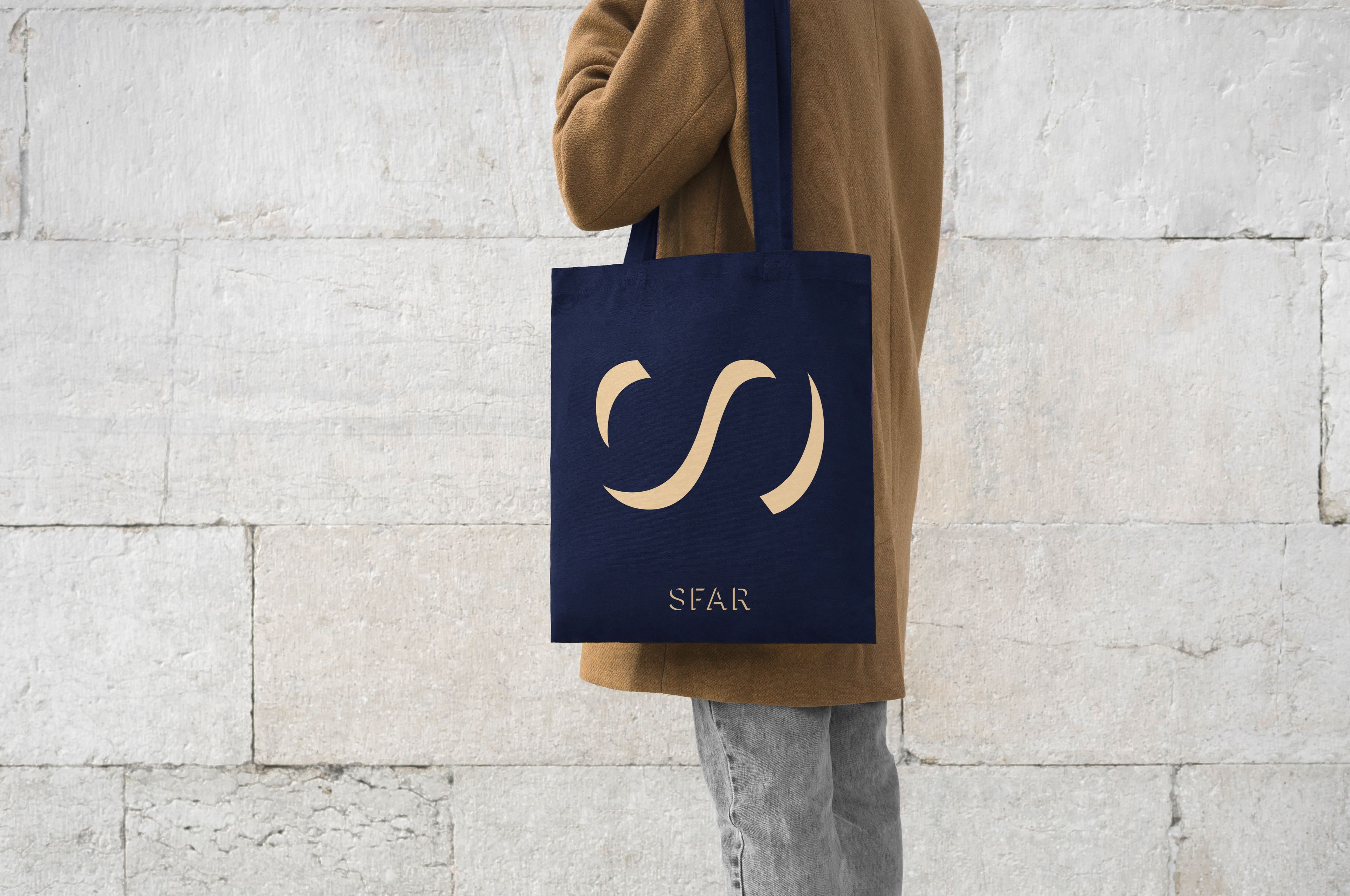
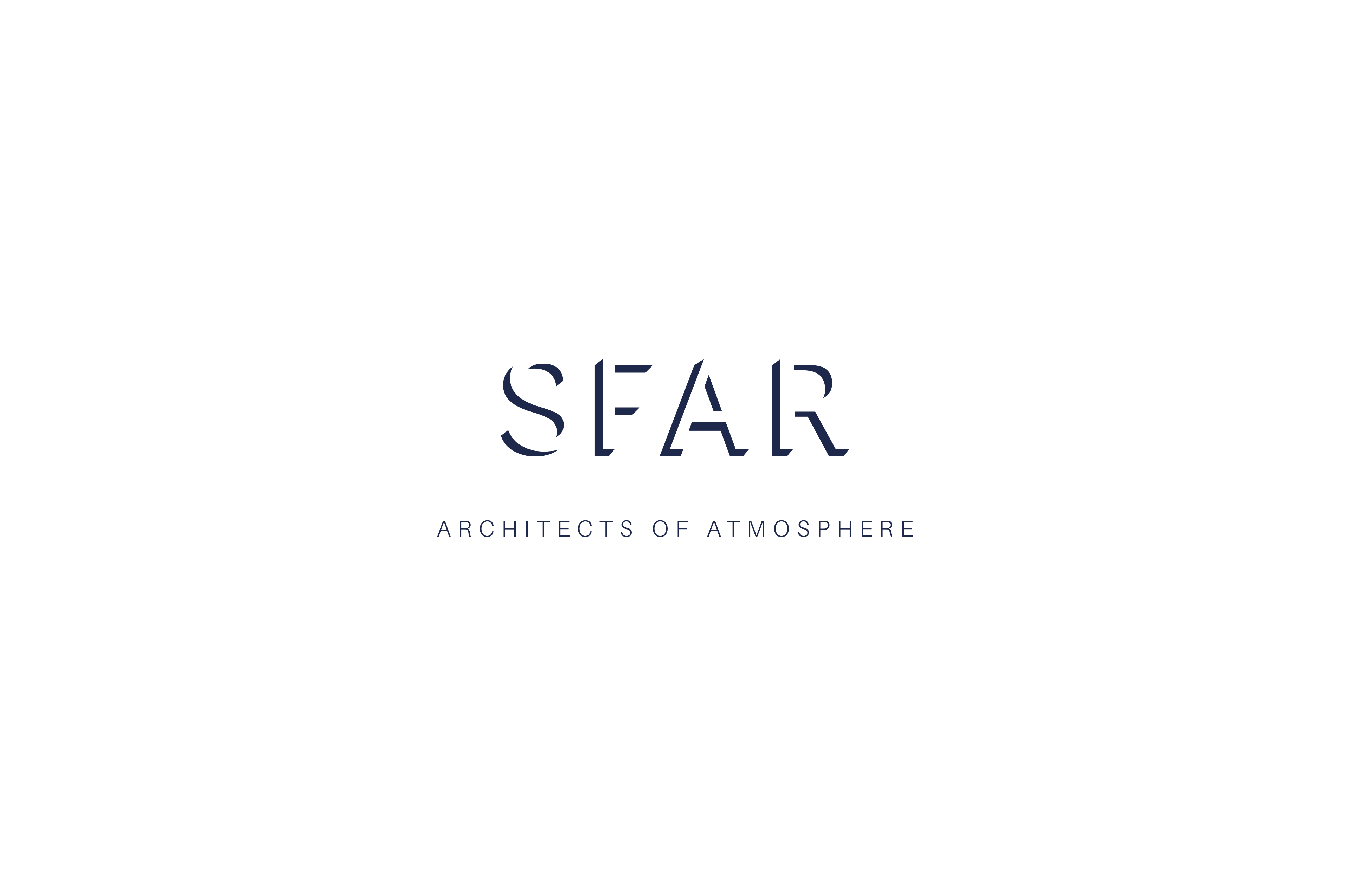
We developed a logo with 2 faces: not everyone sees the logo the same way. Only after a longer look do you see the depth of the logo. This logo emphasizes the spatial feeling of architecture, by saving space between the letters.
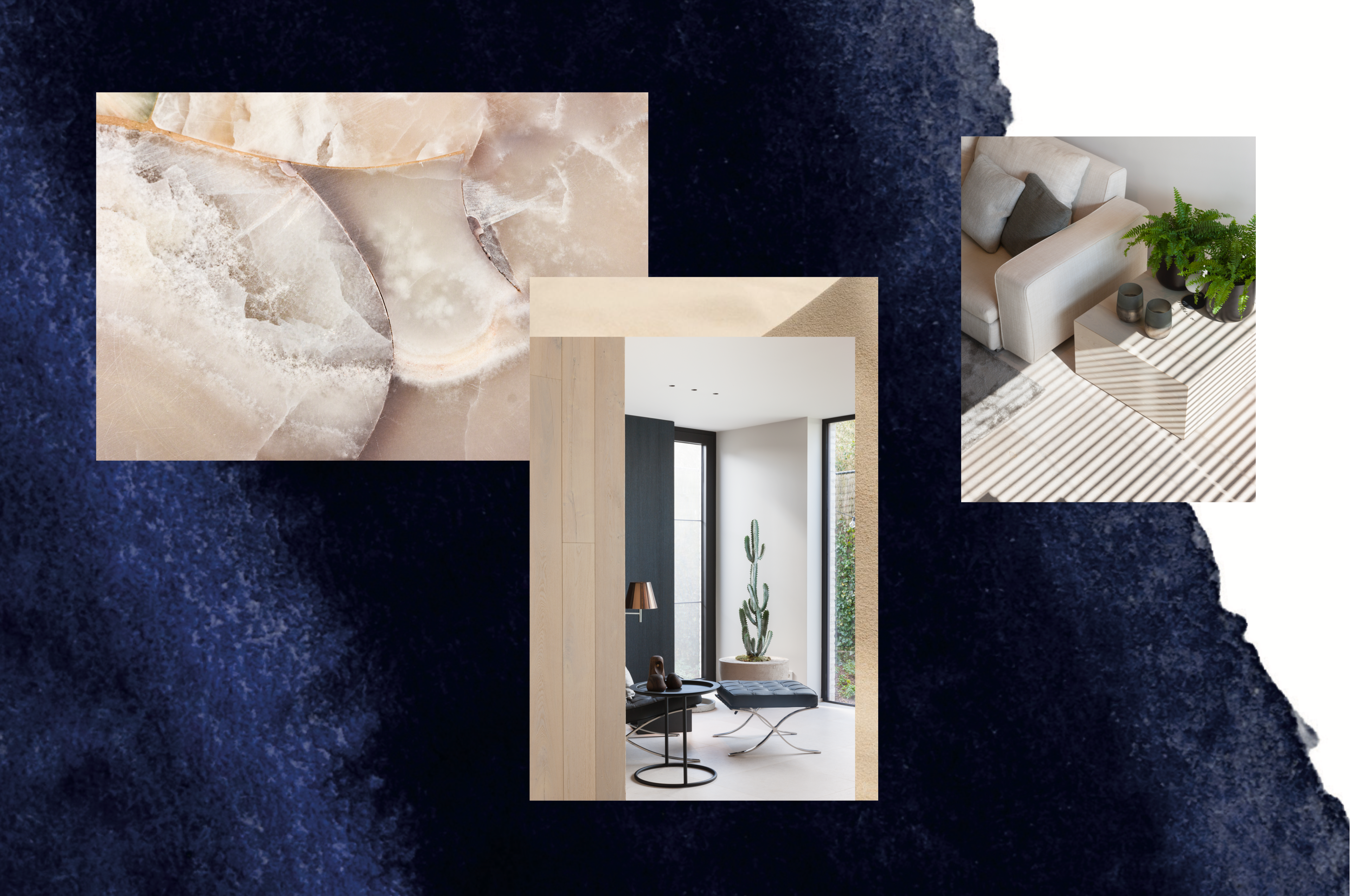
Cobalt blue and a champagne color emphasize the higher segment of customers Sfar wants to profile itself in the future.
“Sfar stands for a harmonious combination of timeless atmosphere, gut feeling and ratio.
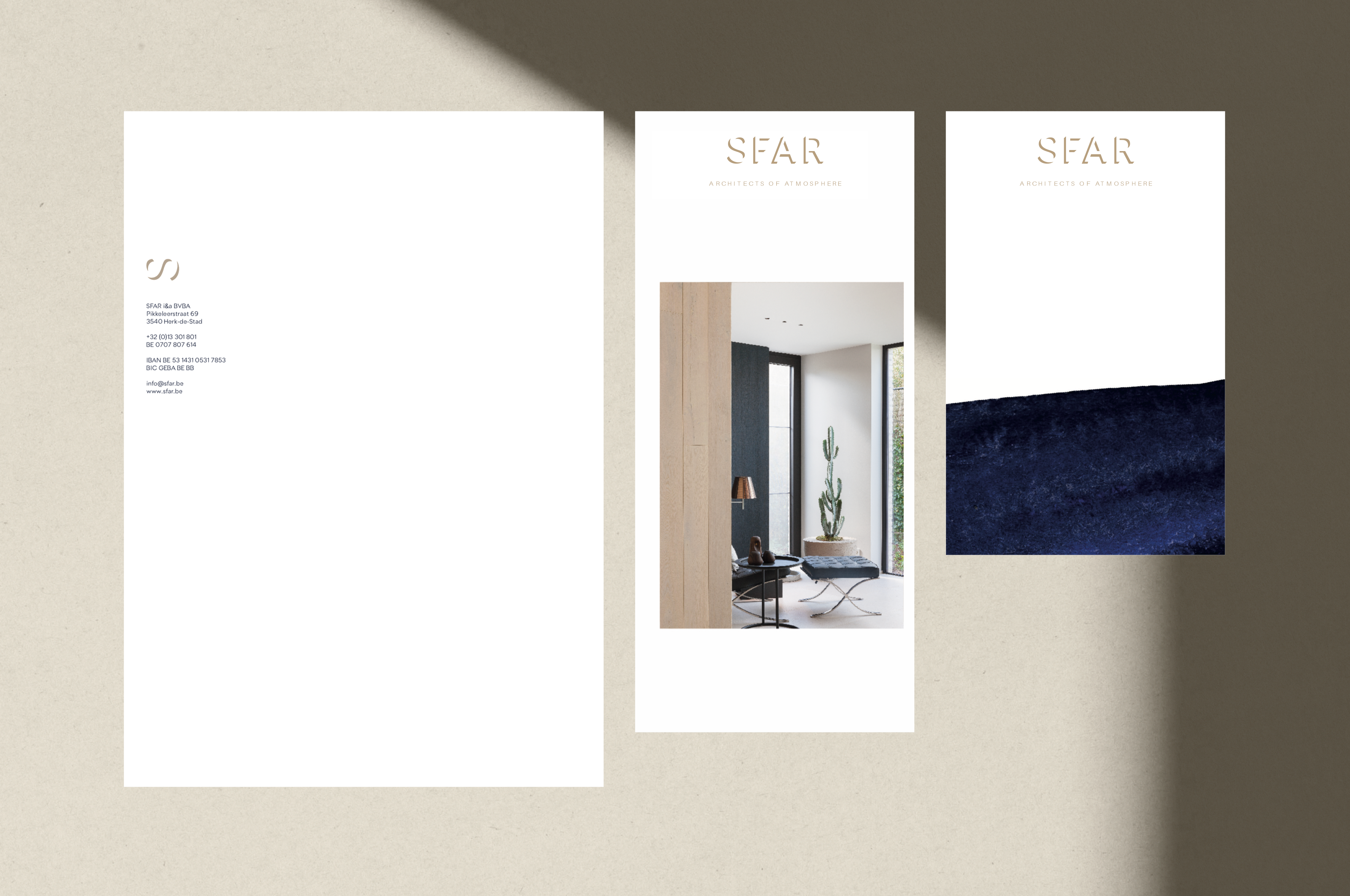
Sfar has its own distinctive design style. You can recognize a sfar project from miles away because they work with atmosphere. To emphasize this, we came up with the appropriate baseline 'architects of atmosphere'.
